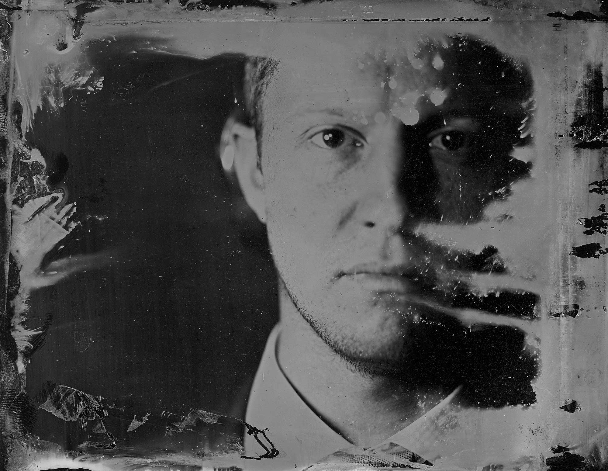
A-Grade Photography A-Level project example
In this post we exhibit an exploration into PTSD and the human condition through Tintypes.
Why did this project receive full marks?
The project is incredibly well researched, technically well executed and ends with genuine discovery. Successfully capturing a tintype image on a mirror to my knowledge is completely unique, for an A-Level student to achieve such a feat is genuinely incredible.
The area of study is sophisticated and handled with maturity.
The style is consistent and well considered given the subject matter, even down to the careful selection of the font.
A mastery of technical language is evident throughout – read the accompanying unit 3 personal investigation essay here.
A mastery of technique and visual language is evident throughout
All components compliment each other; the technique chosen resonates with the underlying concept
Development of project both conceptually and technically is evident, students progress from early mistakes to mastery is well documented

Devin Mitchell.
Born in 1987, Mitchell aspired to follow his own approach in the photographic world. He taught himself in order to create his art. Mitchell’s self-professed devinography work is a composition of Photoshop illusions and surreal imagery, with often controversial results.
Mitchell’s artwork in ‘the veteran art project’ shows the two sides of U S servicemen, often fairly surprising and contrasting to their military lifestyle.
What Mitchell successfully depicts is the controversial side of the soldiers in their casual lives, out of uniform. Mitchell has captured the Individuality and the contrast between the two sides of a member of the armed force’s lives. The images are as if they examine what lies beneath the beret or garrison cap; what they experience and their individual personality outside of their occupation. The series successfully challenges stereotypes within the forces, revealing the vulnerability of service men and women despite the stoic façade.
This image of Marine Ivanchan shows how even after receiving a double amputation, he cannot help but realise he is still that Marine. This photo is very interesting as it presents the reality of how hard many Servicemen find it to leave their band of brothers – to re-join civilian life. Looking in the mirror, the reflection is leaning forward, like in an interrogating or intimidating stance, pressuring the marine; this somewhat presents the effects of Post-traumatic stress disorder (PTSD), controlling the individual internally.
Photoshop software is used to change an image to the operator’s liking. Many professional and amateur photographers, in a range of varying camerawork, employ it to edit their images. Graphic designers also use Photoshop to create and change images. The software is widely known and criticised for the ability to change the image of models and celebrities, causing major ethical issues.


Ed Drew
Born in 1981 – began his career by joining the military a month after graduating from high school. While stationed in Japan, Drew discovered his passion for art.
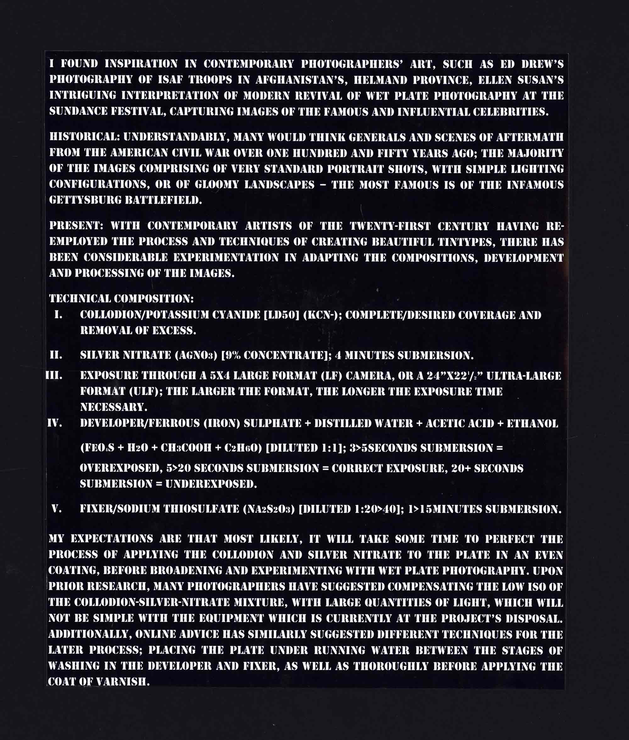
Tintypes were first patented in 1856 and were very popular in the United States during the Civil War. Made by creating a direct positive on the dark iron, Tintypes are technically negatives. Collodion processes can register microscopic detail, giving the resulting photographs a remarkably high-definition look.
Drew’s Tintypes portraits of his fellow soldiers fighting in Afghanistan are the first known Tintypes created in wartime since the American Civil War.
Drew’s use of Tintypes – a photographic technique common place in conflicts such as the American Civil War – in Afghanistan, creates an eerie feeling of ghost like figures. The standard issue M9 Beretta holstered across his chest is the remnants of its ‘6 shooters’ ancestor; their m4s are the replacements of Winchester rifles and APCS the modern day pack horse. His photos present the surreal aspect of using such aged equipment, in such a modern conflict.
The essence of the Tintypes emphasizes the true grit of the subjects and the environment. Drew uses his colleagues, rather than the destitute landscape of Afghanistan – a relatively alternative concept being that most photographers that travel all the way to the front line take images of the conflict, of casualties, of the battlefield. His subjects. Despite being alive and unwounded, seem to express the horror, the pain and the threat of war.

Ellen Susan.
Born in 1969 – Susan began working with wet plate photography on her own, reconstructing the process and taking inspiration from former legendary, wet plate photographers. Susan can be seen as one of the initial individuals to revive wet plate photography.
Each individual image is incredibly refined and detailed in a way in which it allows for entire lives and narration, through use of attire, expression & minute detail.
The physical expression exhibits an intense stare through the camera – his forward leaning posture, and tight-set shoulders adjacent to an almost Roman-like sculpted face, resting upon tightly compressed hands creates an incredibly imposing, intimidating image. However, the prayer Resembling expression of his hands suggests some sort of gracefulness and solidarity. What is odd is that his facial manner is somewhat confusing; his mouth, cheeks and forehead relaxed in a non-threatening manner, yet his eyes, brows and posture conflicting such a condition.
Susan took advantage of living near the Southeast Georgia Army Base, photographing the military personnel that occupied the local residential and commercial areas; meeting soldiers at grocery stores, delving into their story and grasping such experiences in a single mastered Collodion plate image. Despite minimal interjection into the individual’s personality, each image still carries huge character.
This image was particularly appealing due to its social context that is incredibly significant within this day and age: the abundance of conflict between the Western world and radical Islam, yet this photographic portrayal is a statement conflicting with such an idea of peace as idiotic between the two Cultures. The 3rd infantry Division – a unit held in an almost constant state of readiness, if not deployed – patch suggesting the likelihood of the individual having fought against such beliefs, yet such a solidarity between the Arabic scripture tattoo appearing so blissfully at ease upon the Kevlar, despite the war of an obviously apparent irony.

Victoria Will.
Born 1981 – began her career at the New York Post, as a staff photographer. Will honed her skills and sense of humour in articles such as “headless body in Topless Bar” and other such pieces while working solely for the NY Post. However, her exploration progressed into Tintype portraitures of the rich and famous, from the red carpets of the Sundance festival.
Will’s coverage of the 2015 Sundance Film Festival gave her unprecedented access to some of the 21st centuries biggest cultural icons. The images possess an eerie, surreal quality. The juxtaposition of celebrity and antique process removes any idea of social status and allows the viewer to examine the face. Because of this a depth of character, that is otherwise invisible, is revealed
Kristen Stewart’s eyes suggest loss and isolation, re-enforced by the darkness surrounding her. Jesse Eisenberg has a look of despair, almost childlike, and in a sense, lost.
The chemical marks across the image exaggerate the sometimes unpredictable nature of Tintypes. This however adds to the uniqueness of each piece, each image is removed from time and immediately placed within the historical context of the process’ origins. In Addition, its effect resembles being burnt. As if saved and now remains the final, haunting relic of a nightmare. The subject’s hands are crossed over her heart, often symbolic of purity or vulnerability. Her fragile appearance is further emphasised by the framing of the image: her face centred, surrounded by negative space making her appear further engulfed, overwhelmed and defenceless.
Haunting in a literal and metaphorical Sense; Phillip S. Hoffman’s recent death elaborates the impression of deterioration and demise of the relic photographic process. The absent appearance merging into the background. His expression: apathetic and inert, unable to conceal or disguise his grief. With many of Will’s images, there is a certain amount of obvious acting and attempt to obtain what the individual believed to be the necessary expression, yet with Hoffman’s his composure is delicate and seems accepting of exposing his blatantly miserable fragility.

Louie Palu.
Born in 1968 – graduating from the Ontario College of Art in 1991. His accolades include five nominations (2004-08) for the Visa Pour l’Image AND OTHER PRESTIGIOUS INTERNATIONAL PHOTOGRAPHY FESTIVALS. It is incredibly important to note his self- sacrifice and investment into war journalism.
During Palu’s excursion to Kandahar, he carried two still cameras with one lens each – a 50mm and 17-35mm. the compact and minimal nature of the his equipment and essentials was not only down to having to cram into a hot and confined Armoured Vehicle, but also the dreadful heat; he was rehydrated via Intra-Venous bags numerous times by the combat medic of the unit he was embedded with.
The Horrors of war emphasized by Palu: “I want to eliminate the romance and humour of war coverage right here. This may sound exciting but it is not. I saw things that have changed me forever. Some memories never go away.”
Within this image, the bearing of the marines gaze directly down the lens creates unease and intimidation towards the viewer. His mouth forms something of a malevolent smile; or is this merely false, in order to project a hardened exterior to hide a juvenile, lonely and scared individual? The rim of his Kevlar Helmet shields his eyes, darkening his face, making us question, ‘what is he hiding from? Or what is he hiding?’… This Marine’s facial expression is conflicted: tension in his nostrils and mouth imply some sort of resentment toward the camera or the audience. His face has something of a pitying look, almost to suggest that we the viewer could never know his reality.
The image portrays the individual’s stoic nature which is often associated with marines. The young man displaying what is commonly referred to as the ‘thousand yard stare’ of a battle weary soldier. Through the lack of contrast, the lack of emotion is accentuated, bringing to question what could cause a young marine to become so fragile and exhausted.
The inscription on the front of the Marines helmet:
“Front towards enemy” (a reference to the somewhat satirical instructions found upon a deadly and tactless “claymore” anti-personnel explosive device) could represent how the man is merely a tool, a lifeless object designed to kill.

1st Attempt
Having coated the plate in Collodion, the plates were then placed in the silver nitrate for varying times: the first and second images were exposed to the solution for approximately 3-4 minutes, whereas, the third to the fifth were sat in the solution for 4-6 minutes. A Collodion plate was also then left in the silver nitrate solution – for experimental purposes – for approximately 40 minutes. Surprisingly, having repeated the rest of the process as closely as possible to the previous 5 photographs, there was no image upon the plate having exposed it in the same scenarios; it did not seem to be over-exposed or under-exposed – interestingly, it was no longer reactive or sensitive to light. Quite clearly, the Collodion plates, which were mixed with the solution for the longer period of time, have resultantly had a far higher level of contrast and subsequently a more aesthetically pleasing photograph.
The success of these images were in correcting the timing of the process. Future development will require perfecting the process of applying the Collodion, creating an even coat, rather than that of the images of the first attempt which are often ruined by chemical and water marks. Additionally, perfecting focus is necessary as the focal plane is no longer in an exact location as the film holder has been adapted to take the metal plate.
2nd attempt
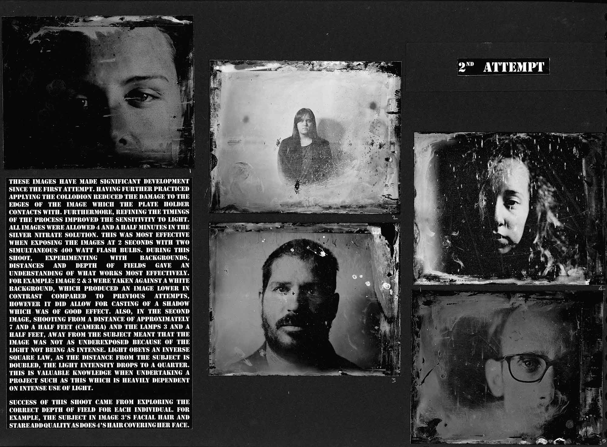
These images have made significant development since the first attempt. Having further practiced applying the Collodion reduced the damage to the edges of the image which the plate holder contacts with. Furthermore, refining the timings of the process improved the sensitivity to light. All images were allowed 4 and a half minutes in the silver nitrate solution. This was most effective when exposing the images at 2 seconds with two simultaneous 400 watt flash bulbs. During this shoot, experimenting with backgrounds, distances and depth of fields gave an understanding of what works most effectively. for example: image 2 & 3 were taken against a white background, which produced an image lower in contrast compared to previous attempts, however it did allow for casting of a shadow which was of good effect. also, in the second image, shooting from a distance of approximately 7 and a half feet (camera) and the lamps 3 and a half feet, away from the subject meant that the image was not as underexposed because of the light not being as intense. Light obeys an inverse square law, as the distance from the subject is doubled, the light intensity drops to a quarter. This is valuable knowledge when undertaking a project such as this which is heavily dependent on intense use of light.
Success of this shoot came from exploring the correct depth of field for each individual. For example, the subject in image 3’s facial hair and stare add texture as does 4’s hair covering her face.

3rd attempt
The third attempt at ‘no, you can’t be that original’ focused particularly upon framing the individual positively. For example, image one works on the basis that the light hits her cheek and her flowing hair disperses into gradual darkness; highlights her most prominent feature of her thick, curled hair creating texture in the image. The offset is successful because of the fade from contrasting black and white, and the detail of the individual hairs, into a near pure darkness. On the other hand, image four is set centre and has light going across most of his face. It crops out the ‘dead space’ of his forehead and sets below his throat and above his collar. This image is an imitation of images similar to that of Don McCullin or Louie Palu, resembling that of a young, First World War soldier. His gaze fixating through the lens; he has the ‘thousand yard stare’, that is so often associated with trauma and loss.
Additionally, the focus of these images are far superior to those of the 2nd attempt; for example: image five focuses particularly at the depth of her eyes and brows, as this is her most prevalent feature. Whereas, image three’s contours and wrinkles are in focus, as it presents wear and the fading of his youth – further exaggerated by the aged technique of wet plate photography.
4th Attempt
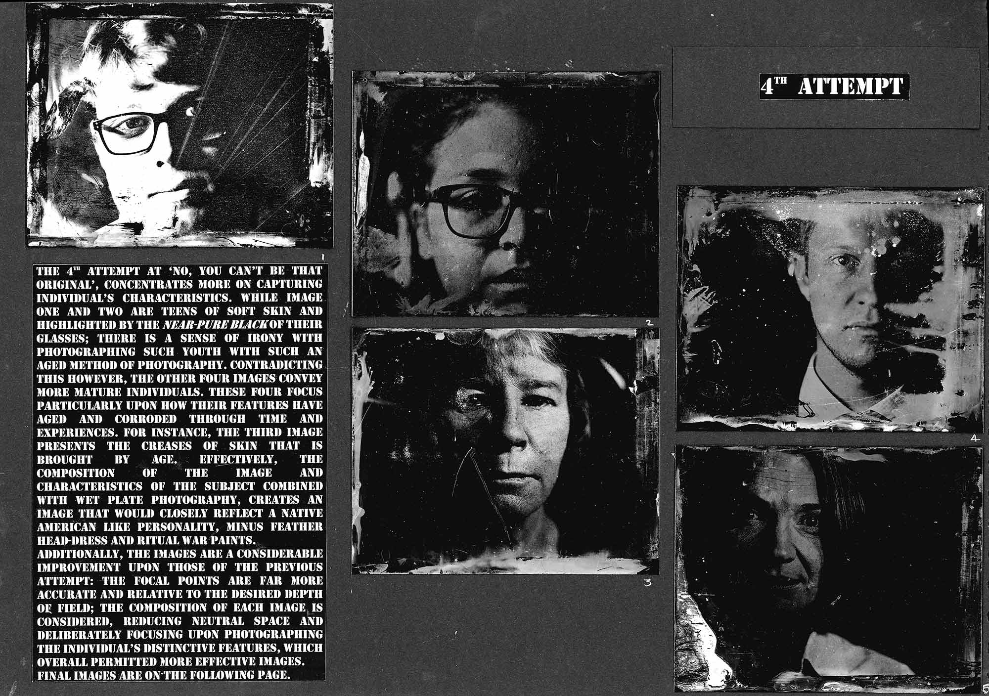
The 4th attempt at ‘No, you can’t be that original’, concentrates more on capturing individual’s characteristics. While image one and two are teens of soft skin and highlighted by the near-pure black of their glasses; there is a sense of irony with photographing such youth with such an aged method of photography. Contradicting this however, the other four images convey more mature individuals. These four focus particularly upon how their features have aged and corroded through time and experiences. For instance, the third image presents the creases of skin that is brought by age. Effectively, the composition of the image and characteristics of the subject combined with wet plate photography, creates an image that would closely reflect a Native American like personality, minus feather head-dress and ritual war paints.
Additionally, the images are a considerable improvement upon those of the previous attempt: the focal points are far more accurate and relative to the desired depth of field; the composition of each image is considered, reducing neutral space and deliberately focusing upon photographing the individual’s distinctive features, which overall permitted more effective images.


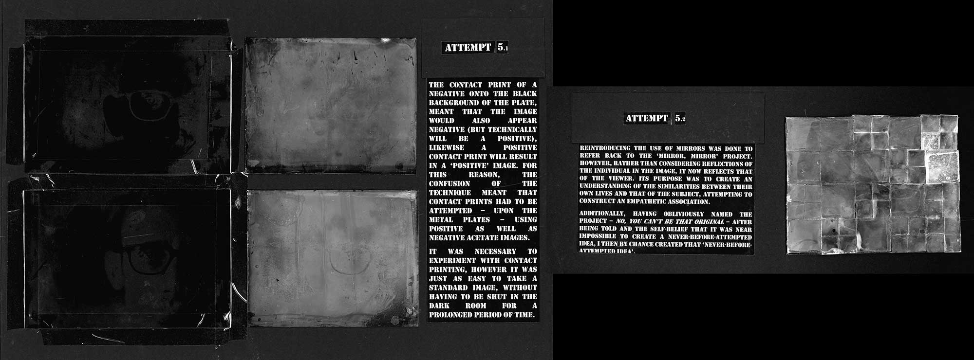
Attempt 5.1
The contact print of a negative onto the black background of the plate, meant that the image would also appear negative (but technically will be a positive), likewise a positive contact print will result in a ‘positive’ image. For this reason, the confusion of the technique meant that contact prints had to be attempted – upon the metal plates – using positive as well as negative acetate images.
It was necessary to experiment with contact printing, however it was just as easy to take a standard image, without having to be shut in the dark room for a prolonged period of time.
Attempt 5.2
Reintroducing the use of mirrors was done to refer back to the ‘mirror, mirror’ project. However, rather than considering reflections of the individual in the image, it now reflects that of the viewer. Its purpose was to create an understanding of the similarities between their own lives and that of the subject, attempting to construct an empathetic association.
Additionally, having obliviously named the project – no, you can’t be that original – after being told and the self-belief that it was near impossible to create a never-before-attempted idea, I then by chance created that ‘never-before-attempted idea’.

6th attempt
The images are beginning to appear more refined and obvious upon the mirror, regardless of colour of reflection and positioning of light (upon viewing). Additionally, beginning to consider the composition of the image: the framing of the portrait, the covering of the light and shading, as well as trying to negotiate depth of fields precisely. This however is proving to be difficult as the mirror is set-back from the desired position by a few millimetres, which off-sets the focal point.
These images were still slightly under-exposed, having been exposed for 8 seconds, with the lamp and two 400 watt flash bulbs.
Chemical marks were considerably worse on these three images. Additionally, despite being the ‘highest quality’ of the images, the image on the opposing page is not well composed. Preferably, the subject will be larger, cropped and far more apparent in the image.
In order to improve, lengthening the time for which each image is exposed, in order to obtain a clearer photograph. Also, washing with white spirit or water before use and leaving the mirror in the fixer for longer before varnishing.

7th attempt
Extended initial experimentation of underexposed images, has finally lead to this point of minimal success. Personally, this only exaggerated the feat over an original idea and accomplishing an ideal outcome.
These images were accomplished using the same equipment as the wet plates. The settings were: 6 seconds exposure time, aperture f5.6, 2 400watt flash bulbs and 5 seconds with the lamp on prior to flash.
Problems encountered were that the collodion-silver nitrate solution was not bonding to the mirror like it would the plates and would peel off when being developed, fixed or washed. Additionally, the outcome of acquiring chemical marks seems to be inconsistent and as of yet unpredictable as the answer is not obvious.
In order to improve, the ‘peel effect’ needs to be resolved, perhaps by employing some form of grit or liquid glue, to allow for better binding to the mirror surfaces. A more refined photo will prove easier visibility on the mirror.

8th attempt
In this shoot there was a consistent outcome of successful images. The detail is far clearer and refined due to progress found within the aspect of the timings of exposures and developing stages.
During this attempt, adapting the lights slightly, resulted in a better portrait. The lights were set-up as one flash bulb at 35o and a second flash bulb/lamp at 55o, in hope that this would illuminate the entirety of the subject’s face.
Unfortunately, still encountering issues concerning chemical marks that do not disappear, despite cleaning plates pre-coating and leaving in the fixer for an even further extended period of time.
Necessary improvements are to clean properly with white spirit or similar cleaning agents. Also, experimenting with smashing the glass for dramatic effect. And finally, further investigation into composition and depth of field. While it is still a struggle to coordinate finding the correct focal point, it is possible to calculate the difference necessary to achieve the desired image. Composition is essential in order to gain a well manipulated image.

9th attempt
Fulfilling a renaissance of the military/conflict aspect of mirror, mirror, incorporating a ‘fracturing’ effect by initially, manually smashing the mirror. However, in order to further develop the subproject, employing various forms of equipment to destroy the plates.
The plates were perforated by a .22 Roundhead, lead air rifle shot. This coincides with the conflict concept, puncturing the plate symbolic of those exposed to war and horror. The thought behind it originates from the idea that after damaging the fragile and delicate, thin metal plate, it will be permanently disfigured. Much like the minds of the youthful soldiers which are sent to fight foreign wars, witnessing horrific injuries, death and utter mutilation of human life; the young men that return with corrupted minds and tainted habits, in the form of PTSD. These men struggle to reintegrate with civilian society, out casting themselves and leading a life of struggle, fear and anxiety. Their hardest battle not fort in compounds in Iraq, or mountains of Afghanistan, but in their own minds.
Improving the images requires configuring the individual and composition to reflect that of damage and pain – i.e. using costumes, props and lighting etc.
Once again, returning to collaborating with mirrors, emphasising the point of addressing self-consciousness and self-worth. The reason being no matter how much we try to persuade others of our perfection and success, looking upon ourselves in a mirror will rightly convey just how damaged and we all are in some way.
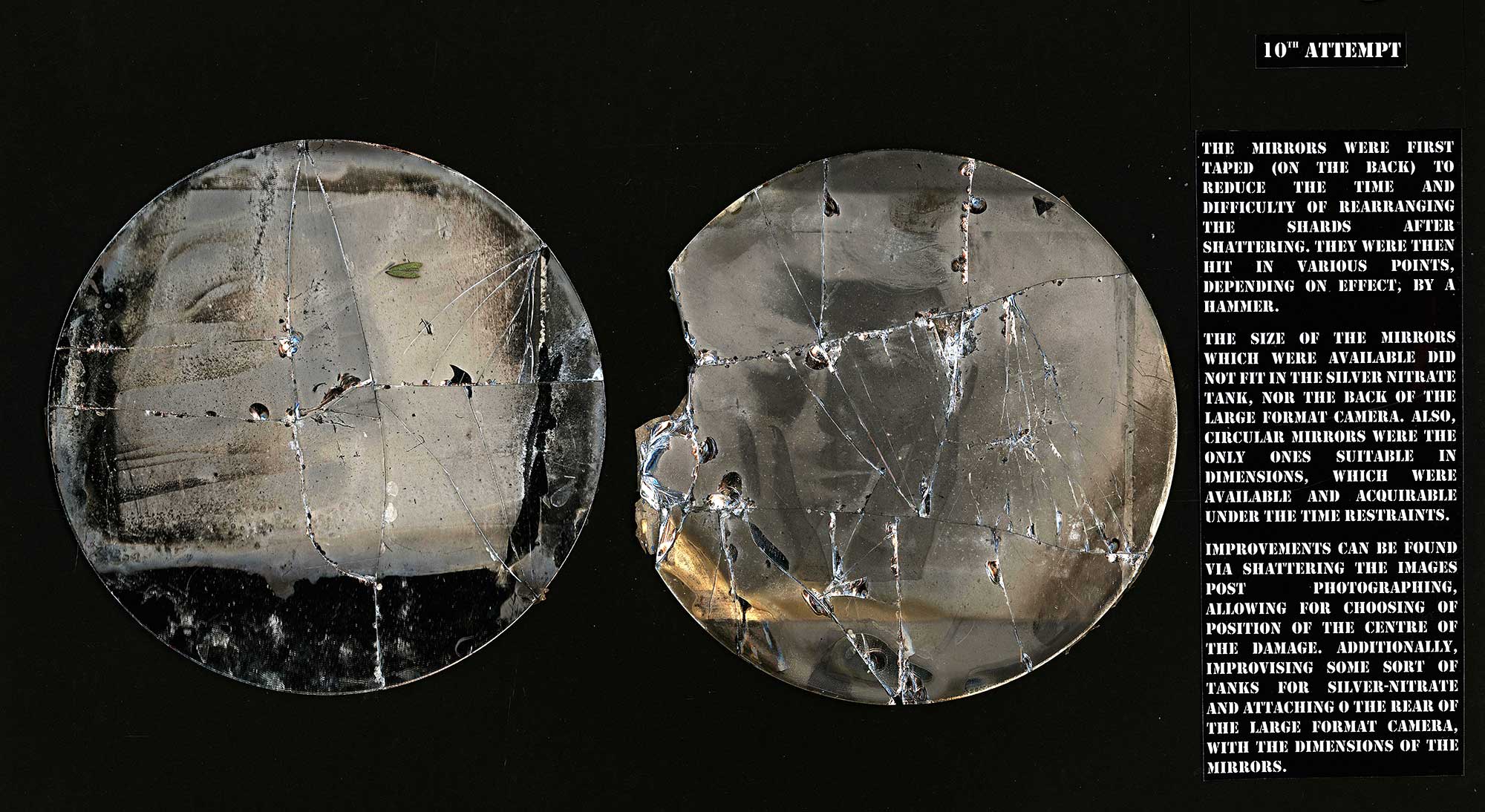
10th Attempt
The mirrors were first taped (on the back) to reduce the time and difficulty of rearranging the shards after shattering. They were then hit in various points, depending on effect, by a hammer.
The size of the mirrors which were available did not fit in the silver nitrate tank, nor the back of the large format camera. Also, circular mirrors were the only ones suitable in dimensions, which were available and acquirable under the time restraints.
Improvements can be found via shattering the images post photographing, allowing for choosing of position of the centre of the damage. Additionally, improvising some sort of tanks for silver-nitrate and attaching o the rear of the large format camera, with the dimensions of the mirrors.

11th Attempt
These images were completed by firstly exposing the photograph upon the mirror’s surface, before then shattering at a precise chosen point.
For example, with the first image, the aim was to achieve a fracturing – cracking – across and down the face; her facial features relating to that of a china doll, therefore a cracking of her ‘glaze’. In other words, her beauty, replaced by ageing and its subsequent aching.
The neutral space on the left of image two’s face seemed like an adequate and justifiable position to aim to get the centre of the shattering. The effect of shattering – rather than cracking – was a result of angling the mirror against two perpendicular surfaces and hitting far harder so that it not only initially cracks but also fragments.
View this students Unit 4 externally set assignment
