Mixed media project – A grade
This is an example of an A-Level photography book that achieved an A grade.
What makes it a good A-Level Photography project?
- It’s exceptional from a technical point of view
- Displays genuine curiosity
- All work links to artist research and a consistent theme runs throughout
- Genuine discovery
- Exploration of ideas practically and conceptually
- Learning from mistakes, demonstrating learning
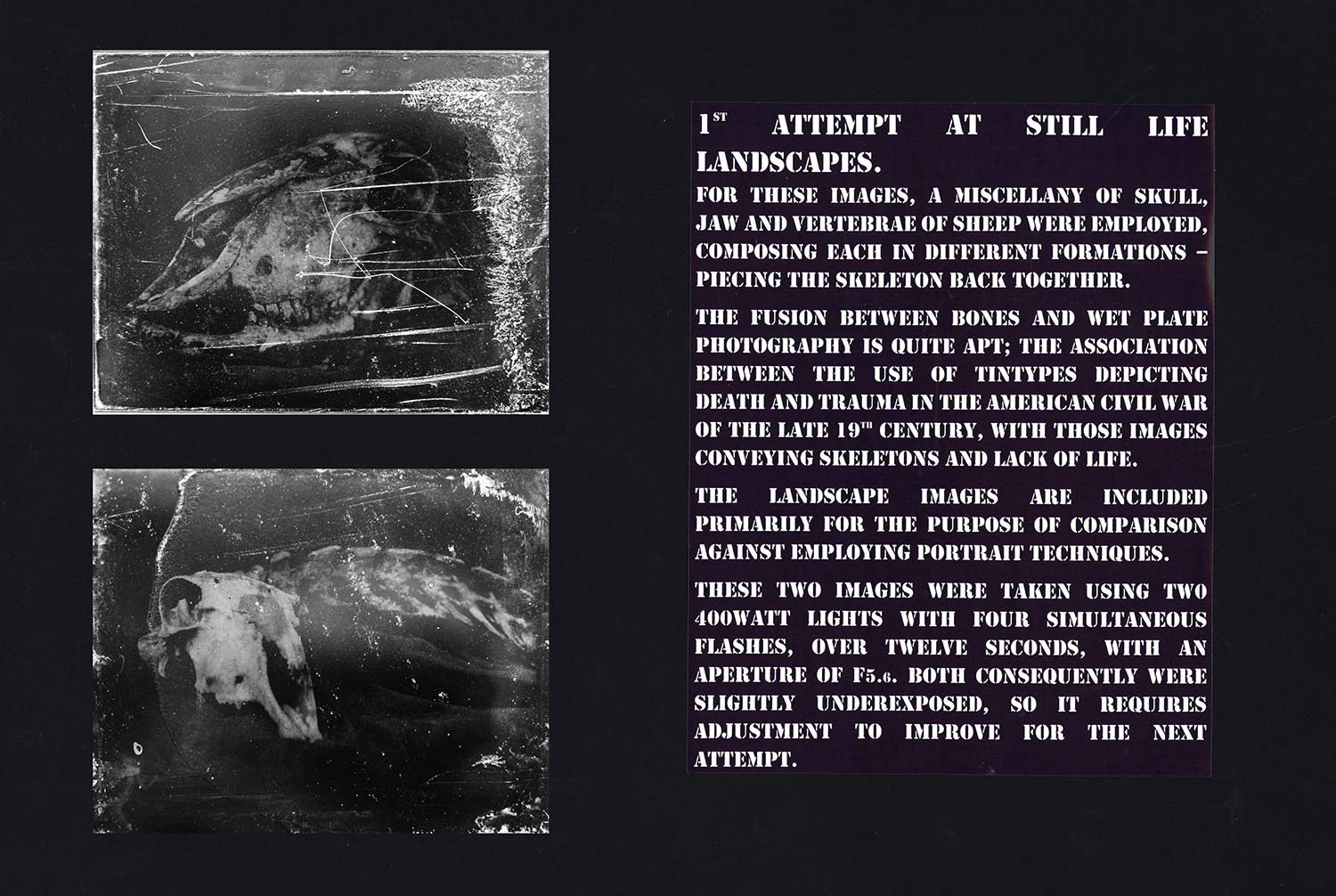
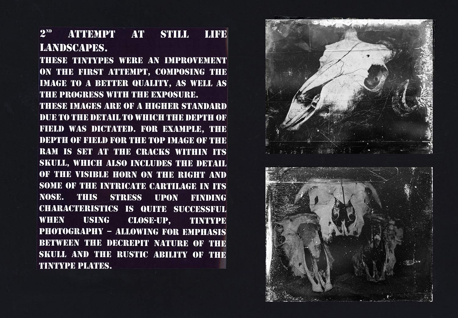
First attempt at still life landscapes.
For these images, a miscellany of skull, jaw and vertebrae of sheep were employed, composing each in different formations – piecing the skeleton back together. The fusion between bones and wet plate photography is quite apt; the association between the use of Tintypes depicting death and trauma in the American civil war of the late 19th century, with those images conveying skeletons and lack of life.
The landscape images are included primarily for the comparison against employing portrait techniques. These two images were taken using two 400 Watt lights with four simultaneous flashes, over twelve seconds, with an aperture of f/5.6. Both consequently were underexposed, so it requires adjustment to improve for the next attempt.
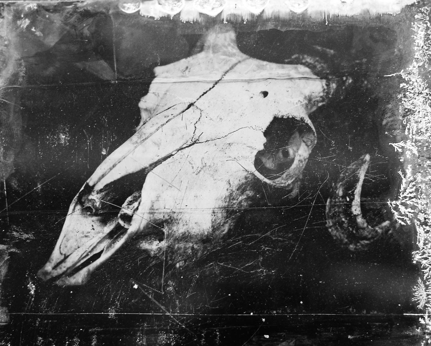
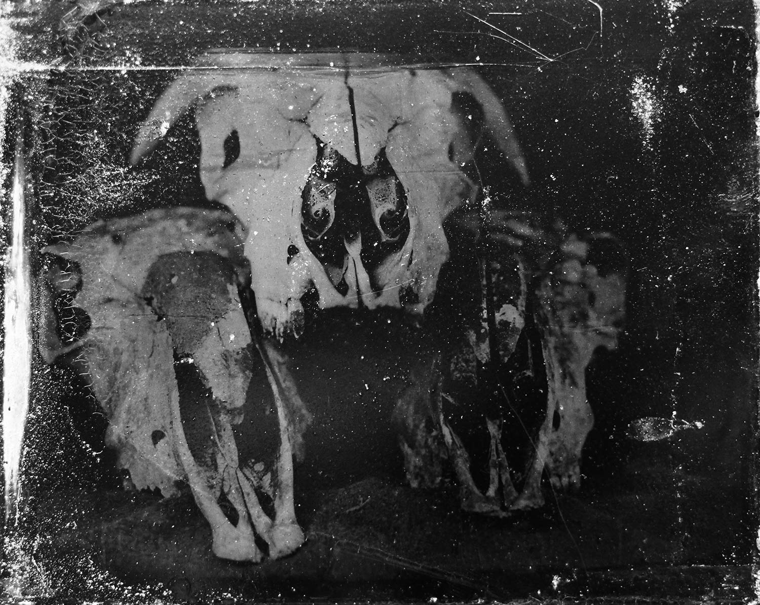
Second attempt at still life landscapes.
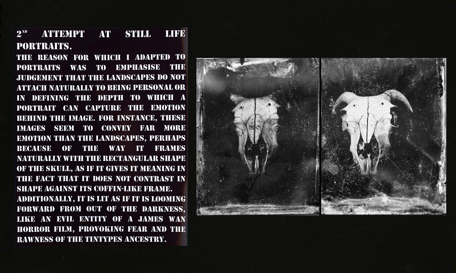
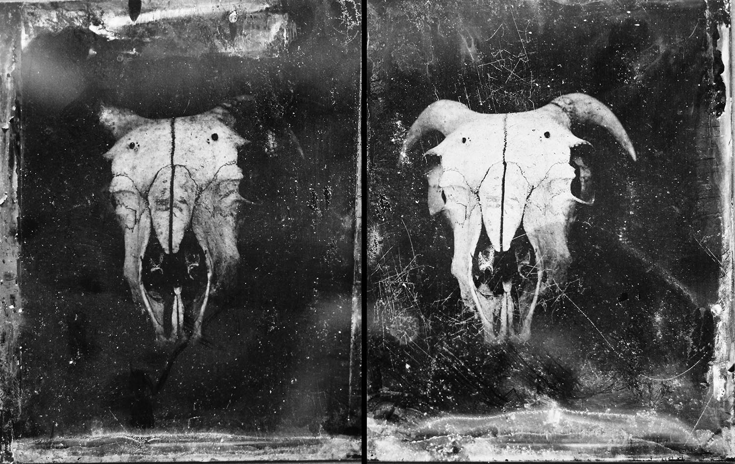
These Tintypes were an improvement on the first attempt, composing the image to a better quality, as well as the progress with the exposure. These images are of a higher standard due to the detail to which the depth of field was dictated. For example, the depth of field for the top image of the Ram is set at the cracks within its skull, which also includes the detail of the visible horn on the right and some of the intricate cartilage in its nose. This stress upon finding characteristics is quite successful when using close-up Tintype photography – allowing for emphasis between the decrepit nature of the skull and the rustic ability of the Tintype plates.
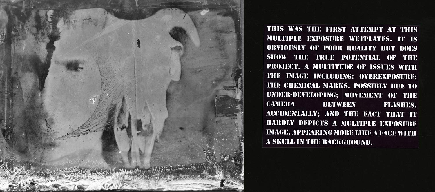
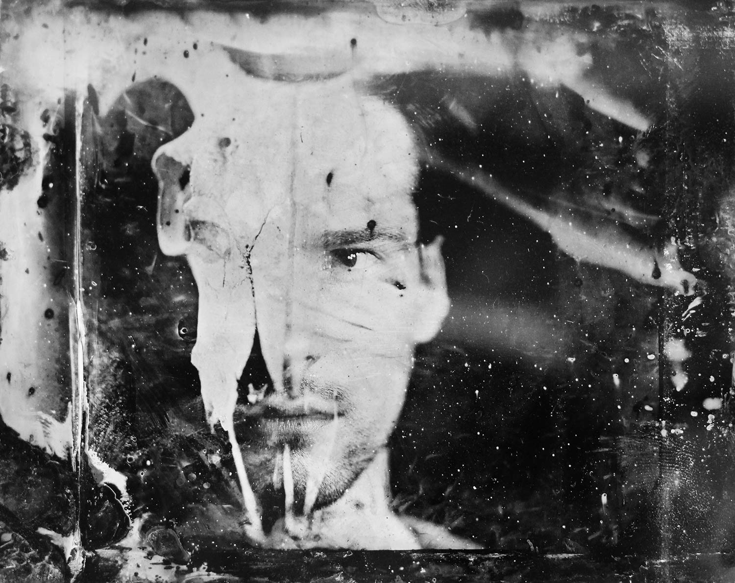
This was the first attempt at this multiple exposure wet plate photography. It is obviously of poor quality but does show the true potential of the project. A multitude of issues with the image including; overexposure; the chemical marks (possibly due to under developing); accidental movement of the camera between flashes; and the fact that it hardly depicts a multiple exposure image, appearing more like a face with a skull in the background.
So funny are my students that not only do they produce technically excellent work but they also find ways to take a dig at me during their project write up.
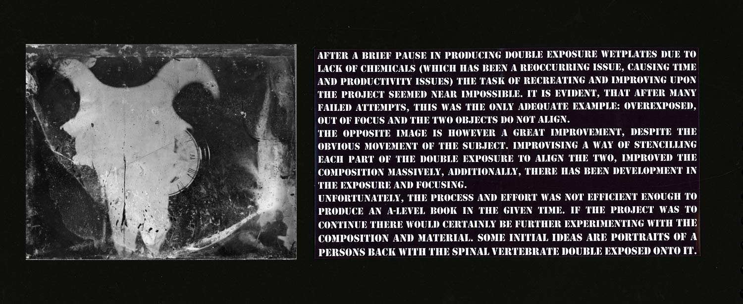
The task of recreating and improving upon the seemed near impossible. It is evident, that after many failed attempts, this was the only adequate example: overexposed, out of focus and the two objects do not align.
The next image is however a great improvement, despite the obvious movement of the subject (it’s worth pointing out here that it is indeed me, Liam Smith the photography teacher, in the photograph. Once again students love taking a dig). Improvising a way of stencilling each part of the double exposure to align the two images improved the composition massively, there has been development in the exposure and focus. Unfortunately, the process and effort was not efficient enough to produce an A-Level book in the given time. If the project was to continue there would certainly be further experimenting with the composition and material. Some initial ideas are portraits of a person’s back with the spinal vertebrae double exposed onto it.
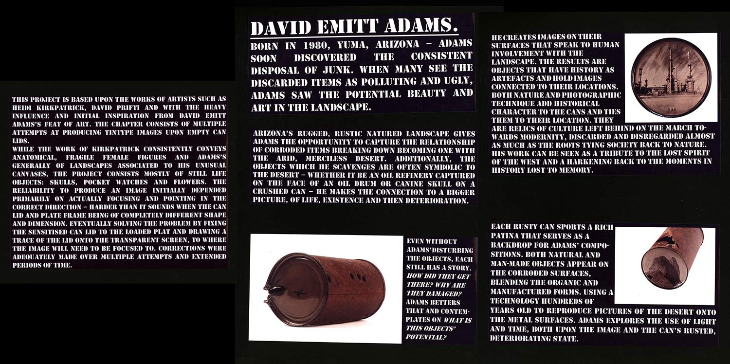 This project is based upon the works of artists such as Heidi Kirkpatrick, David Prifti and with the heavy influence and initial inspiration from David Emitt Adams’s feat of art. The chapter consists of multiple attempts at producing tintype images upon empty can lids.
While the work of Kirkpatrick consistently conveys anatomical, fragile female figures and Adams’s generally of landscapes associated to his unusual canvases, the project consists mostly of still life objects: skulls, pocket watches and flowers. The reliability to produce an image initially depended primarily on actually focusing and pointing in the correct direction – harder than it sounds when the can lid and plate frame being of completely different shape and dimension. Eventually solving the problem by fixing the sensitised can lid to the loaded plat and drawing a trace of the lid onto the transparent screen, to where the image will need to be focused to. Corrections were adequately made over multiple attempts and extended periods of time.
David Emitt Adams.
Born in 1980, Yuma, Arizona – Adams soon discovered the consistent disposal of junk. When many see the discarded items as polluting and ugly, Adams saw the potential beauty and art in the landscape. Arizona’s rugged, rustic landscape gives Adams the opportunity to capture the relationship of corroded items breaking down becoming one with the arid, merciless desert. Additionally, the objects which he scavenges are often symbolic to the desert – whether it be an oil refinery captured on the face of an oil drum or canine skull on a crushed can – he makes the connection to a bigger picture, of life, existence and then deterioration.
Even without Adams’ disturbing the objects, each still has a story. How did they get there? Why are they damaged? Adams betters that and contemplates on what is this objects’ potential?
Each rusty can sports a rich patina that serves as a backdrop for Adams’ compositions. Both natural and man-made objects appear on the corroded surfaces, blending the organic and manufactured forms. Using a technology hundreds of years old to reproduce pictures of the desert onto the metal surfaces. Adams explores the use of light and time, both upon the image and the can’s rusted, deteriorating state.
He creates images on their surfaces that speak to human involvement with The Landscape. The Results are Objects that Have history as Artefacts and hold images Connected to their locations. Both nature and photographic Technique add historical Character to the cans and ties them to their location. They Are relics of culture left behind on the March towards modernity, discarded and disregarded? His work can be seen as a tribute to the lost spirit of the West and a harking back to the moments in history lost to memory.
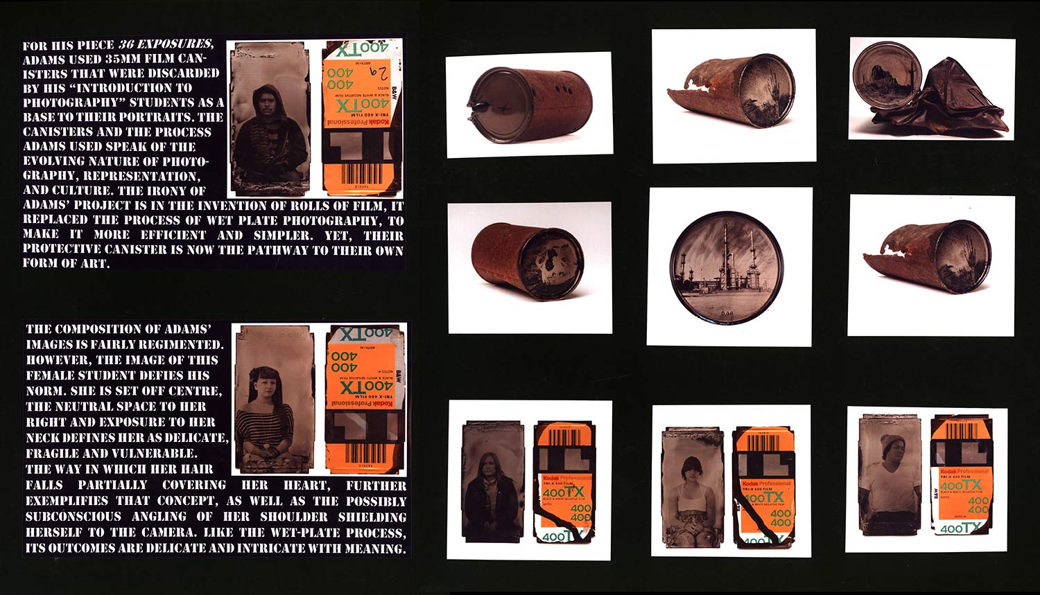
For his piece 36 Exposures, Adams used 35mm film canisters that were discarded by his “Introduction to Photography” students as a base to their portraits. The Canisters and the process Adams used speak of the Evolving nature of photography, representation, and culture. The irony of Adams’ project is in the invention
The composition of Adams’ Images is fairly regimented. However, the image of this Female student defies his Norm. She is set off centre, the neutral space to her Right and exposure to her Neck defines her as Delicate, Fragile and vulnerable. The way in which her hair Falls partially covering her heart, further exemplifies that concept, as well as the possibly subconscious angling of her shoulder shielding herself to the camera. Like the wet-plate process, its outcomes are delicate and laced with meaning. Then of rolls of film, it replaced the process of wet plate photography, to make it more efficient and simpler. Yet, their protective canister is now the pathway to their own form of art.

David Prifti
Born in 1961 – Prifti dedicated 25 years to learning and teaching photography at Concord-Carlisle High School. He once wrote that it was his desire to explore his life through the things that shaped his time: his relationships, his memories, his sense of family, rites of passage, aging and death. Prifti Died of cancer in 2011. The imperfections that often occur on the edges of the plates only add to their precious quality and mediate the intensity of the images. Imperfections of the print produces a symmetry between the final outcome and the contents of the photograph itself. The print is representative of the uniqueness of the individual and the uniqueness of their behaviour, here we see an elderly lady drinking (what can only be assumed to be tea or coffee due to the presence of a saucer and spoon) through a straw. Entirely unique in both artistic process, outcome and depiction of behaviour. The way in which Prifti bushes the light sensitive solution over the material is unique to his work. Not only does it add additional texture to the surface and the image, but also gives the ability to paint only certain parts and allows for possible patterning. The images of the individuals
And their possessions or Interactions gives life to the seemingly discarded inanimate Object; a personal quality, With the possibility that they had their own memories, Experiencing emotions of its owners, to have been part of history only to be thrown away. While depressing, it is Enchanting that they have been given new life as art. What may have been a chair or a boat or simply a fence panel is now elevated beyond its original status, from disposable object, to irreplaceable art.
The nature of the corroding metal can is symbolic of the deterioration of childhood and innocence. The Stare of the young, female eye only amplifies the preconception of the corroding of virtue, exposing the youth to horrors and pain. Images of executions and disasters being broadcast across the internet make it impossible to shield young people from the truths of human nature; the inevitable Decay of the person and death of all things pure. In practice, nothing lasts forever, the exposure to life and hurt destroys everything. Beauty is temporary, suffering is essential and death is inevitable.
Heidi Kirkpatrick.
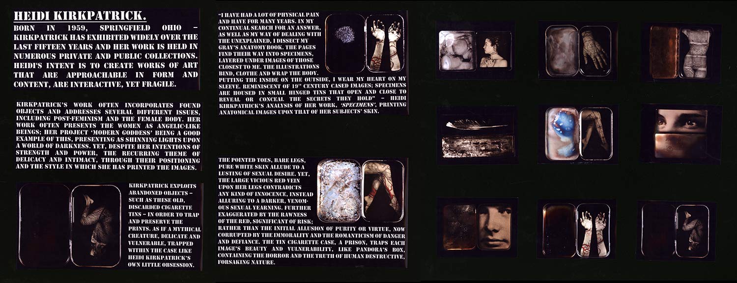
Born in 1959, Springfield Ohio – Kirkpatrick has exhibited widely over the last fifteen years and her work is held in numerous private and public collections. Heidi’s intent is to create works of art that are approachable in form and content, are interactive, yet fragile. Kirkpatrick’s work often incorporates found objects and addresses several different issues, including post-feminism and the female body. Her work often presents the women as angelic beings; her project ‘modern goddess’ being a good example of this, women being presented as shining lights upon a world of darkness. Despite her intentions of depicting strength and power, her pieces retain a level of intimacy through the models positioning and the style in which she has printed the images.
Kirkpatrick exploits abandoned objects – such as these old, discarded cigarette tins – in order to trap and preserve the prints. As if a mythical creature, delicate and vulnerable, trapped within the case like Heidi Kirkpatrick’s own little obsession.
“I have had a lot of physical pain and have for many years. In my continual search for an answer, as well as my way of dealing with the unexplained, I dissect my Gray’s Anatomy book. The pages find their way into specimens, layered under images of those closest to me. The illustrations bind, clothe and wrap the body. Putting the inside on the outside, I wear my heart on my sleeve. Reminiscent of 19th century cased images; Specimens are housed in small hinged tins that open and close to reveal or conceal the secrets they hold” – Heidi Kirkpatrick’s analysis of her work, ‘specimens’, printing anatomical images upon that of her subjects’ skin.
The pointed ballerina like toes, bare legs and pure white skin allude to a purity and innocence. Yet, the large red vein upon her legs contradicts any kind of innocence, instead alluring to a darker, throbbing sexual yearning. Further exaggerated by the bold use of the colour red (signifying risk) rather than the initial allusion of purity or virtue, now corrupted by the romanticism of danger and defiance. The tin cigarette case, a prison, traps each image’s beauty and vulnerability, but Like Pandora’s Box, also containing the horror and destructive power of human nature.
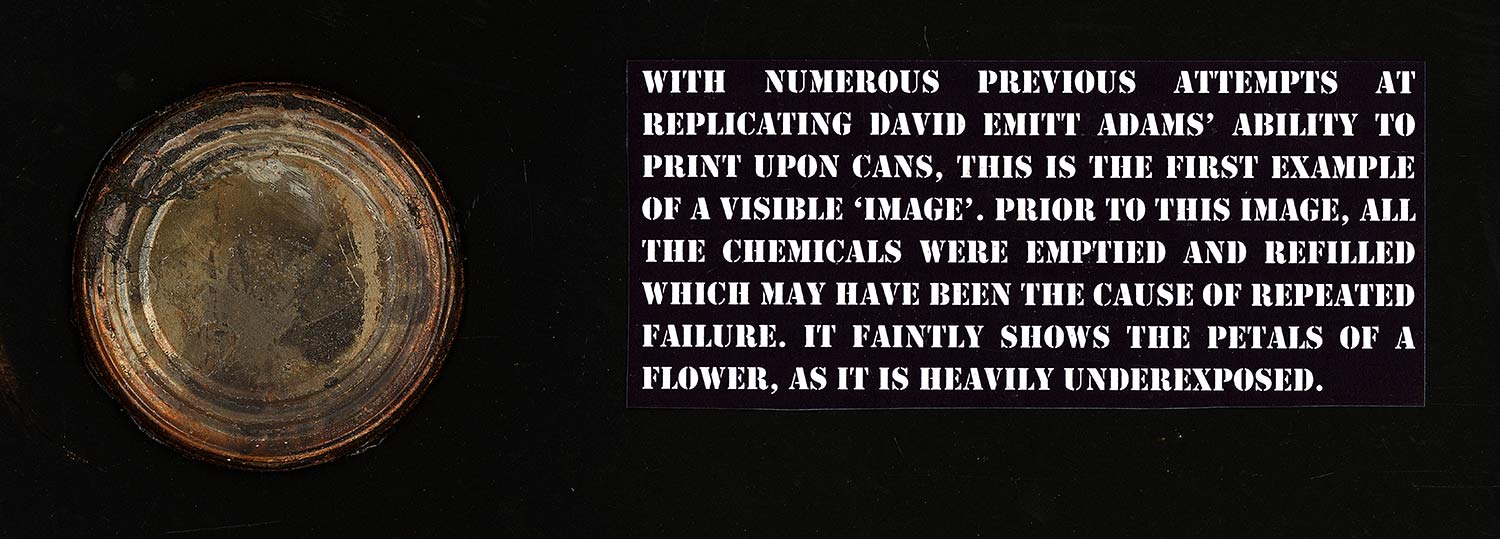
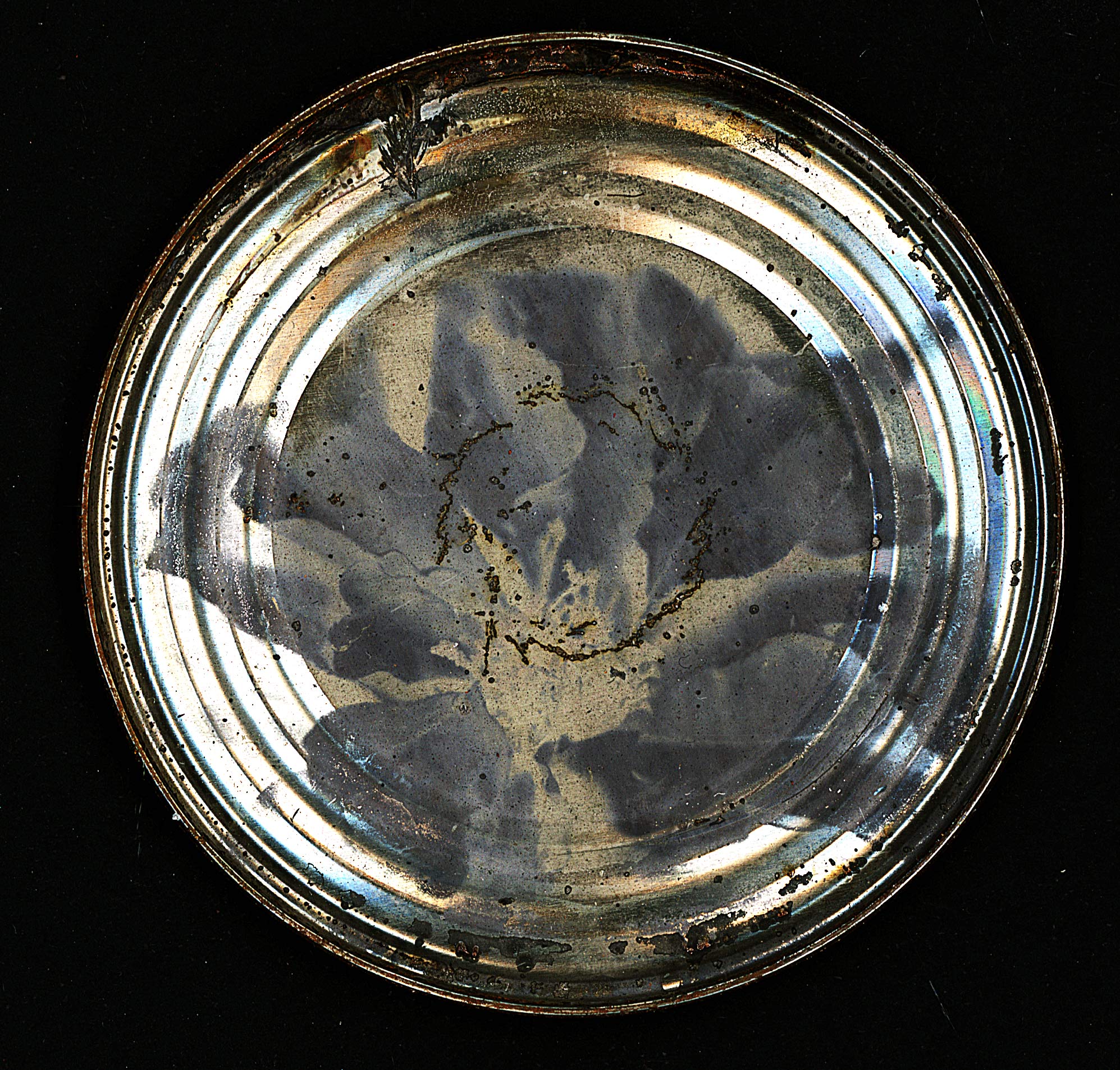
With numerous previous attempts at replicating David Emitt Adams’ ability to print upon cans, this is the first example of a visible ‘image’. Prior to this image, all the chemicals were emptied and refilled which may have been the cause of repeated failure. It faintly shows the petals of a flower, as it is heavily underexposed.
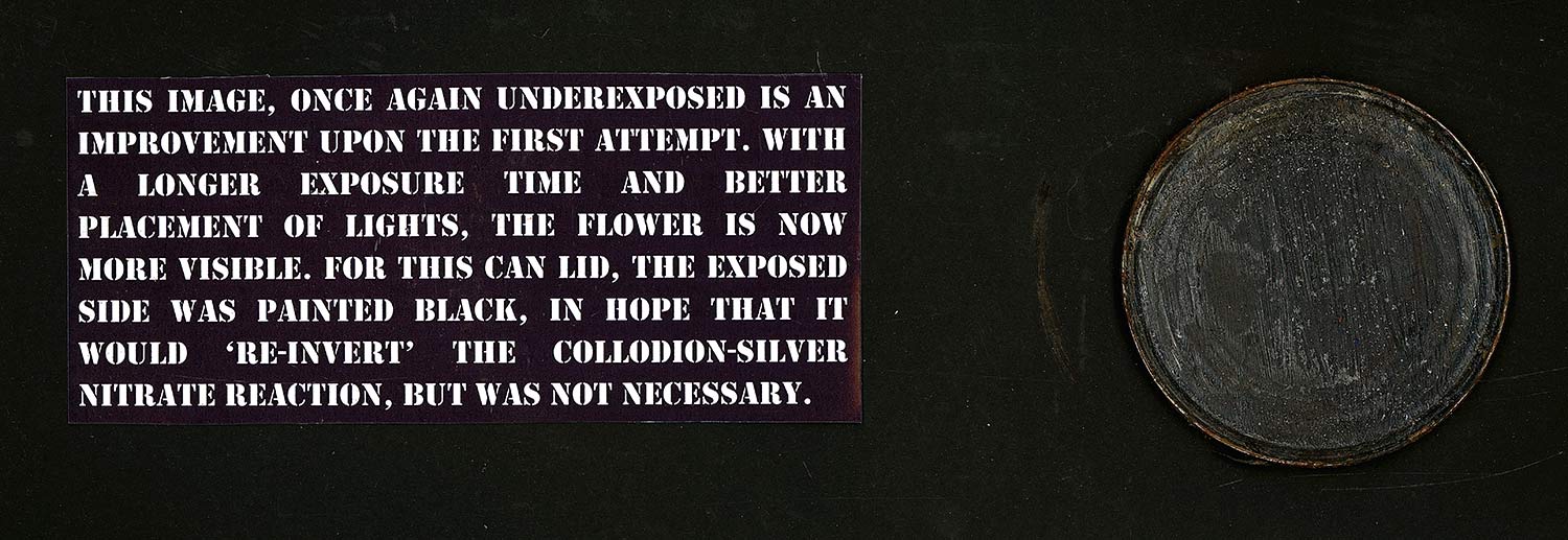
This image, once again underexposed is an improvement upon the first attempt. With a longer exposure time and better placement of lights, the flower is now more visible. For this can lid, the exposed side was painted black, in hope that it would re-invert the collodion-silver nitrate reaction, but was not necessary.
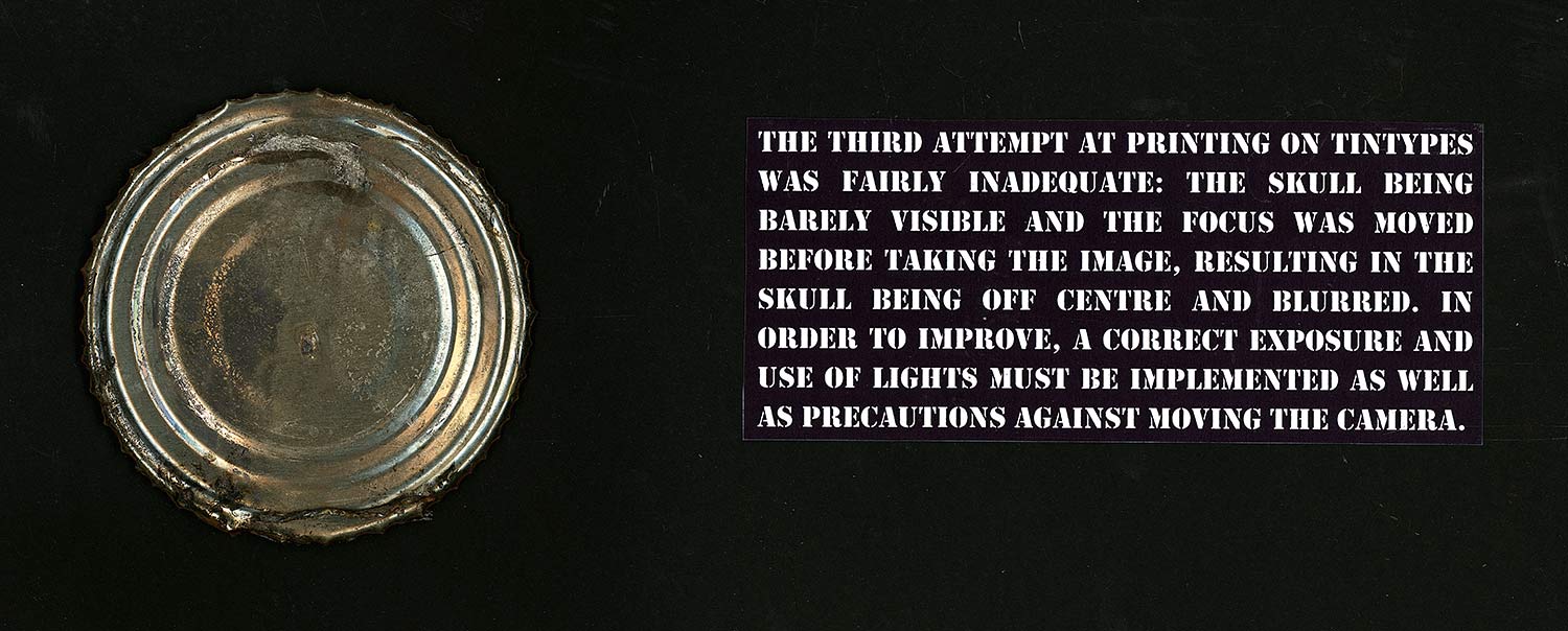
The third attempt at printing on Tintypes was fairly inadequate: the skull being barely visible and the focus was moved before taking the image, resulting in the skull being off centre and blurred. In order to improve, a correct exposure and use of lights must be implemented as well as precautions against moving the camera.
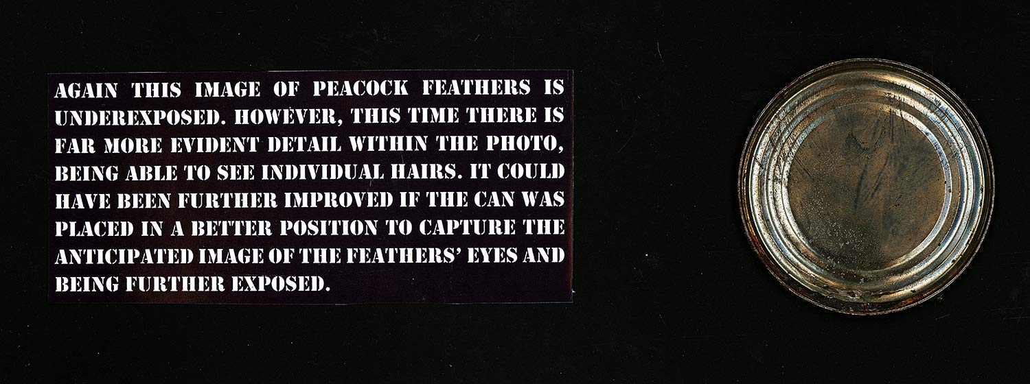
Again this image of peacock feathers is underexposed. However, this time there is far more evident detail within the photo, being able to see individual hairs. It could have been further improved if the can was placed in a better position to capture the anticipated image of the feathers’ eyes and being further exposed.
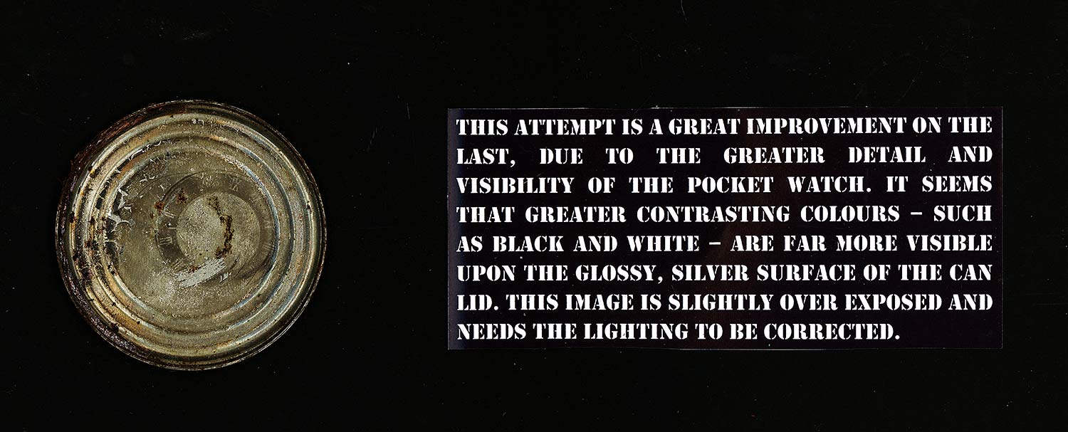
This attempt is a great improvement on the last, due to the greater detail and visibility of the pocket watch. It seems that greater contrasting colours – such as black and white – are far more visible upon the glossy, silver surface of the can lid. This image is slightly over exposed and needs the lighting to be corrected.

The 6th attempt at working with cans was a slight improvement upon exposure and lighting. However, it is obvious that there has been camera movement during the exposure. This is simple to counter, however what is more obvious is the lack of attention to composition of the image; centring and enlarging is necessary.
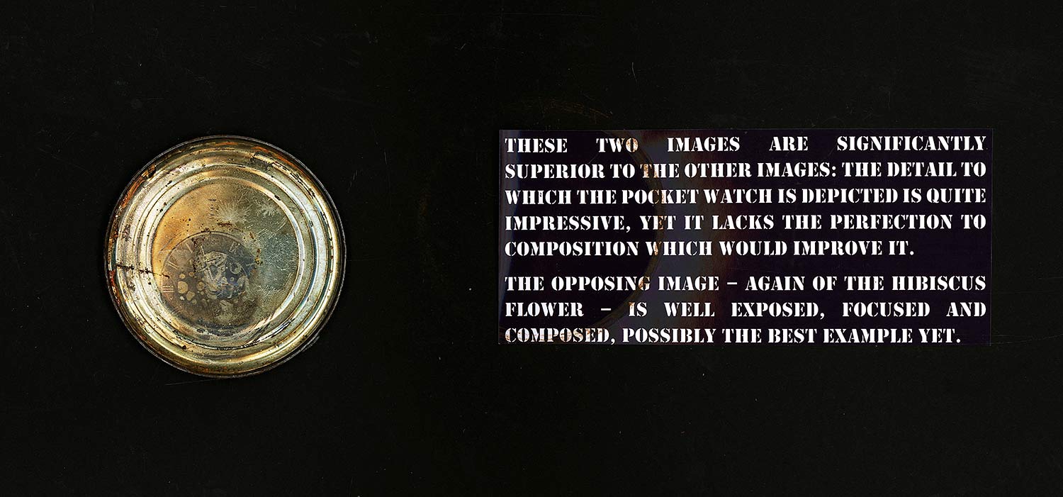
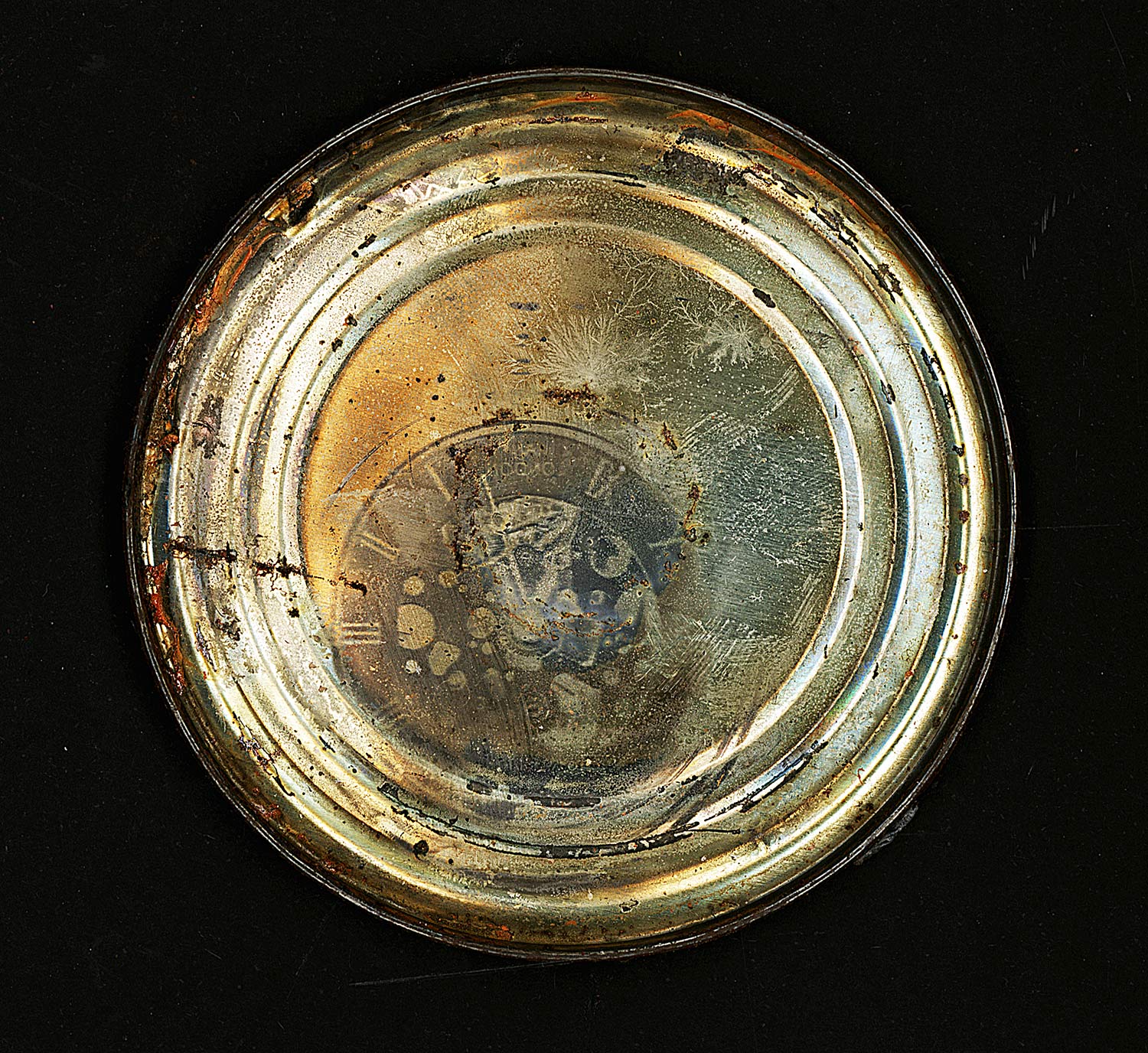

These two images are significantly superior to the other images: the detail to which the pocket watch is depicted is quite impressive, yet it lacks the perfection to composition which would improve it.
The image of the hibiscus flower is well exposed, focused and composed, possibly the best example yet.
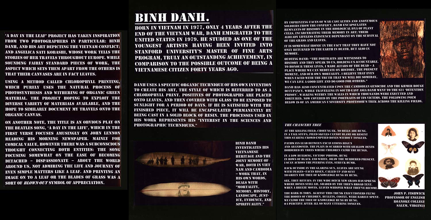
Binh Danh.
Born in Vietnam in 1977, only 4 years after the end of the Vietnam War, Danh emigrated to the United States IN 1979. He studied as one of the youngest artists having been invited into Stanford University’s Master of Fine Arts program, truly an outstanding achievement, in comparison to the possible outcome of being a Vietnamese citizen forty years ago.
Danh uses a specific organic technique of his own invention to create his art, the style of which is referred to as a chlorophyll print. Positives of photographs are placed onto leaves, and then covered with glass to be exposed to sunlight for a period of days. If he is satisfied with the finished piece, it will be encapsulated permanently by being cast in a solid block of resin. The processes used in his work represents his “interest in the sciences and photographic techniques.”
Binh Danh investigates his Vietnamese heritage and the joint memory of war, both in Viet Nam and Cambodia – work that, in his own words, deals with “mortality, memory, history, landscape, just-ice, evidence, and spirituality.”
By imprinting faces of war casualties and anonymous soldiers from the conflict, Danh encapsulates Remnants Of history in the biological DNA of Plant Cells, Incarcerating their memory in Art; their already lifeless existence dependant on the survival of the grass and leaves.
There is a harmony in the fact that they have not only returned to the earth in death, but also in memory.
Quoting Danh: “The portraits are witnesses to History and they speak to us, holding us accountable. To honour these Lives, I made altars of the dead – a Place where we can meditate on history, the present Moment, and Our own Mortality. I believe that even when faced with the truth that we will die someday, we can live a good life and do well for others.”
Danh has also concentrated upon the Cambodian Genocide and the Khmer Rouge occupancy. While travelling in South-East Asia Danh went to the S21 ‘detention prison’, walking within the walls in which thousands were executed and tortured, now covered by the portraits of its victims. The following poem below is of an American University Professor’s trek across the killing fields.
The Chancery Tree
At the killing field, Choeung Ek, no bells are rung. In a tall stupa, piled skulls cannot blame or resent this staring crowd-emptied bones without tongues.
Pathways lead between excavations begun and abandoned. The plain is scarred with shallow dents bordered by trees where children climb the rungs.
In a low building, victims’ photos, hung in rows of black and white, draw the murdered present. I scan across the peering eyes, struck dumb. Back outside in the glaring sun, leaves are stung with images—faces risen, called up and sent to green the tree of knowledge rung by rung.
See, they return: In the wide ditch new grass has sprung where bones still lie, shaded by the tree’s broad tent. When a breeze moves, leaves whisper what they’ve become.
The bark is torn. Against this trunk executioners flung the bodies of children. Bullets, costly, were rarely spent. We climb the tree of knowledge rung by rung. O I perceive after all so many uttering tongues.
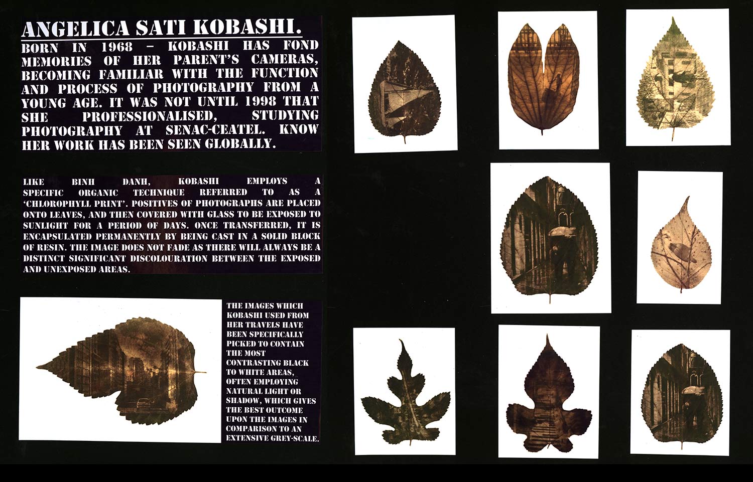
Angelica sati Kobashi.
Born in 1968 – Kobashi has fond memories of her parent’s cameras, becoming familiar with the function and process of photography from a young age. It was not until 1998 that she professionalised, studying photography at Senac-Ceatel. Know her work has been seen globally.
Like Binh Danh, Kobashi employs a specific organic technique referred to as a ‘chlorophyll print’. Positives of photographs are placed onto leaves, and then covered with glass to be exposed to sunlight for a period of days. Once transferred, it is encapsulated permanently by being cast in a solid block of resin. The image does not fade as there will always be a distinct significant discolouration between the exposed and unexposed areas.
The images which Kobashi used from her travels have been specifically picked to contain the most contrasting black to white areas, often employing natural light or shadow, which gives the best outcome upon the images in comparison to an extensive grey-scale.
Kobashi’s image of a traditional Japanese archway seems to be purposefully transferred on to the leaf with the ‘point’ aiming quite belligerently towards the Sky – perhaps in a biblically symbolic gesture. The image also possesses an apparent sense of Death: the dying leaf, the empty Veins and within the image itself appears to be a Smoke or dust cloud which instantly brings to mind – in Conjunction with the definite Japanese architectural features – the two infamous Atomic bombs which fell upon Japan in 1945. The composition seems to suggest imminent danger, as well as the characteristics of the leaf as if looking over her shoulder, running away.
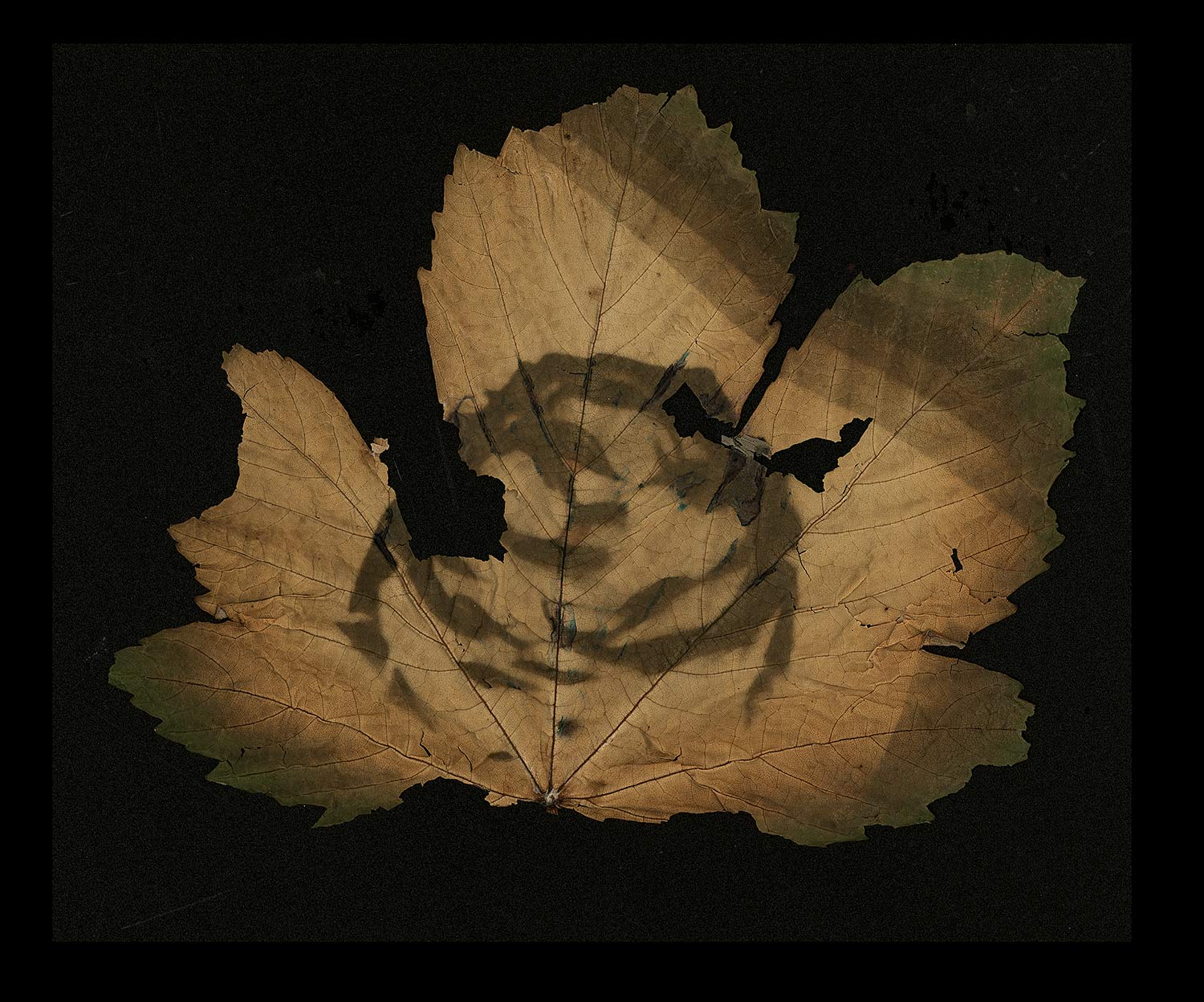
The combination of the veins and the webs has close links with cliche elements of life and death: The green of the leaf subsiding to a withered demise, then crested with an item symbolic of death and Haunting. What is more is the Construction and relationship between the texture of the leaf’s Veins and the patterns of the web. While the leaf is a very high standard example of a chlorophyll print, in my own project the idea of presenting own past adventures and travels or the people in my life appeals far more than arbitrary still life images, even if only having a special meaning to myself.
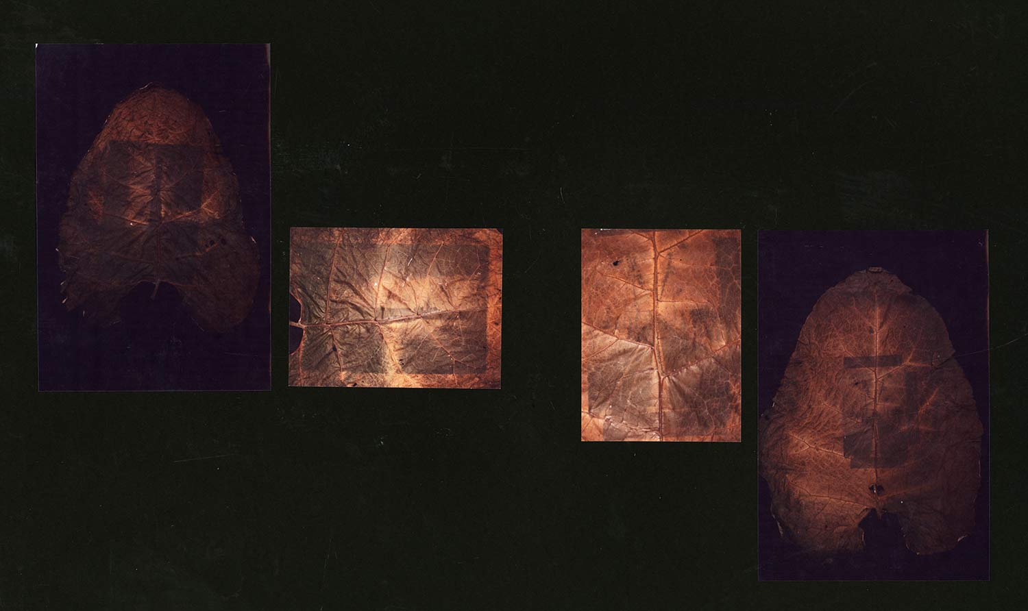
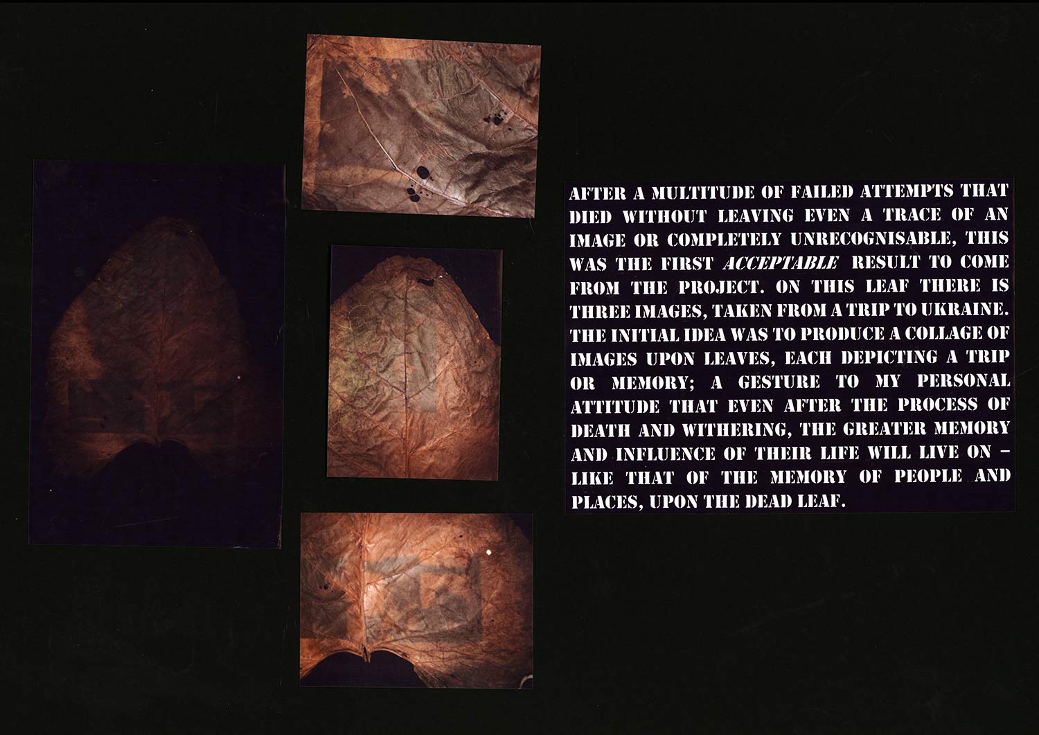
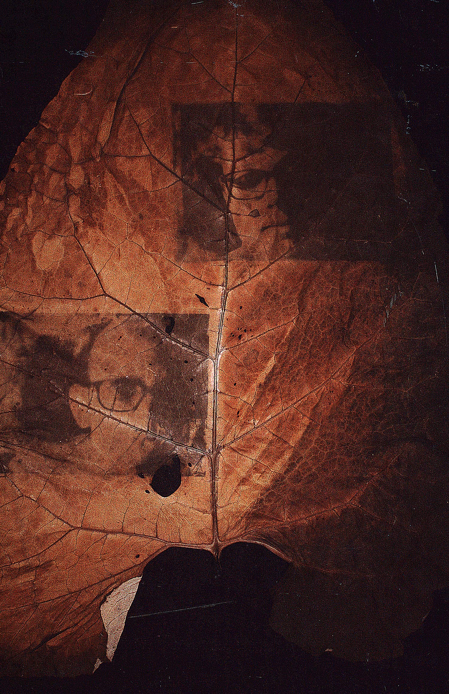
After a multitude of failed attempts that died without leaving even a trace of an image this was the first acceptable result to come from the project. On this leaf there are three images, taken from a trip to Ukraine. The initial idea was to produce a collage of images upon leaves, each depicting a trip or memory; a gesture to my personal belief that even after the process of death and withering, the memory and influence of a life will live on imprinted on the leaf.
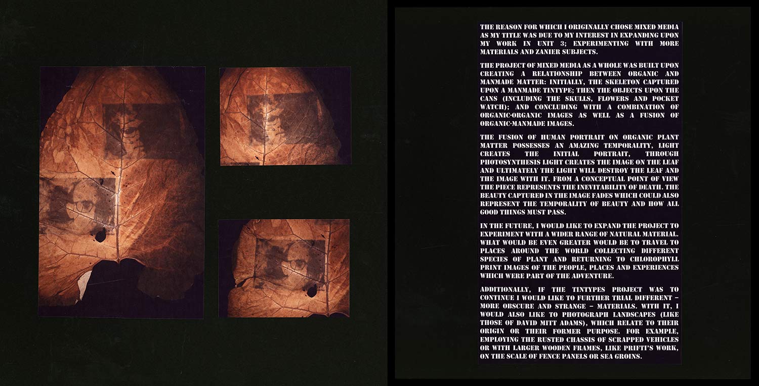
The reason for which I originally chose mixed media as my title was due to my interest in expanding upon my work in unit 3; experimenting with more materials and zanier subjects. The project of mixed media as a whole was built upon creating a relationship between organic and man-made matter: initially, the skeleton captured upon a man-made Tintype, then the objects upon the cans (including the skulls, flowers and pocket watch) and concluding with a combination of organic-organic images as well as a fusion of organic-man-made images.
The fusion of human portrait on organic plant matter possesses an amazing temporality, light creates the initial portrait, through photosynthesis light creates the image on the leaf and ultimately the light will destroy the leaf and the image with it. From a conceptual point of view the piece represents the inevitability of death. The beauty captured in the image fades which could also represent the temporality of beauty and how all good things must pass.
In the future, I would like to expand the project to experiment with a wider range of natural materials. What would be even greater would be to travel to places around the world collecting different species of plant and returning to chlorophyll print images of the people, places and experiences which were part of the adventure.
Additionally, if the Tintypes project was to continue I would like to further trial different – more obscure and strange materials. With it, I would also like to photograph landscapes (like those of David Mitt Adams) which relate to their origin or their former purpose. For example, employing the rusted chassis of scrapped vehicles or with larger wooden frames, like Prifti’s work, on the scale of fence panels or sea groins.
