It is always important to state this – we can never know the full context for the shoot.
We do not know the mood of the model, we do not know the brief, maybe the photographer received some bad news before the shoot and was off their game, maybe the stylist was told she had to produce the shoot a certain way or she would lose her job.
We just don’t know.
I feel it’s important to state this because I’d hate for someone to take this critique in the wrong way, I want my blog to be a part of my own learning journey, it’s never about the creator being bad or good.
I saw this shoot and something felt off, but i just couldn’t see what was wrong.
My intuition was telling me something didn’t sit right, so I wanted to do an in depth breakdown of the images to educate myself as much as anything.
It’s a learning journey, so come with me!
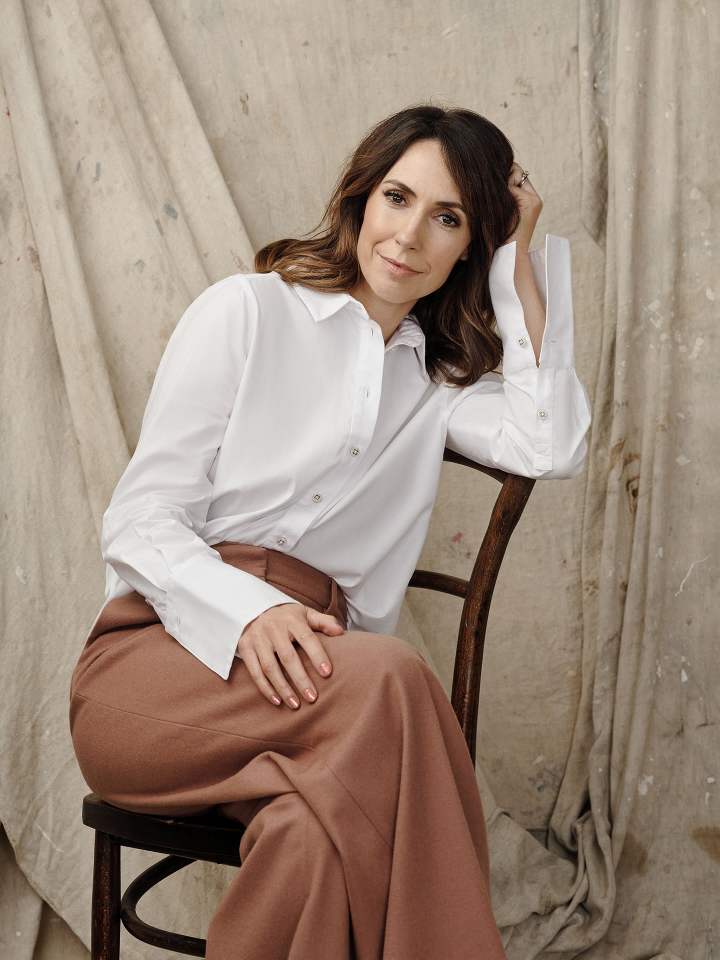
The model has been made up, is in beautiful clothes etc. so we can assume stylistically that the image is supposed to be elegant, chic and sophisticated. That being understood there are certain assumptions that we can make about the intention behind the shoot, and one of those would be to flatter the model.
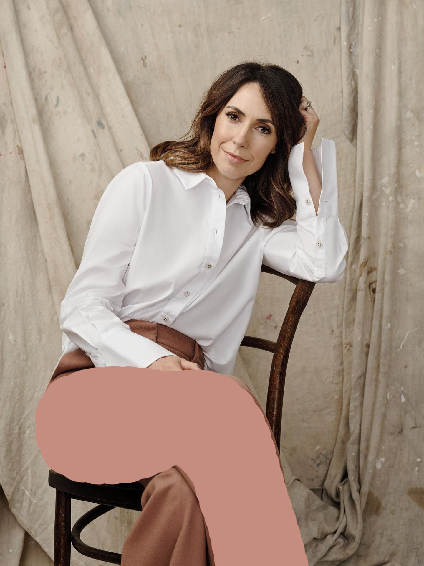
One simple rule in posing is the closer something is to the camera, the larger it appears.
I don’t like this leg positioning for this reason, it makes the leg look too big relative to the rest of the model and becomes too dominant in the frame.
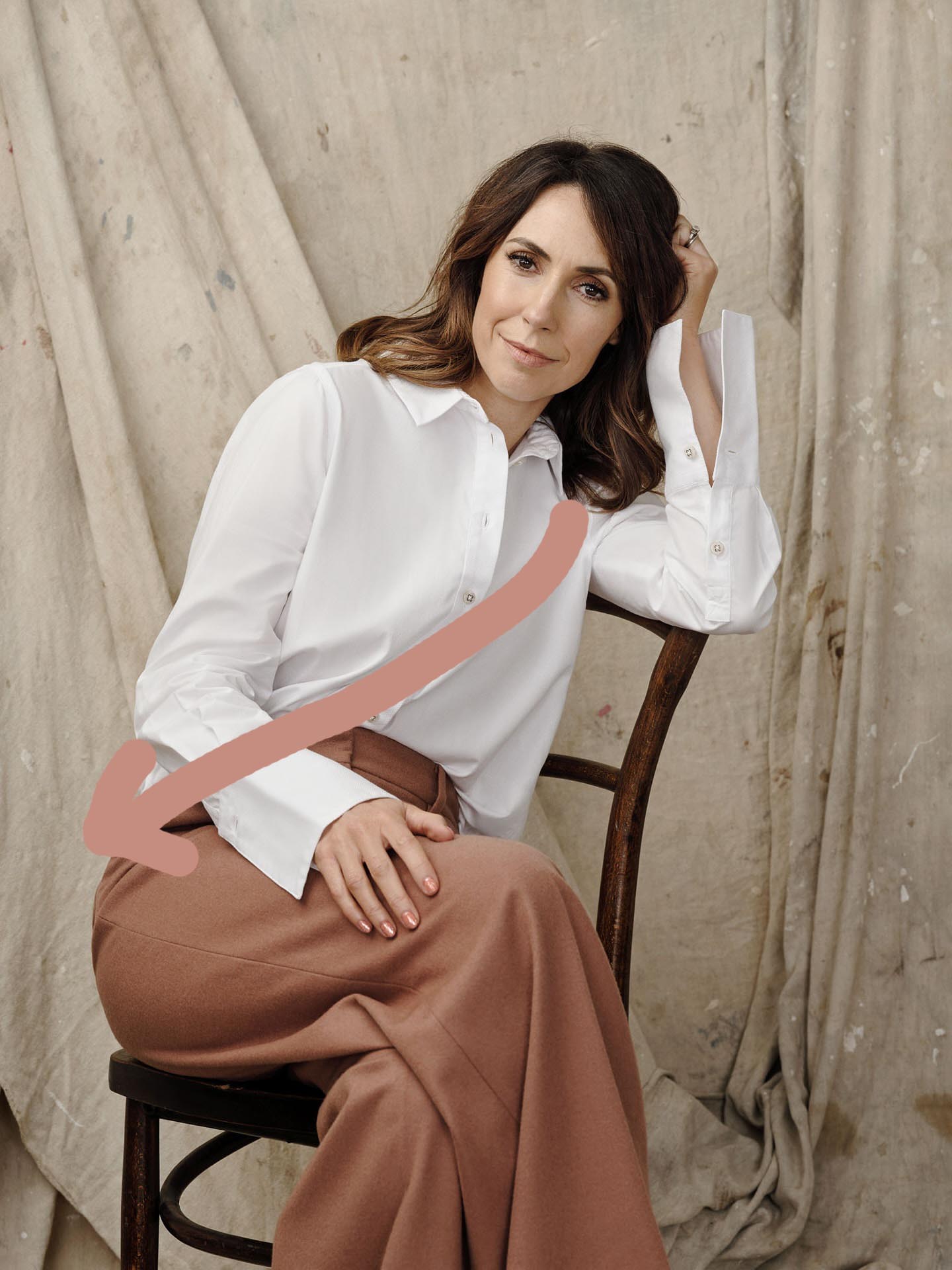
Her body position has created a crease in the shirt.
The crease creates angular momentum in the image and draws the eye down towards the bottom left hand corner.
There is nothing down there that then sends the eye back up the picture.
Your eyes are naturally drawn to the brightest area of a picture.
If we whack up the contrast we can see that the brightest part is her left shoulder.
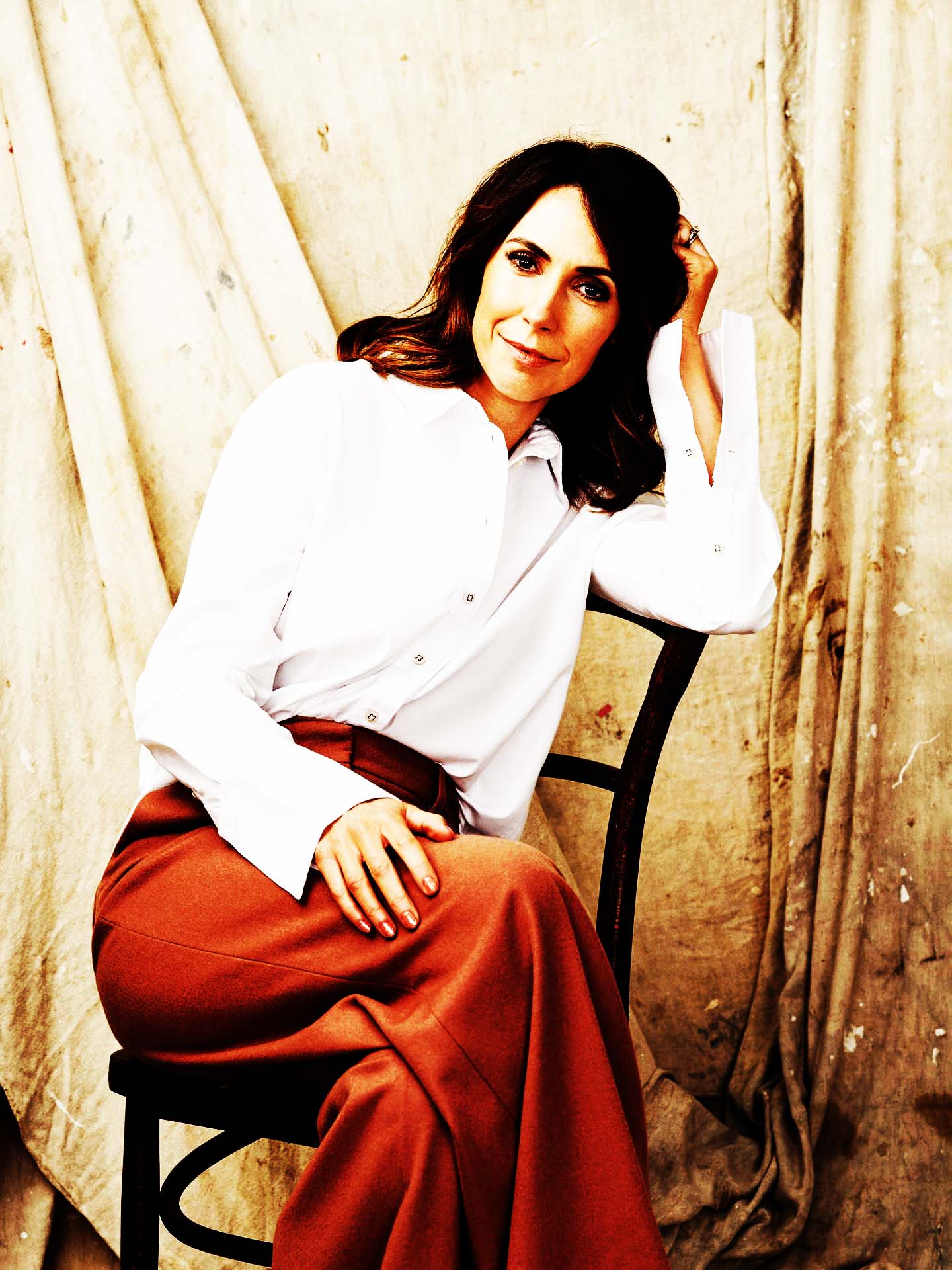
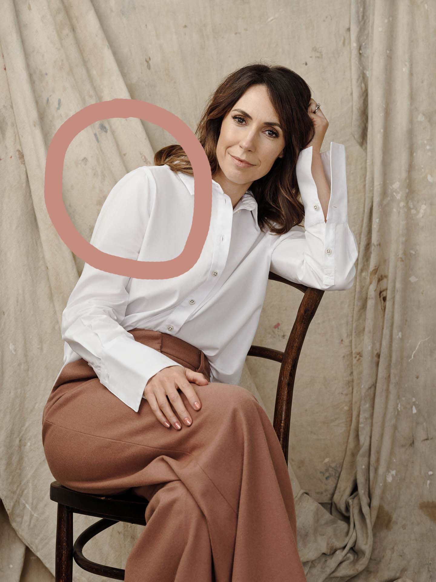
If we add all these elements together we can see how the body position, the direction of the light and brightness of the image is keeping our eye locked in this zone.
The image is heavily weighted to the left, and given we naturally read left to right in the West, it creates an unease, the focal point should be the face, but all the elements of the picture are pulling your eyes out of the left hand side of the frame.
Lets also break down her body language, she’s leaning away, it immediately feels defensive, like she’s unsure with the photographer, uncomfortable in the situation and there that translates to the viewer.
This is so easily overlooked in photography. Being calm and comfortable and putting people at ease will yield infinitely better pictures than better equipment.

I confess I had a hard time finding a really good chair shot.
I think the nature of the furniture naturally closes off the body and it’s a really hard picture to pull off. Even the so called ‘masters’ have examples in their catalogues of work that just don’t work for the same reasons mentioned above.
I looked for some good examples and found these:
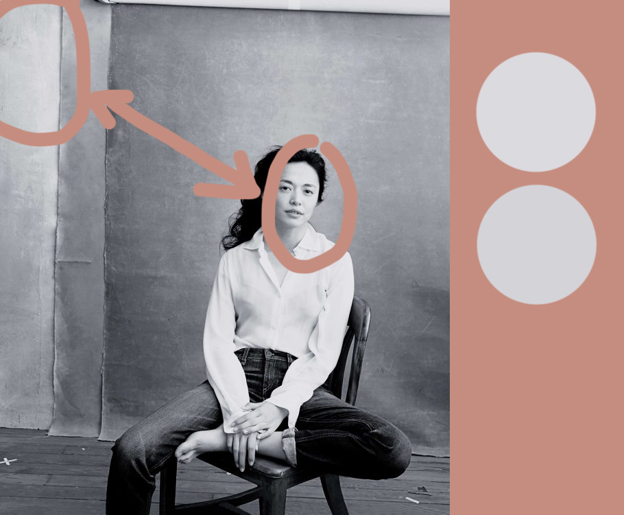
The first is by Annie Liebowitz.
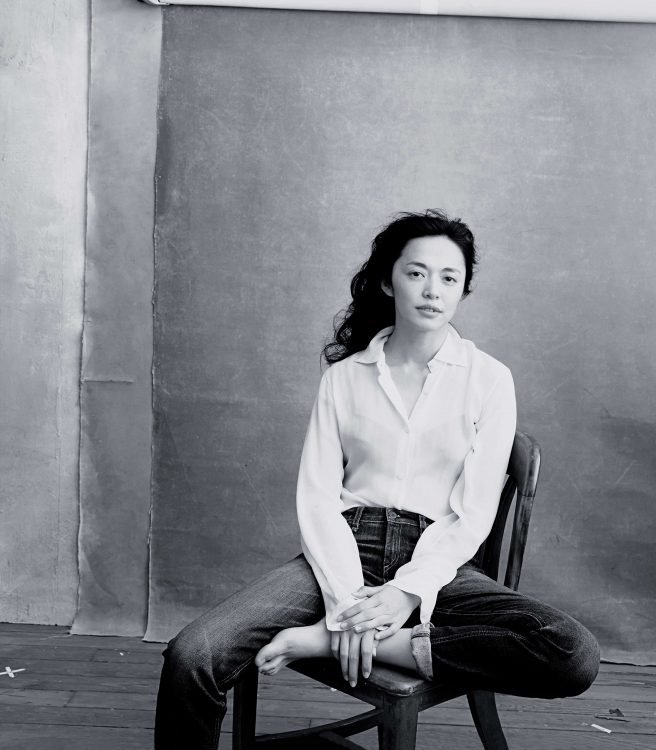
She’s pulled this off by creating a natural tilt in the image, that helps lean the eye back to the right hand side of the frame.
The draped canvas behind the model also makes a hard edge which creates a frame within a frame and gives the viewers eye something to bounce off of, a container for the picture.
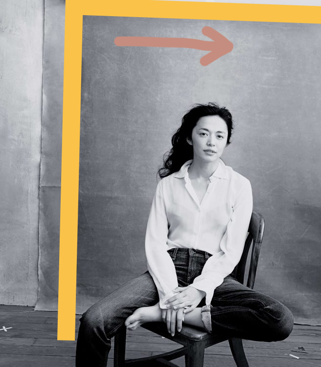
The bright part of the top left of the picture draws the eye in that direction, but you’ll notice that the tone of gray in the top left is nearly the exact same as the tone on her face, which creates a tension between the two and aids the eyes ability to move around the picture.
Lastly, the darkest part of the image is her knee which is kept in the frame and it is directly opposite the brightest part of the image in the top left. All these elements combine to create a wonderfully dynamic portrait out of a static subject.
This portrait of Kate Upton again exemplifies just how hard the chair shot is to get right.
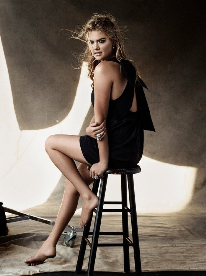
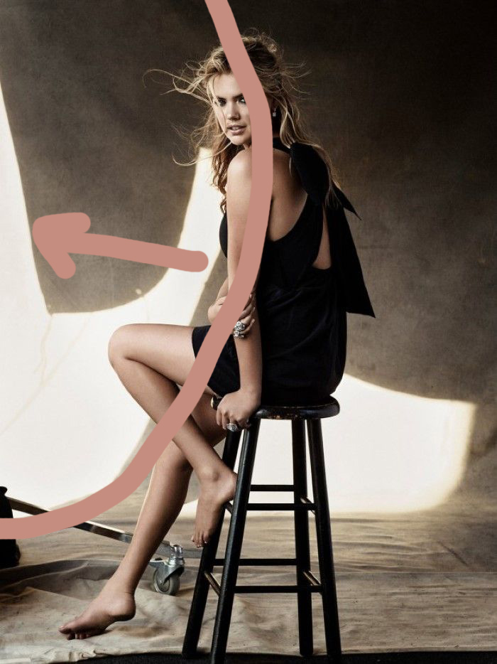
Her body position closes the viewer off to her front so it immediately feels guarded.
The brightest part fo the image is the laft, and the highlights are in deep contrast to the rest of the picture so everything pulls the viewers eye to the left of the image with nothing to reboud off of, so this doesn’t work for me either. The eye is drawn out of the frame and has no incentive to come back in.
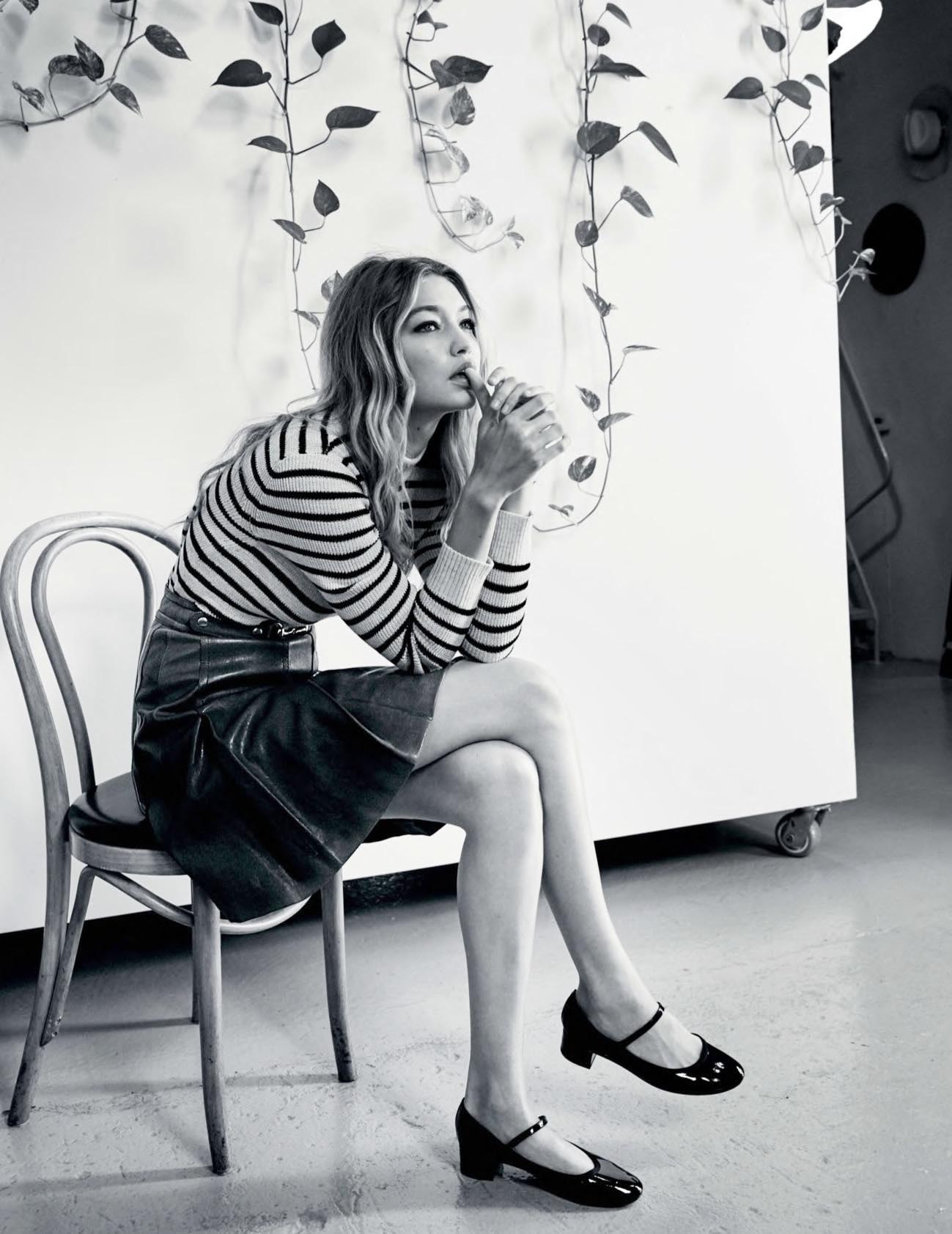
This is a really good example.
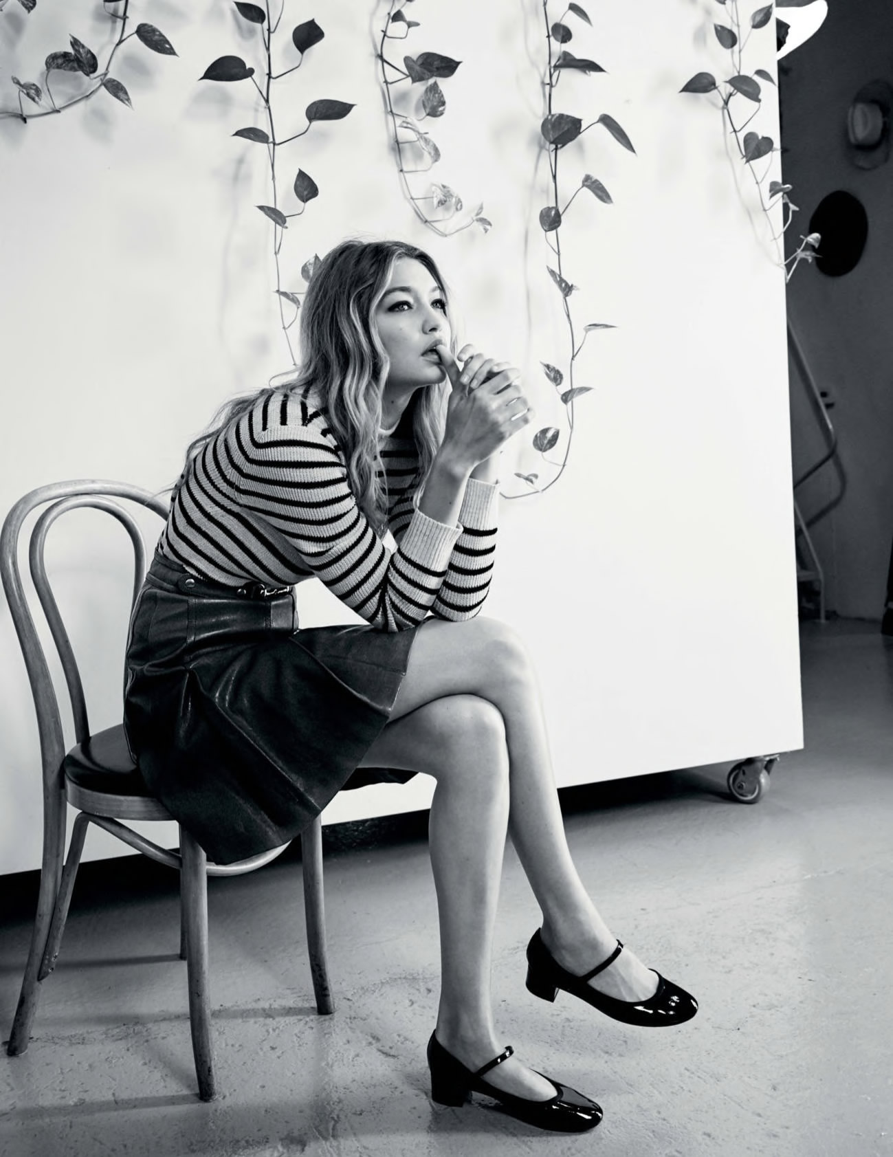
Her body position and direction of her face are both pointing to the brightest part of the image on the right hand side.
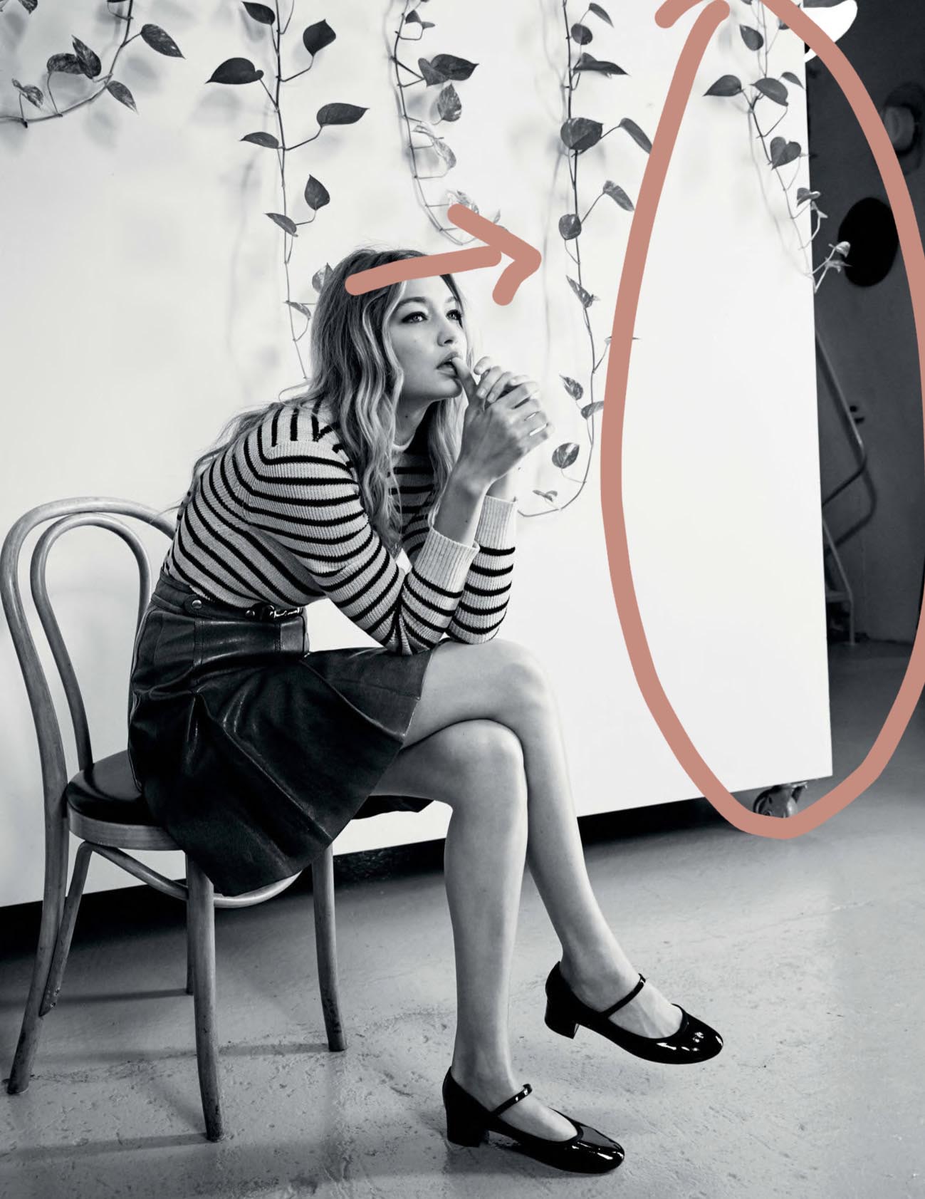
The arc of her back also creates angular momentum drawing the eye towards the face.
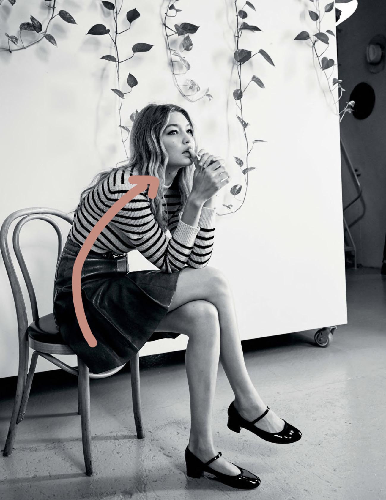
In the image below i’ve increased the exposure of the bottom left of the image to balance it out, i felt the bottom left was like a black hole pulling your eye in.
With the exposure increased, balance is restored and there is less tension in the image and your eyes can rest calmly on her face.
Next up.
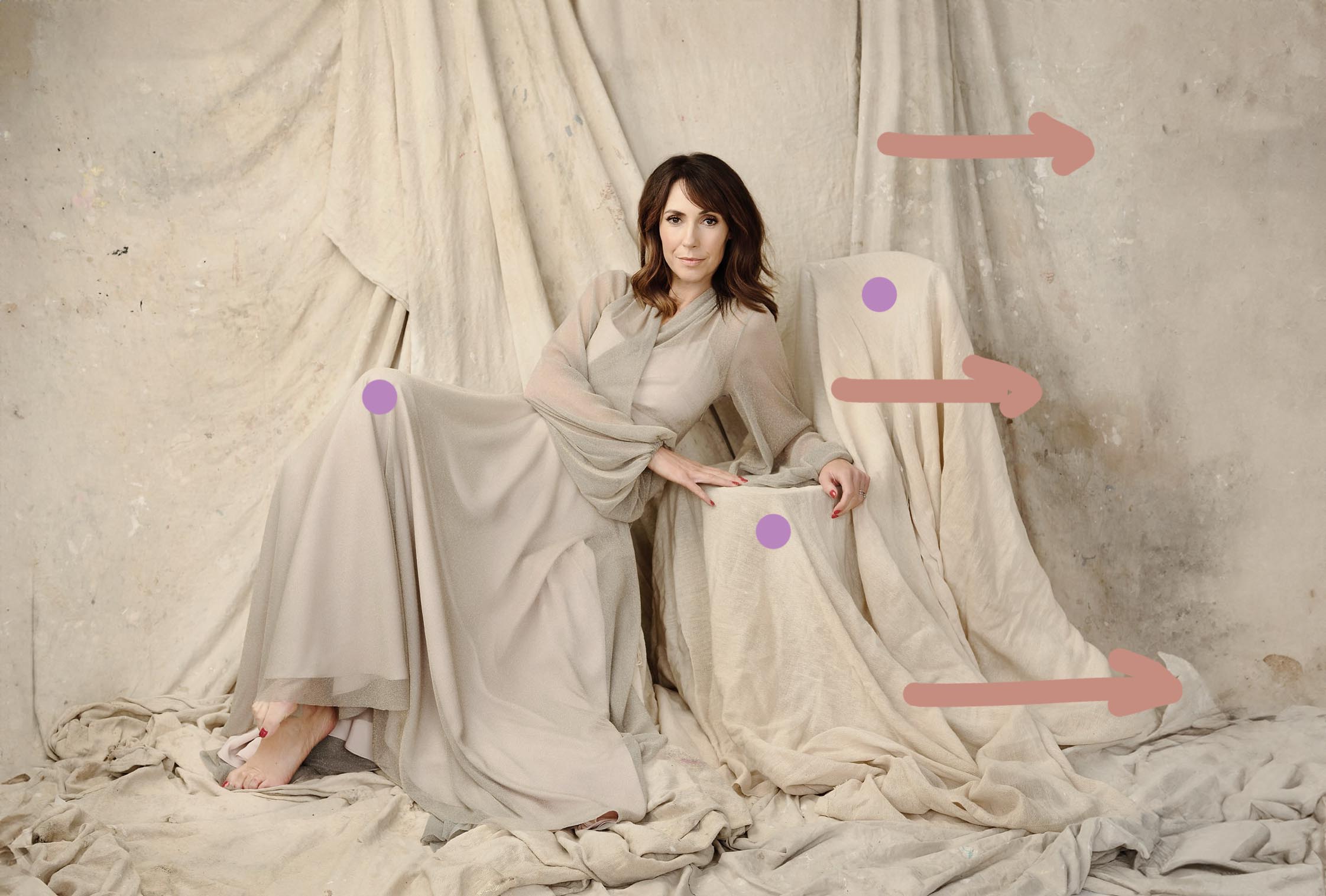
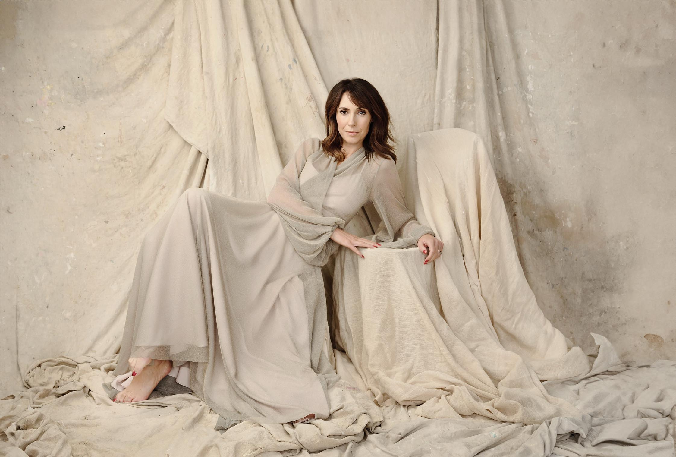
This is, to be blunt, bad.
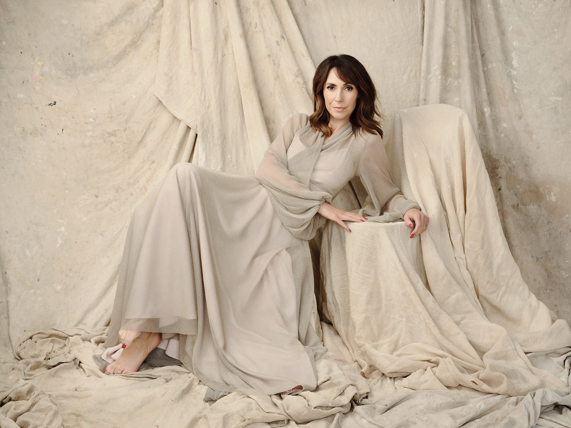
First off, composition, lets place a simple thirds grid on top and see what we can see.
It’s off.
Even in the most basic sense the picture is composed badly.
There is no clear and obvious direction to the photograph, her dress matches the background so there’s no separation and conceptually there is absolutely no reason for her to be there, there is no given context why this woman is lying down on a box.
Stylistically theres also no contrast, draped outfit on a draped background, it looks wrong and she gets lost.
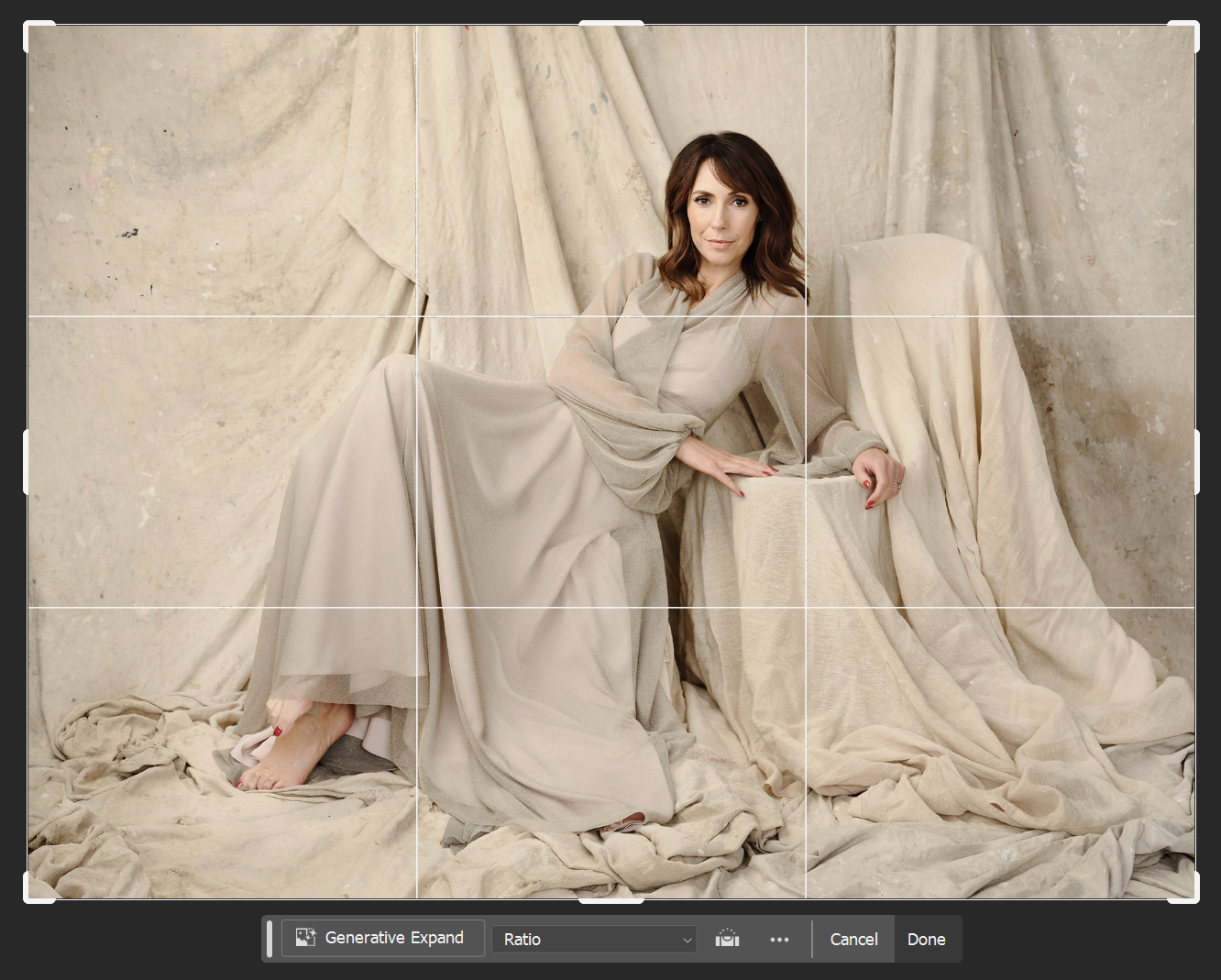
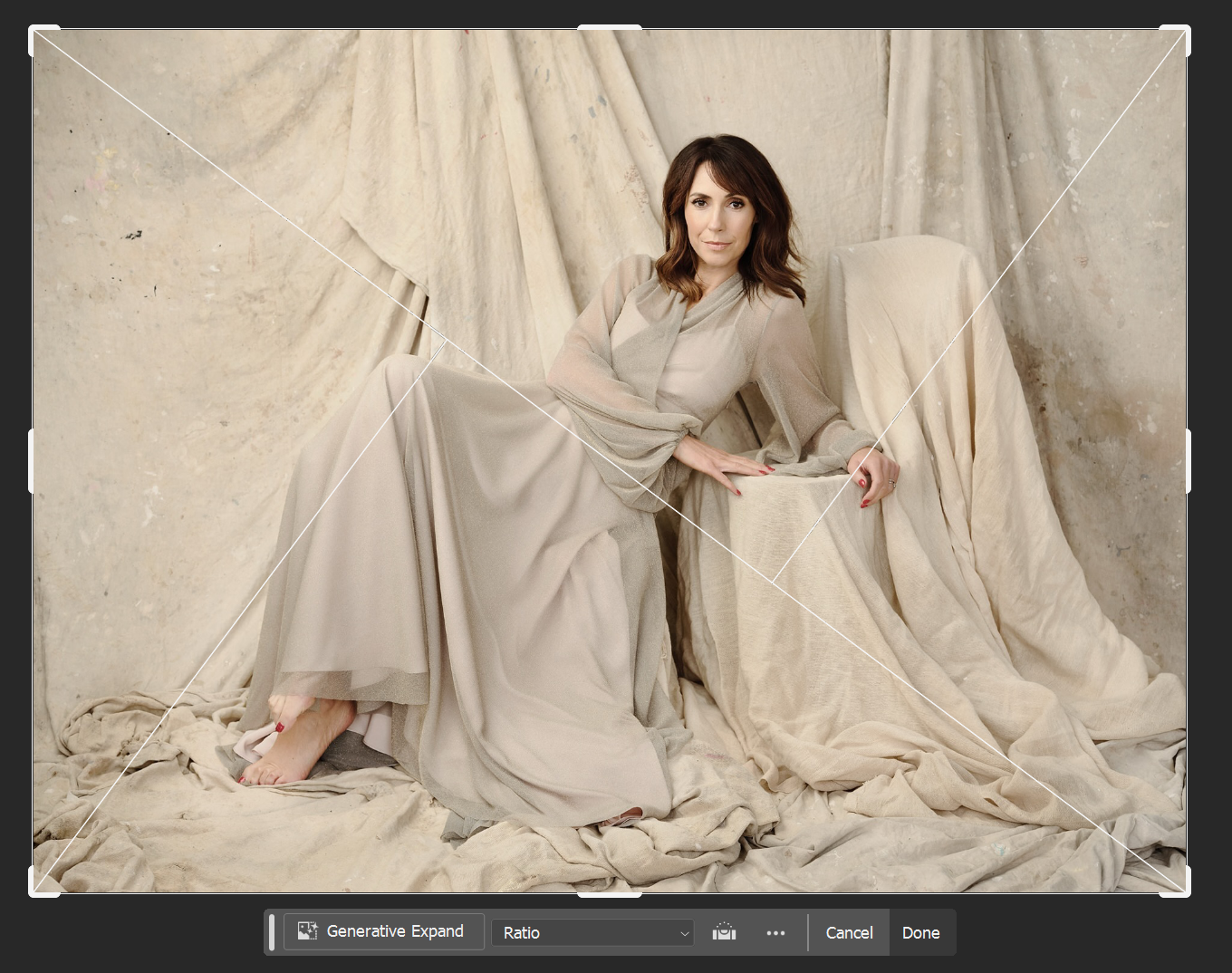
If we lay the golden triangle on top this could reveal what the photographer was going for, but it still hasn’t worked.
The pillars increase in size on the right which could be seen as an attempt to draw the eye in that direction, but her elbow creates a ‘stop’ point in the image, it creates a sort of gravity there. the leg is not extended properly and it looks uncomfortable.
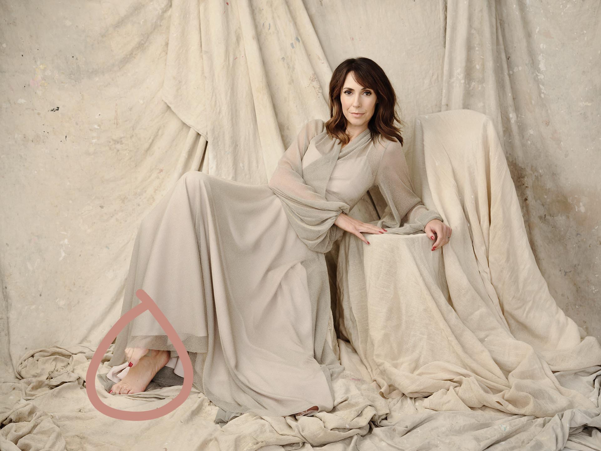
As a fashion photographer you don’t really get the same leniency when it comes to missing details, the entire shoot is under your control, so you have to notice everything.
Unless of course your concept is spontaneity, but that’s not the vibe I’m getting from this series.
So, you have to look at everything your model is doing, look at her feet, the tension there doesn’t lend itself to the overall image of elegance that’s trying to be created. it also tells me she’s unsure and uncomfortable.
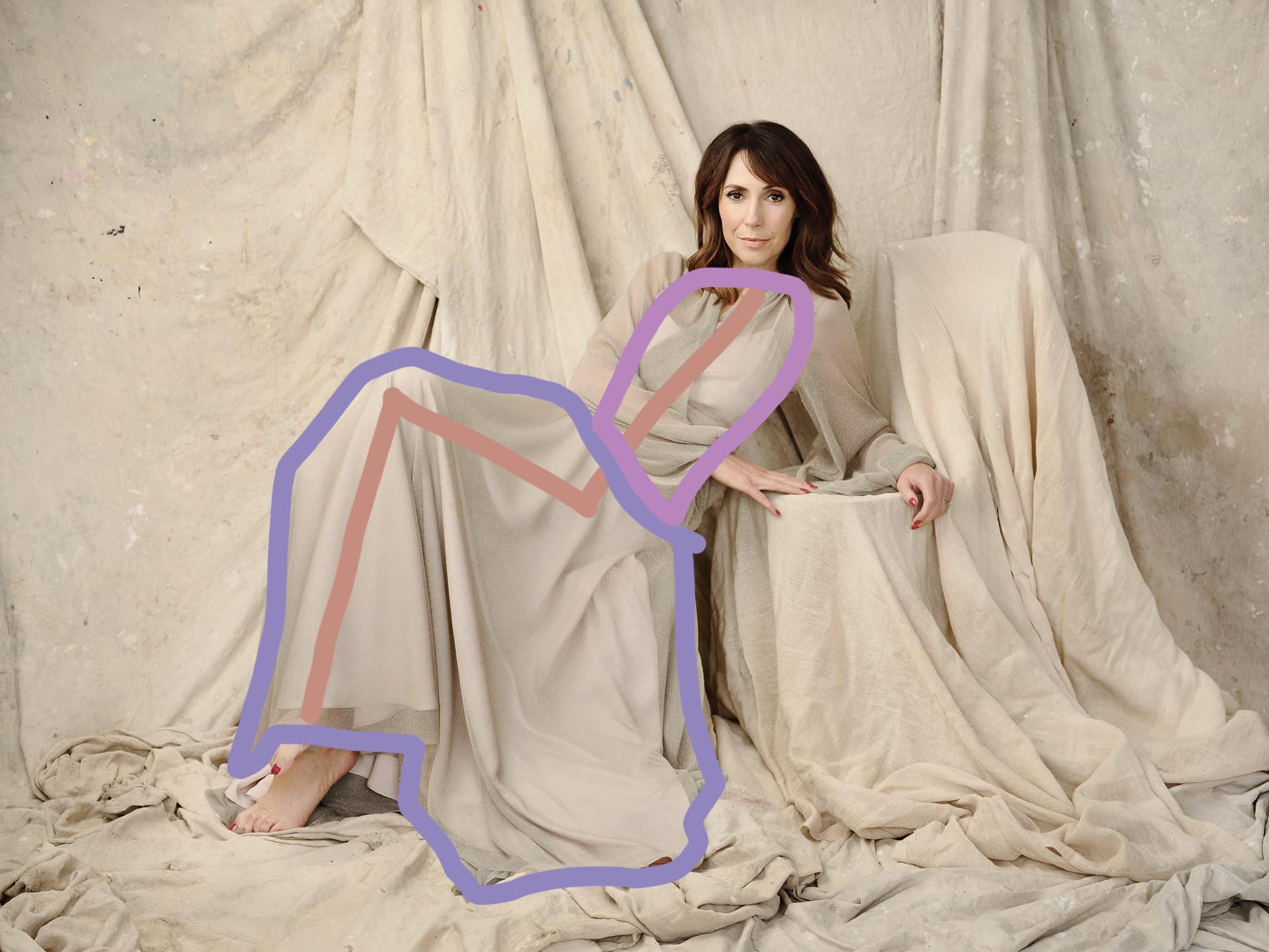
The styling is at fault as well, theres no way she should be in that dress on that background, it just blends into one.
She has a slim figure, but the shapes do nothing for her, its not elegant, it just turns into a big blob of material.
Look at the shape of her dress as well relative to the plinths next to her, i think the image feels entirely confusing because her legs take on the same form as the plinths, so its actually quite hard to work out what’s going on.
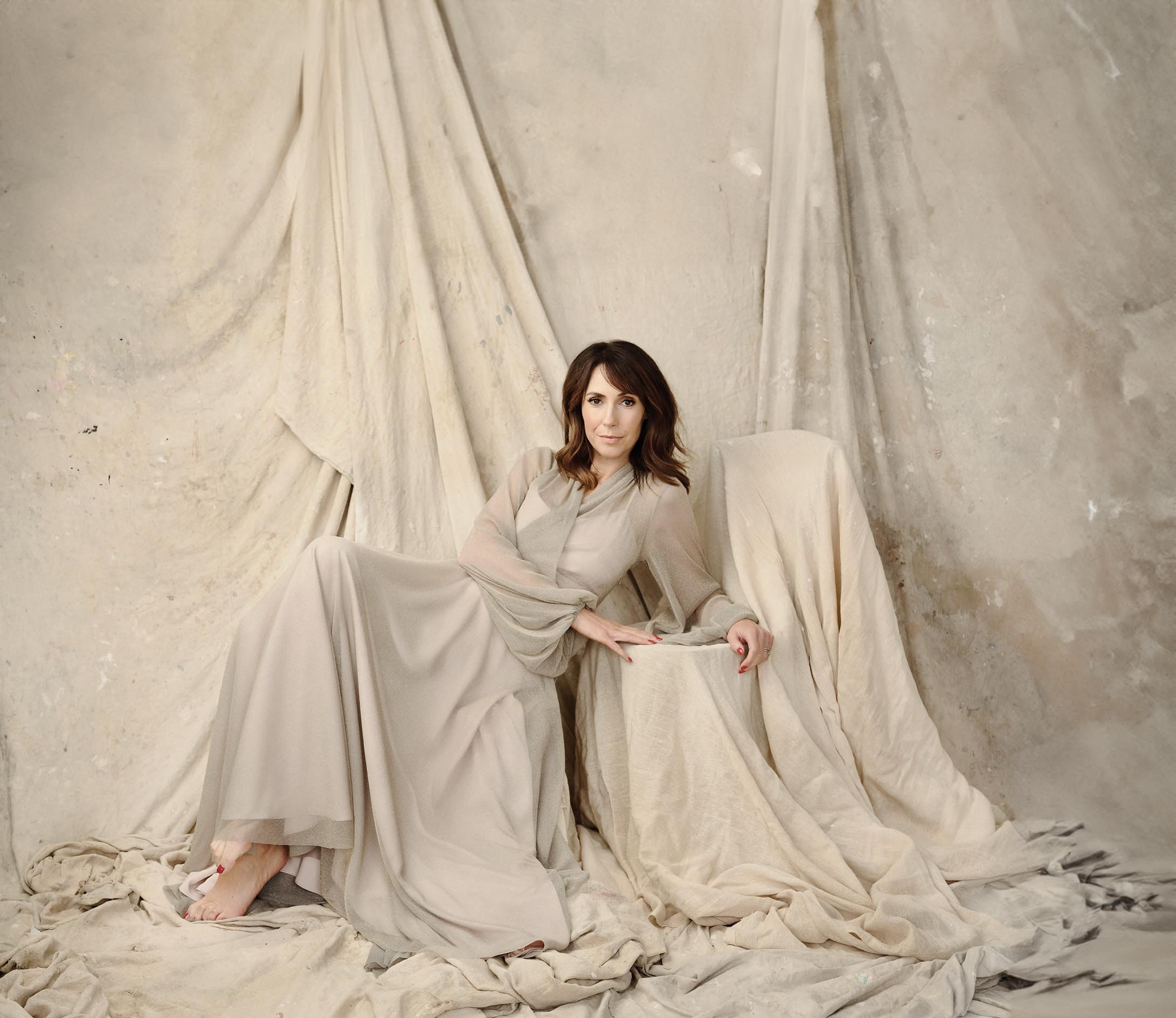
A slight tweak on the composition.
Photoshops background generator is so cool, it means i can make this example in seconds.
Look at the difference it makes to the feel of the image when its not so cramped. her direction of leaning suddenly has balance, she no longer feels squashed in the frame and where you can see all the material now touching the floor, it anchors her to the ground and allows the draping element of the background to do what its intended and that is to create linear direction in the frame. There’s now contrast, her body shape moves the image from left to right and the material top to bottom. one simple tweak and its already much better.
I must say i still don’t think the picture works even with that change, but i do think it’s better.
I made this version too, which i think may be marginally better again.
It further allows the drapes to draw you down into the subject and helps to soften the picture.
Picture three. Why is her bra strap showing?
Details like that immediately shatter the illusion of cool, sophisticated elegance.
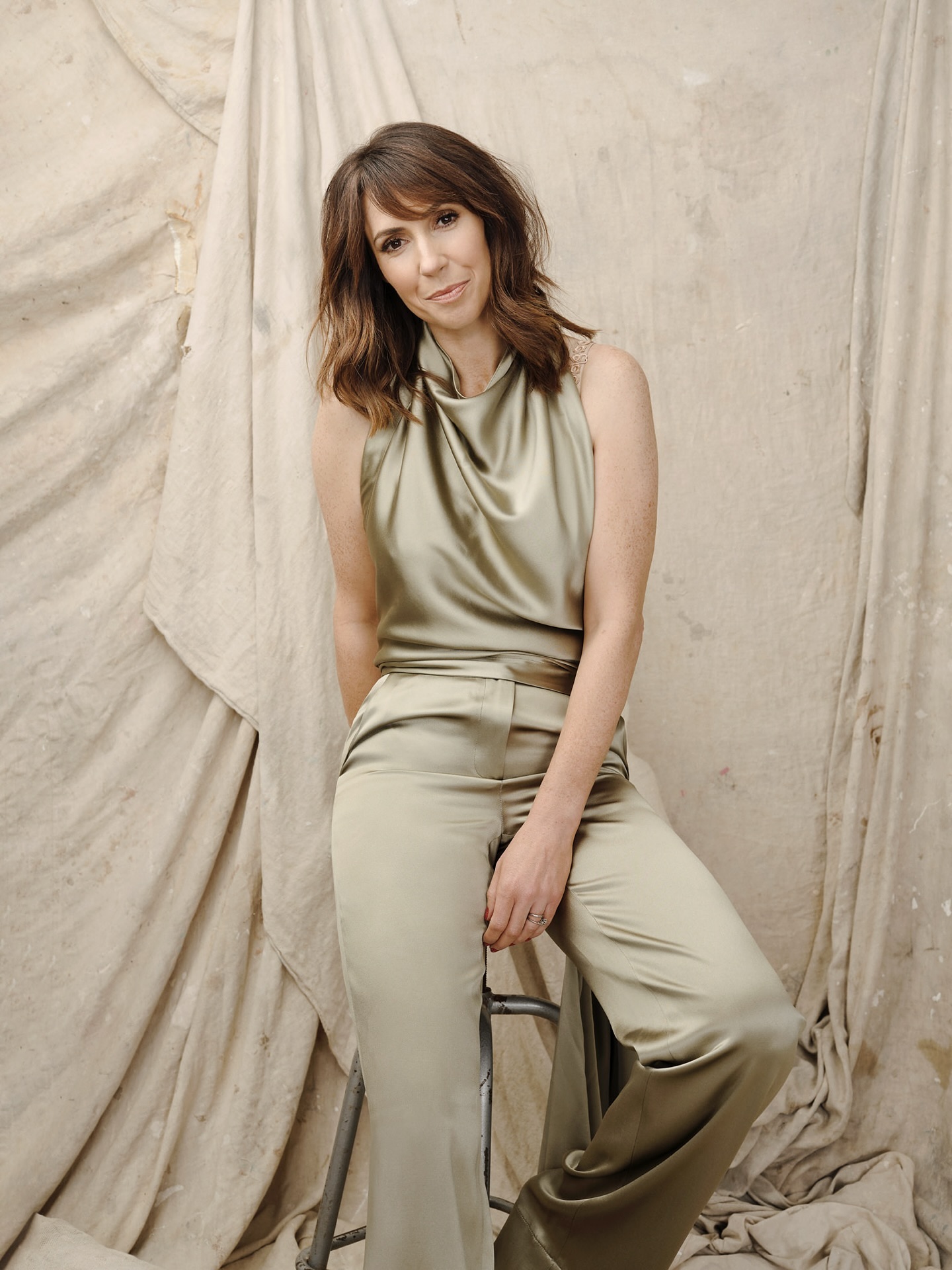
Overall this isn’t so bad, but I do still think the body language is guarded, no facial expression either, she still looks like she’s not enjoying herself.
A bit more headroom I think improves it too. it visually gives her the space it seems she needs, it doesn’t box her in which makes her body language seem ever more exaggerated.
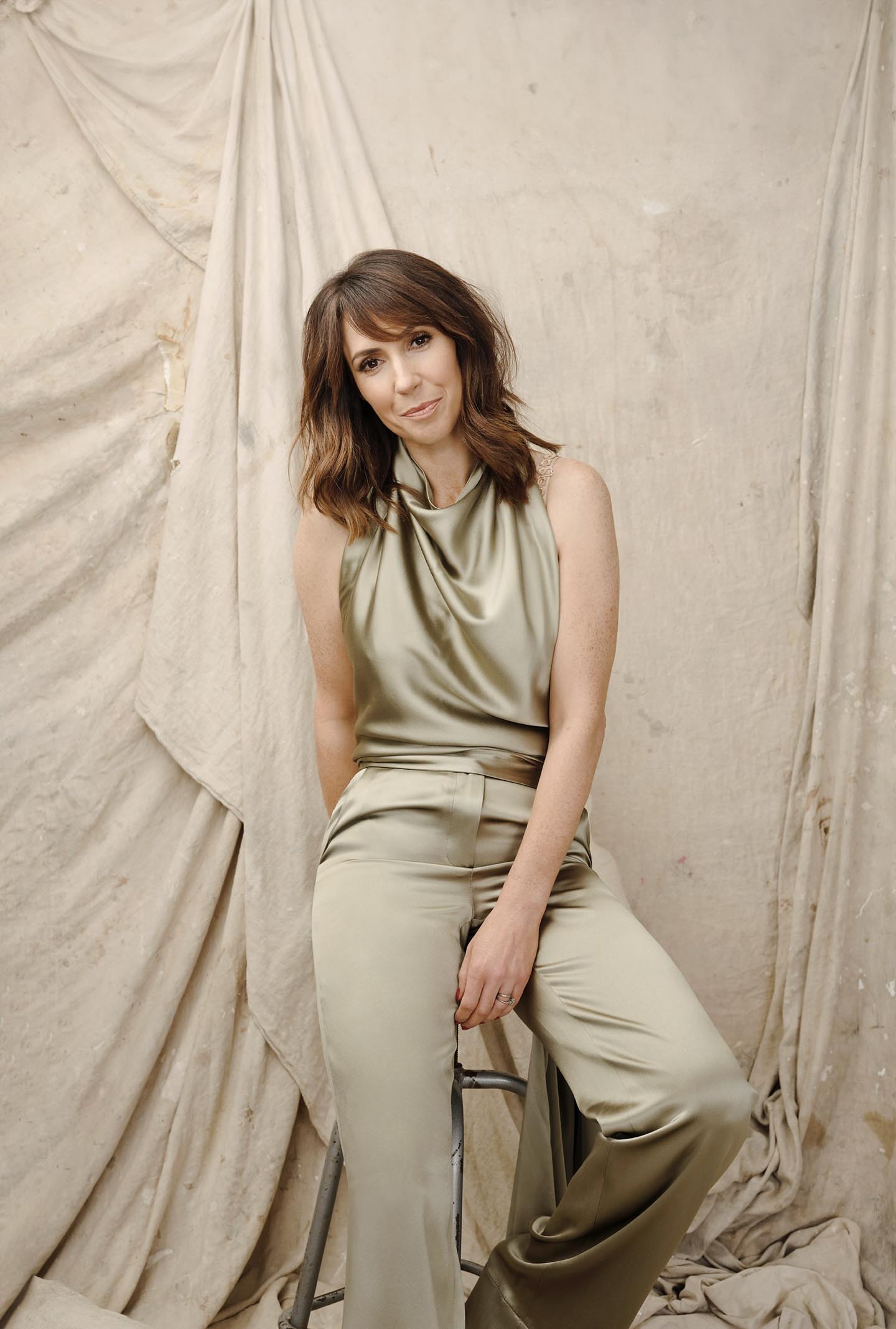
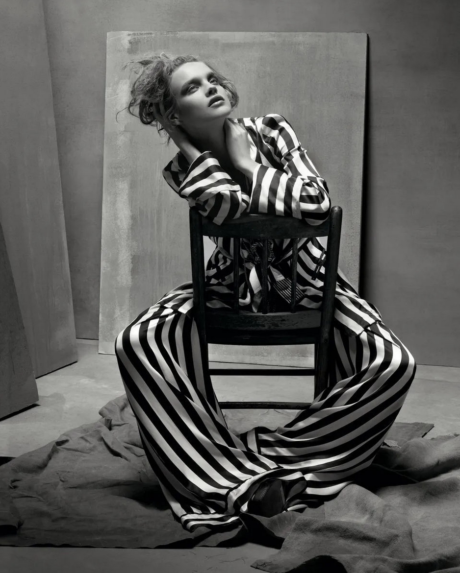
I don’t want to be harsh, but I have no idea what is going on here.
I’m hit with the expression ‘there is nothing so sharp as a fuzzy concept’.
I don’t get what she’s doing in this context.
The background, the pose, the outfit, the lack of expression. What is it supposed to add up to?
Throw in the straight leg of a stool from her crotch and you’ve got a really odd final image. Is it supposed to be homage to David Bowie? I don’t know.
These trousers are fun…there is no fun in this picture.
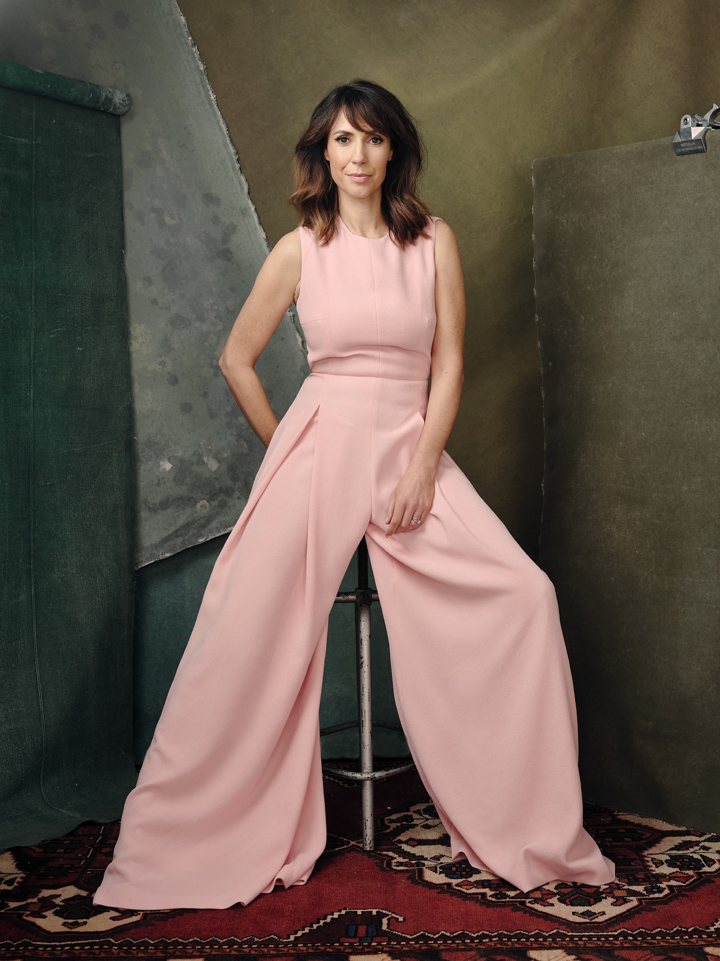
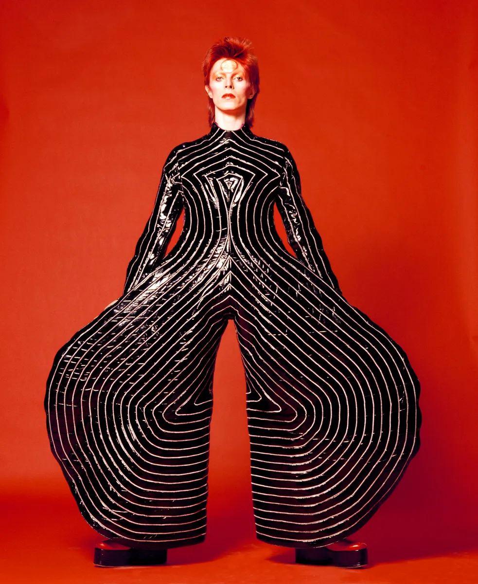
I’m at a loss.
It looks like someone has spent an afternoon looking through old Vogue magazines, seen the works of people like Steven Meisel and said ‘I can do that’, with very little thought beyond the aesthetic.
Portraits need a purpose, there has to be a reason for the person to be doing the thing they’re doing, otherwise it falls flat.
You know in films where characters say out loud things that everyone in the room already knows? It feels like that, almost lazy. That there was no thought beyond the styling and the result is something with no soul.
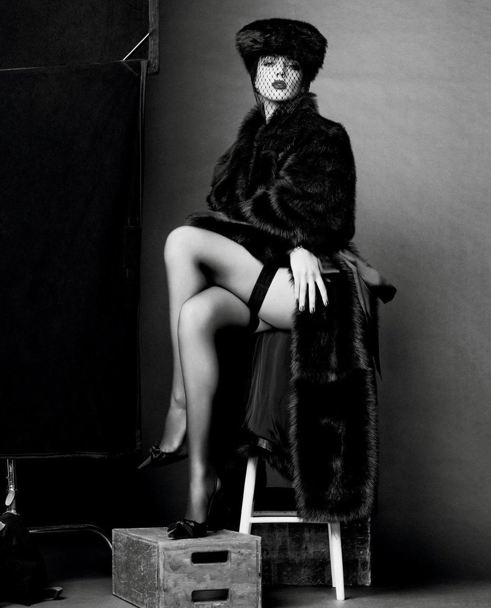
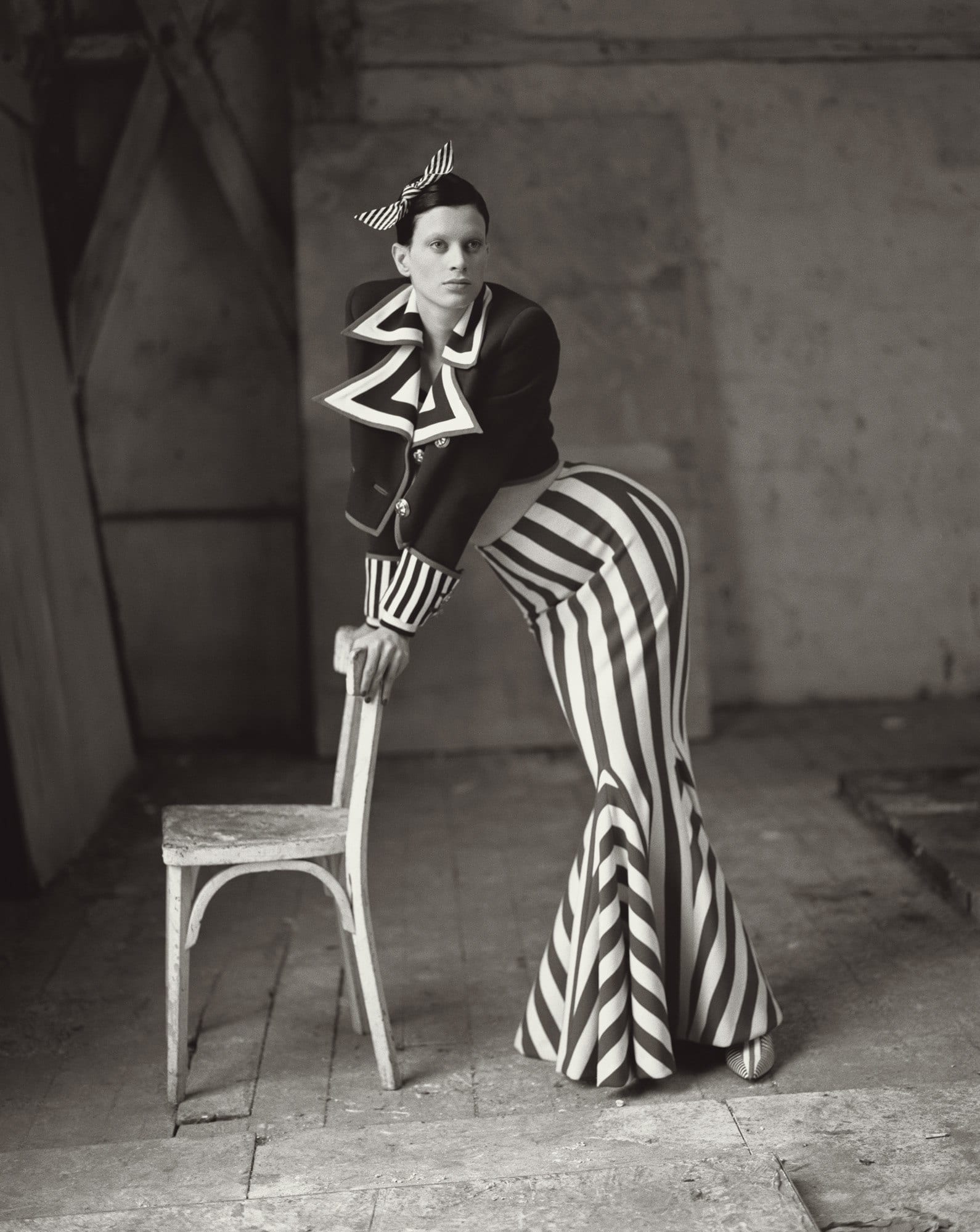
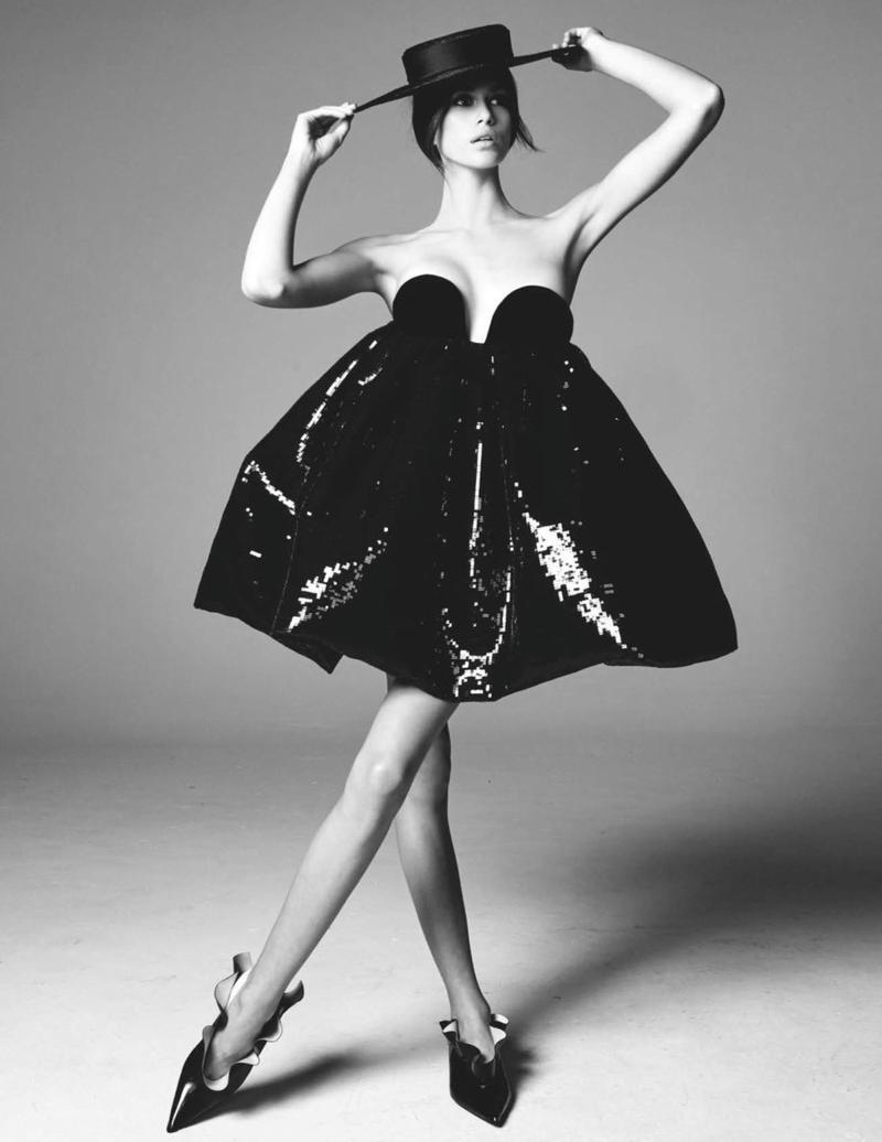
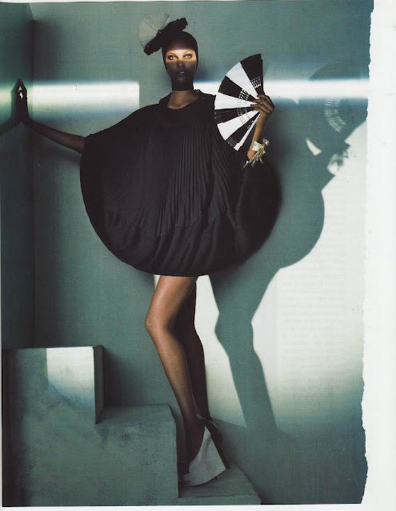
I’ll leave you with these.
Take a look at this series of images and do your own critique.
Notice how big dresses can work very well, as long as there’s contrast.
You need to have big with small, light with dark.
And always create shapes.
This image for example. She is a petite lady, and the outfit swamps her, but the hair is given structure and size to mimic the outfit.
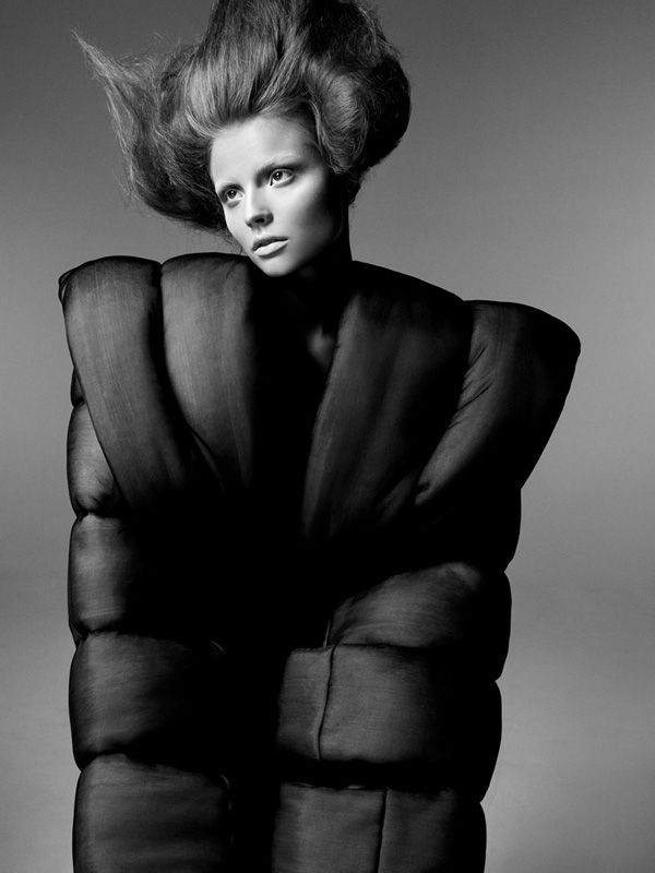
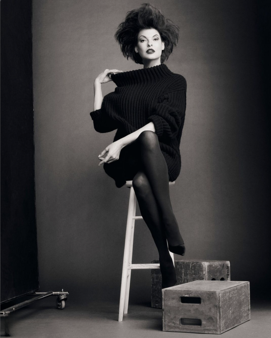
I really enjoyed this, I’ve never been great at fashion photography myself and I’ve always wondered how the masters do it, so it’s been immensely valuable.
I hope there was some nuggets of useful information in there for you too.
DM’s always open if you’ve got any comments!
