The third rule in photography is commonly referred to simply as ‘the rule of thirds’. It may well be one of the single most misunderstood and misinterpreted elements of photography.
Why?
Because on the surface it is incredibly simple, yet it is an introduction to the topic of composition, which is unbelievably complex.
From leading lines and screen direction, to colour balance and dynamic tension, composition is an absolute beast of a subject and would take years to understand completely.
The reason composition is such a complex instrument is because so much of it is contextual, the rules don’t always translate across subject matter, you can’t simply use the same tactic for each picture and expect a great photograph each time.
You have to teach yourself to ‘see’.
You have to understand under any given circumstance what it is about an image that makes it work visually, and equally what doesn’t make it work so you may correct it.
For the beginner however, the rule of thirds is a perfect place to start.
Let’s take it from the top. What exactly is the Rule of Thirds?
What does the thirds rule mean in Photography?
It is the process of dividing the frame into nine equal sections.
A 3×3 grid.
The principle idea of the rule of thirds is to give you a structure within the camera frame that you can use as a guide. The guide helps you place things/objects/people within it to create balance.
The grid looks like this:

The grid can be used in four distinct ways:
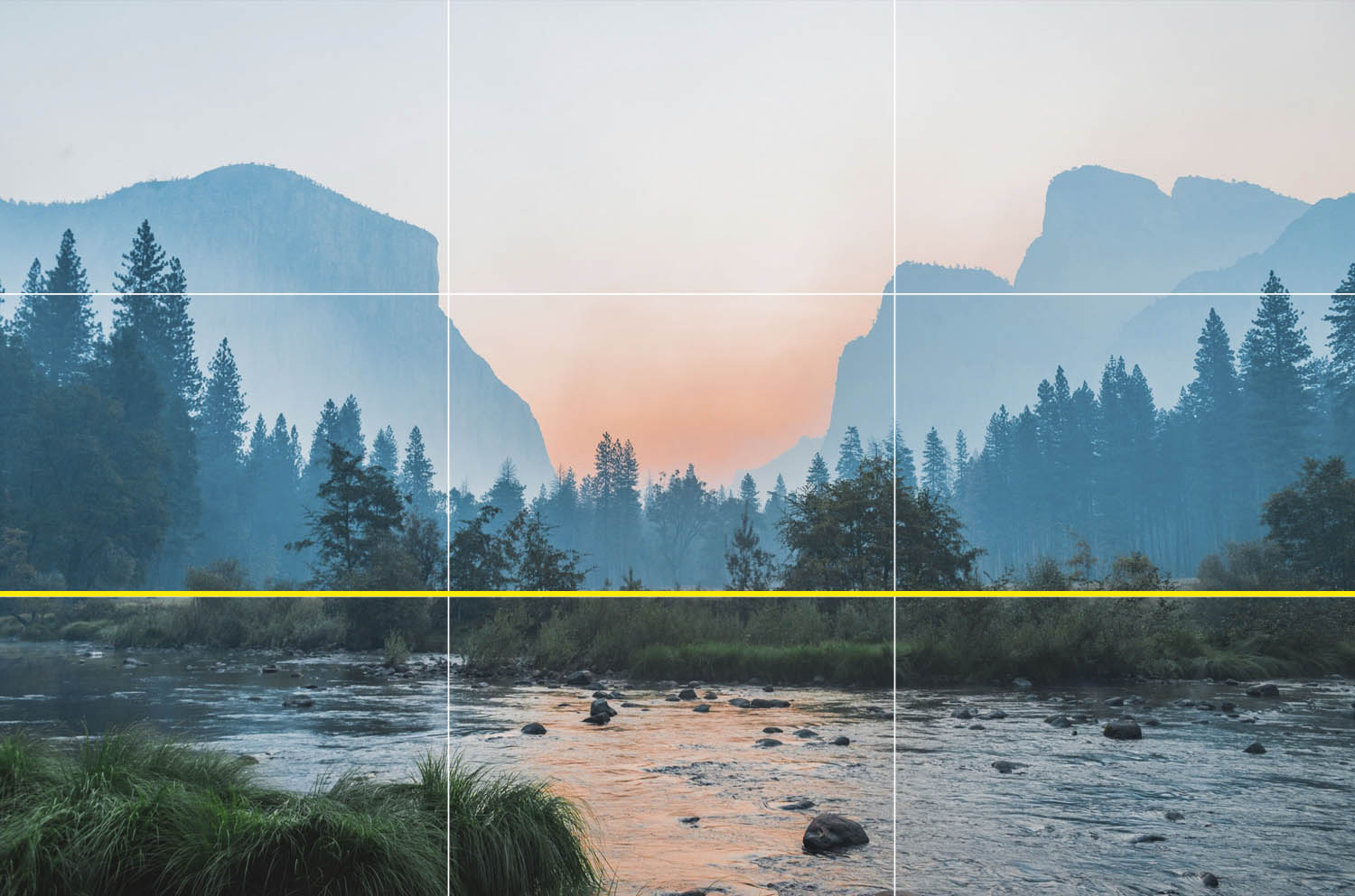
1) Placing the key part of the image either along one of the vertical lines, or along one of the horizontal lines.
A horizon line along this line for a landscape photograph for example:


2) Placing the key part of the image inside one of the blocks.

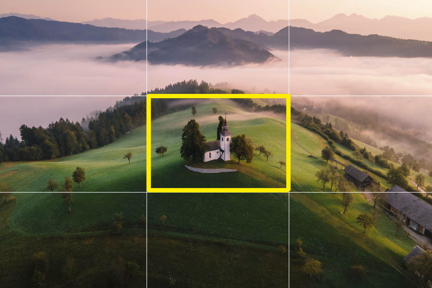

3) Placing the key part of the image at a point where the lines intersect.

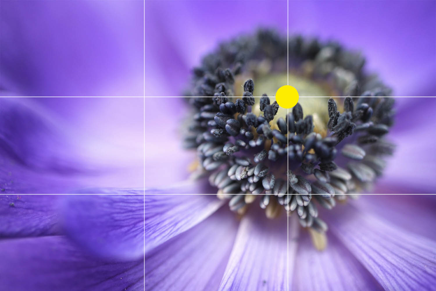

4) Placing a point of interest within an entire third of the image, like this:


Does it really work in the real world?
Well…sort of.
Explain this hazy answer please?
The grid itself is rigid, and real life is rarely so rigid.
The images above all look great and they are successful photographs.
BUT
They aren’t successful JUST because they have obeyed this rule.
There are many other factors that come into play when discussing composition.
Let me show you.
This is the original composition of the landscape image used above.
I really like the picture, it’s really well composed. And whilst it does obey the rule of thirds, I want you to appreciate that there are far more things at work than obeying a 3×3 grid.

When we place the rule of thirds grid over the image, the church is clearly placed within the centre rectangle. Obeying the rule of thirds that the point of interest should be placed within one of these rectangles.
However.
The image isn’t successful purely because the photographer has placed the point of interest inside a square.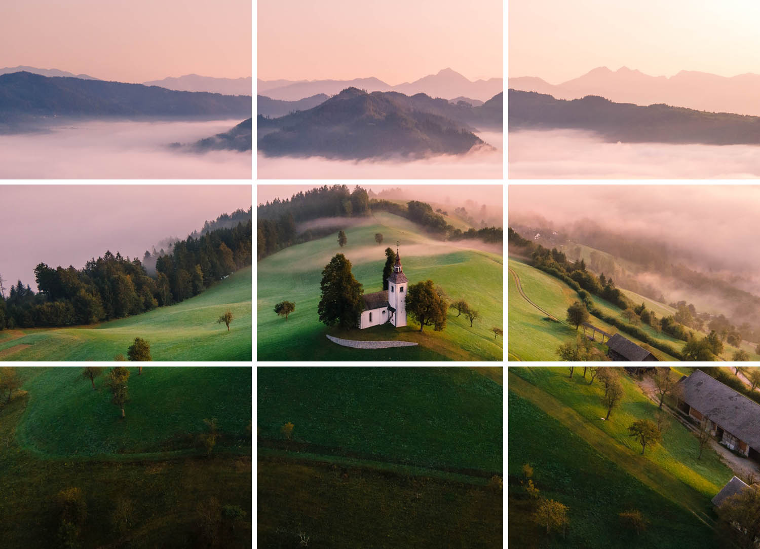
We can see that the image is clearly divided into three equal sections, again obeying the rule of thirds, where the light is darkest at the bottom and lightest at the top.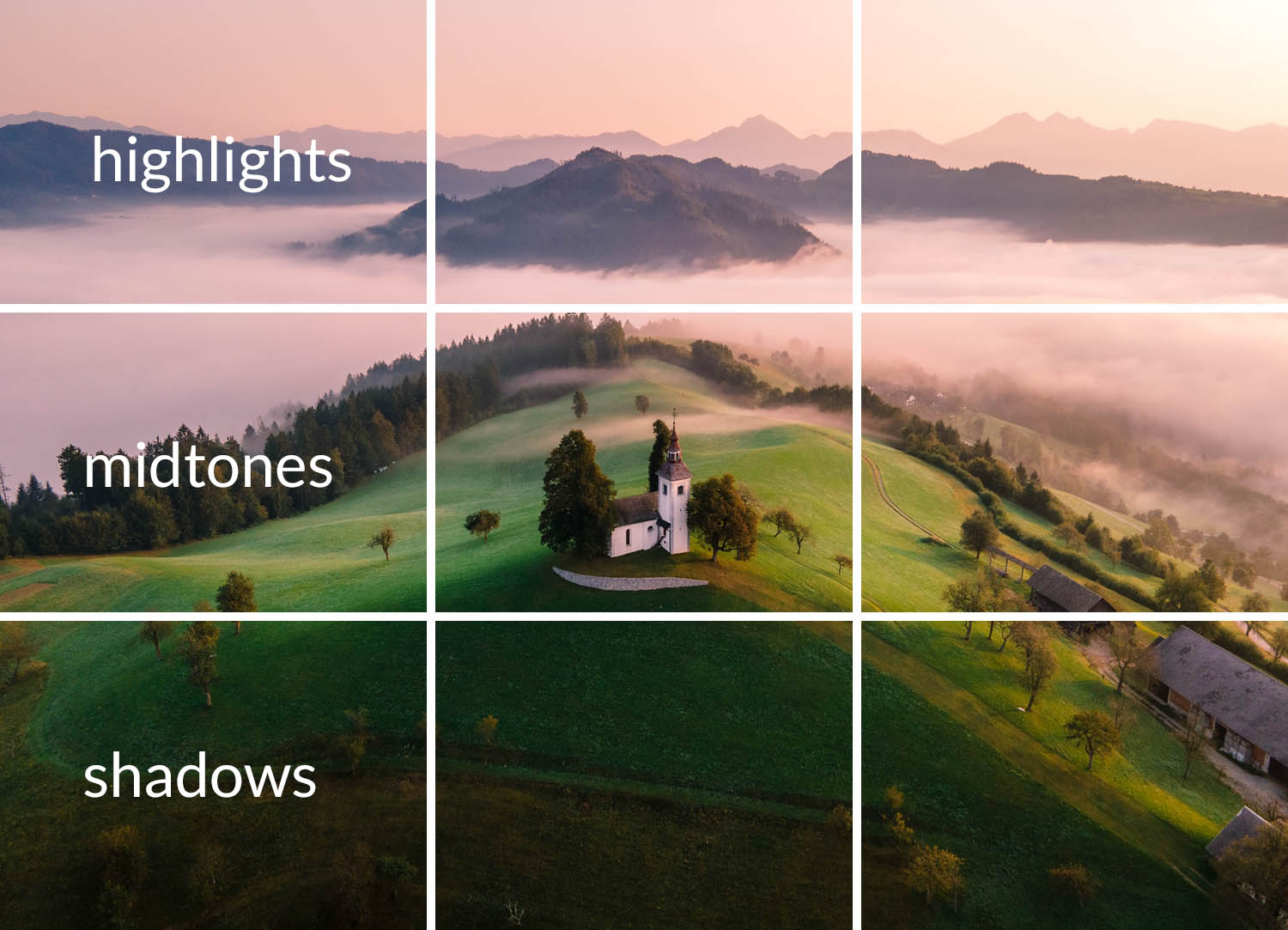
This aids the composition as it gives the picture a visual direction, it encourages the eye to move across the picture in a fluid motion.
Our eyes are drawn to the lightest part of an image, in this case with a landscape, it draws the eye from the bottom to the top of the picture and creates a sense of depth.
Leading lines also play a huge part in the success of this composition.
The lines of the hill, lead the eye into the middle of the frame and up, through the rest of the image.

Hopefully you’ll agree with me, there are more things in play, than simply placing an object in a block.
How to break the Rule of Thirds
The Rule of Thirds is one of the rules in photography that can easily be broken.
Images that do not follow the rule can employ other techniques to create an arresting image. The use of leading lines, colour, contrast and symmetry attracts and holds a viewer’s attention.
The Rule of Thirds is not a one-size-fits-all composition technique. In some situations, it might hold you back and hinder your artistic production process.
I have this picture of Picasso’s in my bathroom, I stare at it whilst I brush my teeth.

Let’s get something straight from the off, Picasso was a genius. So let’s not get too upset if we don’t measure up to his standards. But there are some cool lessons to be learnt from his amazing paintings.
We can see that if we place the rule of thirds grid over this painting, not much about the success of the composition is revealed. It doesn’t jump out of the image that the rule has been followed.
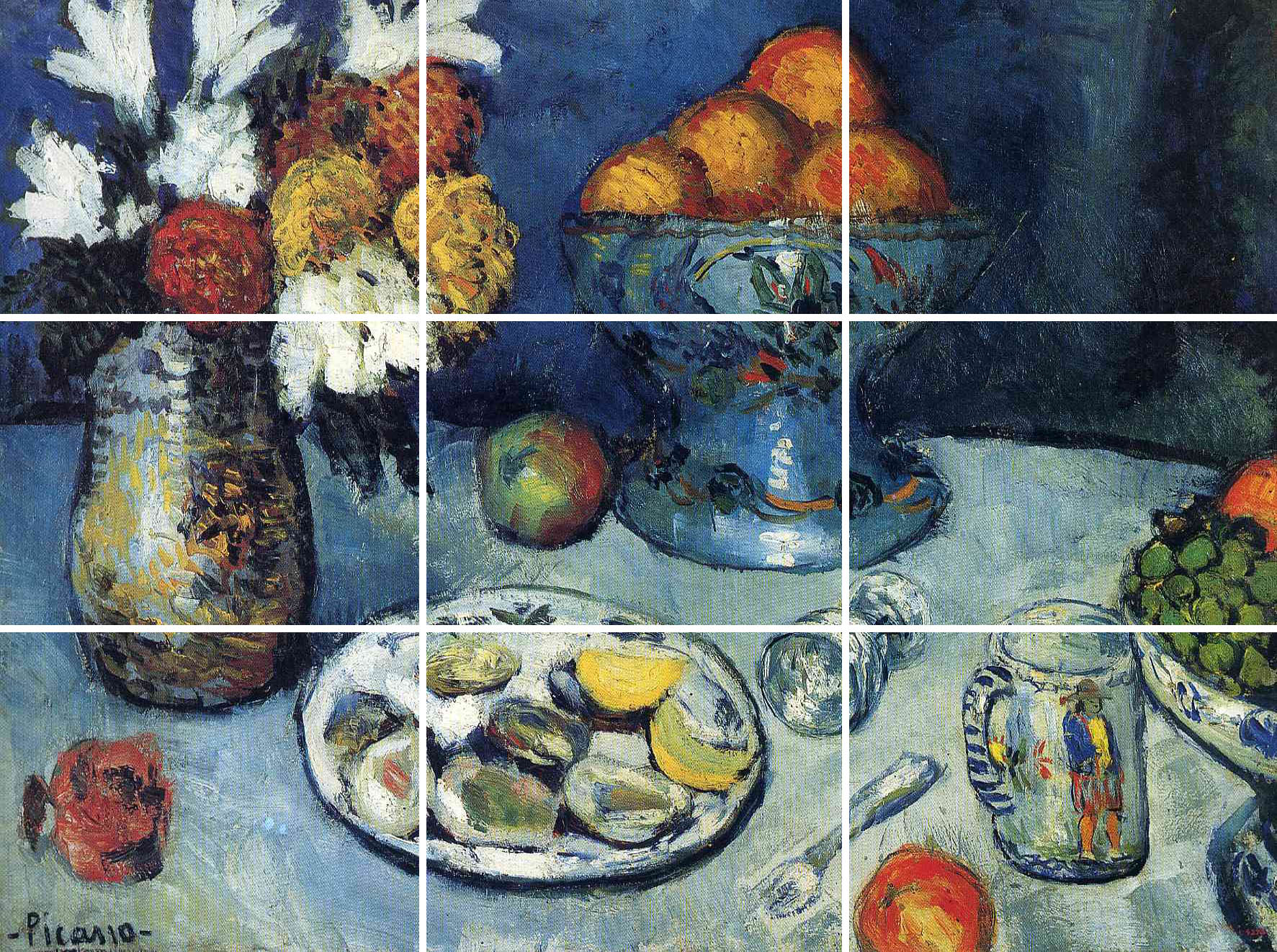
This is where the rule of thirds can be broken, yet a successful composition can still be achieved.
In this case, Picasso has used colour to do the heavy lifting of the composition.
If we reduce the main colour elements to a single tone, it becomes a bit clearer.
Each element has been carefully placed within the frame to lead the eye across the image and allow the eye to move freely across the painting without hitting any hard stops that upset the flow.
The tones in the orange fruits are echoed in the flower vase. The grapes, apple and oyster shell share a similar palette, as do the reds from the fruits which are echoed in the flowers themselves and also in the oyster shell.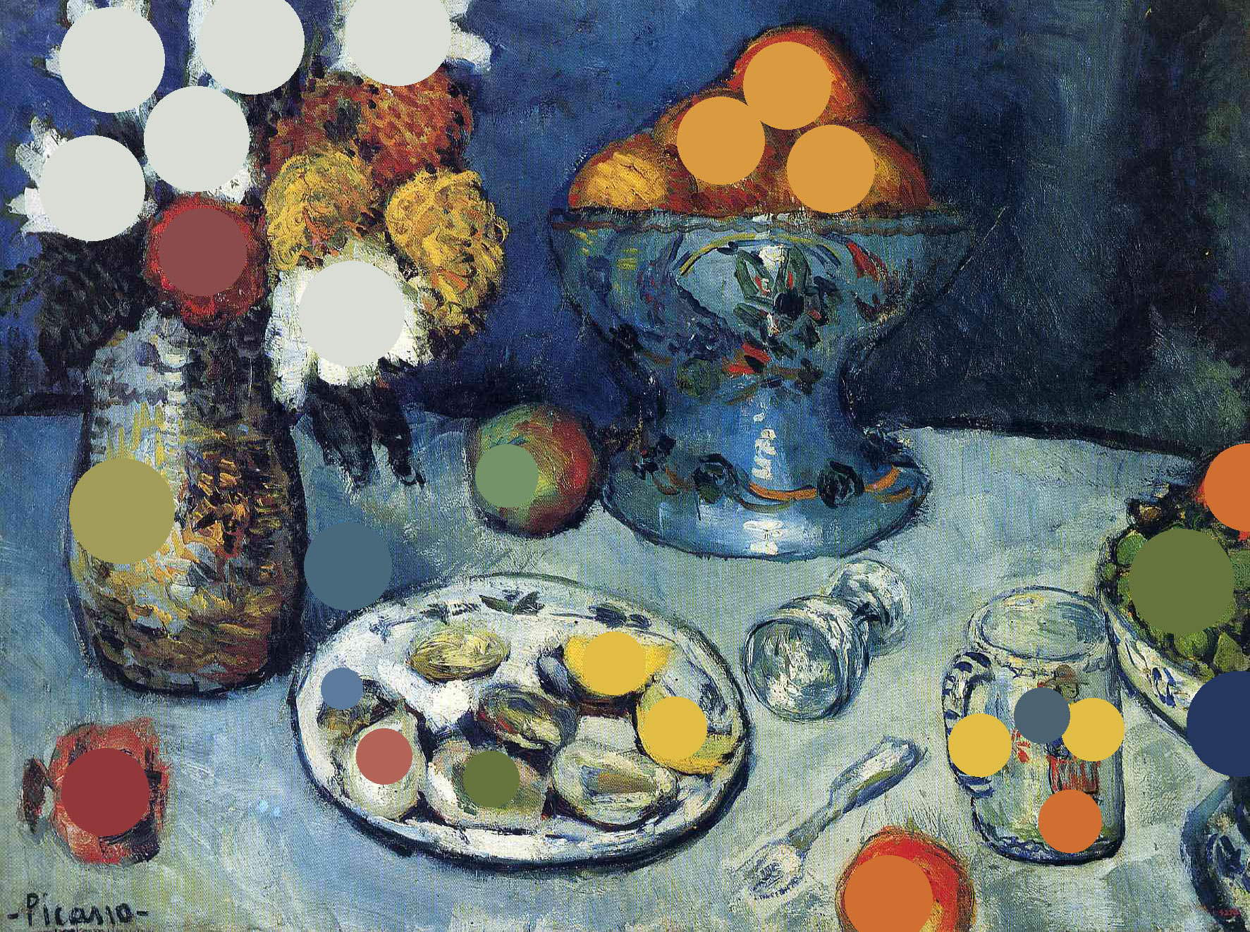
One of the most clever parts is the positioning of the strong highlights in the top left corner.
The eye naturally reads from left to right, the slope of the table aids this, and then the orange and grapes and the right hand side of the frame act as a bumper to push the eye back into the middle of the image.
Our eyes also naturally gravitate towards highlights as well, and that’s where these white flowers do their job.
As the eye moves back into the frame, the white pulls the eye all the way back to the far left, and the visual journey across the picture is complete.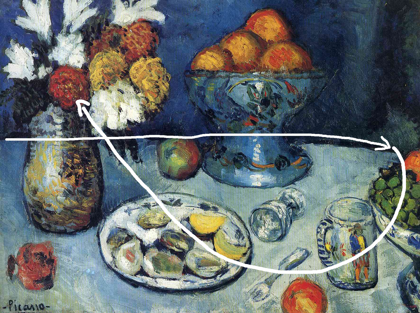
Rule of Thirds for beginners – Recap
On your first trips out with a camera, you’ll most likely shoot images sporadically. That is understandable, you’re just starting out, don’t be too had on yourself.
With the large amounts of information to remember and process, particularly when trying to get your head around exposure, ISO, depth of field etc. following compositional rules might be a big ask. This especially applies to those wishing to shoot moving objects, like wildlife photographers for example.
Sudden events might push you to shoot pictures instinctively. At that point, paying attention to the rules of composition disappear as you frantically work to capture the cool event unfolding in front of you.
As you grow and develop as an image maker, you will find that you are able to follow these rules instinctively. You can take shots and follow the composition rules in one fell swoop.
In order to get you through in your early days, you should allow for space. This space allows you to rectify crap composition through cropping later on in Photoshop, when you have more time to reflect on and learn from your mistakes.
Historical Background of the Rule of Thirds
The Rule of Thirds was first espoused as a theoretical concept in 1783 by Sir Joshua Reynolds. It was given the tag “Rule of Thirds” by John Thomas Smith in his 1797 book Remarks on Rural Scenery.
In 1845, George Field confirmed Smith’s input in his book Chromatics. There he confirmed Smith’s theory.
He also advocated for a 2:1 aspect ratio on images. He opined that it be applied to the “crossing and breaking of objects” in a picture.
It is believed that the application of the Rule of Thirds heightens interest and tension from anyone who sees the image on which it was applied.
Rule of Thirds was designed to apply to all areas involving visual imagery. Areas like designs, movies and motion pictures, paintings, and photographs.
Tips for Composing Pictures
Composition and the application of the Rule of Thirds are generally easier when wide shots are taken. That will give you enough wriggle room to alter the composition.
Where taking close up shots is necessary, the same rules should also be applied, however there are often fewer elements with the frame to balance out the composition.
In a wide angle landscape photograph for example, a swivel of your hips one degree may allow additional trees into the frame for example to add balance where needed. When shooting close ups, such degree of movement is rarely available as the object is small and any surrounding elements are farther away.
In shots and frames involving people, the line of interest cuts through the eyes. This is because most people who see the picture look at the eyes first.
For shots and frames meant to depict the weather, the sky should take up 2/3 of the total frame. Incidental images will take up 1/3, as the sky is the focal point.
In doing so, the Rules of Thirds have to be followed in and out of frame. As such, it is important to highlight the tension. It can also show what is at stake between a character in focus and his environment. For example if a person takes up one third of the frame and is looking out of the frame, the ratio of 2:1 negative to positive space is in play, which creates tension as the viewer follows the eyeline out of the frame. This then creates questions, what are they looking at? And can create suspense.
The Rule of Thirds favours asymmetrical image arrangements. This is because of the fact that its use obviates central design. Central design involves putting all objects of interest in the centre of the space. When that is done, the focal image(s) become stationary.
The use of the Rule of Thirds adds motion and perspective to the image, and that in turn heightens interest.
The use of the Rule also sets you on your way to properly structure your images through the grid system. It also helps you frame and scale the additional or incidental elements in the photograph.
Tips for following the Rule of Thirds
There are ways by which a beginner can master and follow the rule of thirds. The ultimate goal is for you to take in the composition and grid by eye.
Before you lose heart, chances are that you have been following the rule of thirds even before you knew what it was! All you need to do is keep calm and follow through on the learning process.
The truth is that such skills cannot be acquired on-demand. You will get there, but you will need some assistance for that to happen.
As you continue working, you will find that you naturally prefer some compositions to others. That is your photographic intuition kicking in.
Such intuition helps you improve, gauge and set up your composition. Before then though, there are some ways in which you can be assisted.
Take advantage of the phone feature that allows you to use a gridded outline on every picture you will take. This will enable you to have a preset overlay that follows the Rule of Thirds.
The most interesting part of all of this is that this gridded skeletal overlay is available on every smartphone. You just need to go to the camera menu options and activate the compositional guide.
Another way you can benefit from this overlay aid is by activating and putting them to use in the editing software. You can find it on editing apps and programs like Photoshop and Lightroom.
In the process, you can also develop an eye for gauging and composing pictures within the grid. That in itself is the end goal, so get going!
Conclusion
The rule of thirds is a tool, and like any tool, it should be used in the right circumstances.
It is not a one size fits all method of composition and should be applied with care and in conjunction with other composition techniques.
