Monochrome Photography
Black and white photography – an art form all of it’s own. Seeing the world in black and white tones will improve your craft and help develop your understanding of composition, balance and the rhythm of an image.  Taking a picture a putting a black and white filter on top of it as a after thought will never result in you improving as a photographer.
You need to create with purpose.
Hopefully this walk through all things black and white will give you a new appreciation for monochrome and help you on your journey to photographic mastery!
What is Black and White Photography?
Black and white photography is recording images in a range of tones, from black through to white. Sometimes referred to as monochrome, sometimes referred to as grayscale.
Once upon a time, black and white was the only means of capturing a photograph and is an art form all of it’s own. It tests the photographers control of light, contrast, texture, shape, composition, you name it, it’s under the microscope.
Not that colour photography doesn’t do this, more that with black and white photography there is more emphasis placed upon these characteristics of the image.
There is a magic that comes with black and white photography. Because we see in colour, black and white has an ability to remove an image from the procession of time and make it instantly ‘timeless’. As such, I’ve always felt that black and white images are viewed differently to colour as they are less of an attempt to capture life ‘as is’. It is more of an exercise in creating a representation, a documentation.
Black and white photographs are no more ‘Art’ than colour, they are merely their own entity. My love of monochrome comes from playing in the darkroom. With the distraction of colour removed, shape and form are revealed in a new light. Making contact prints, exploring shape, texture, light and shadow taught me a lot about image making. I thoroughly recommend any budding black and white photographers to experiment in the darkroom making contact prints. Use different materials, change the angle of the light – just keep playing! It will teach you everything from how different materials render on photographic paper to developing a deeper understanding of exposure.
What makes good black and white photographs?
 Black and white can’t be an afterthought, it has to be in your mind that you are creating monochromatic photographs as they approach to composition, exposure, depth of field etc. will all be different. In colour photography, the same rules apply, however bold colours will draw the eye in a certain direction, or repeating colours across a composition will give balance. In black and white photography, with the colour no longer present, it is the gentle interplay of light and dark that will play a much bigger role in your compositions. Take this colour painting by Picasso for example:
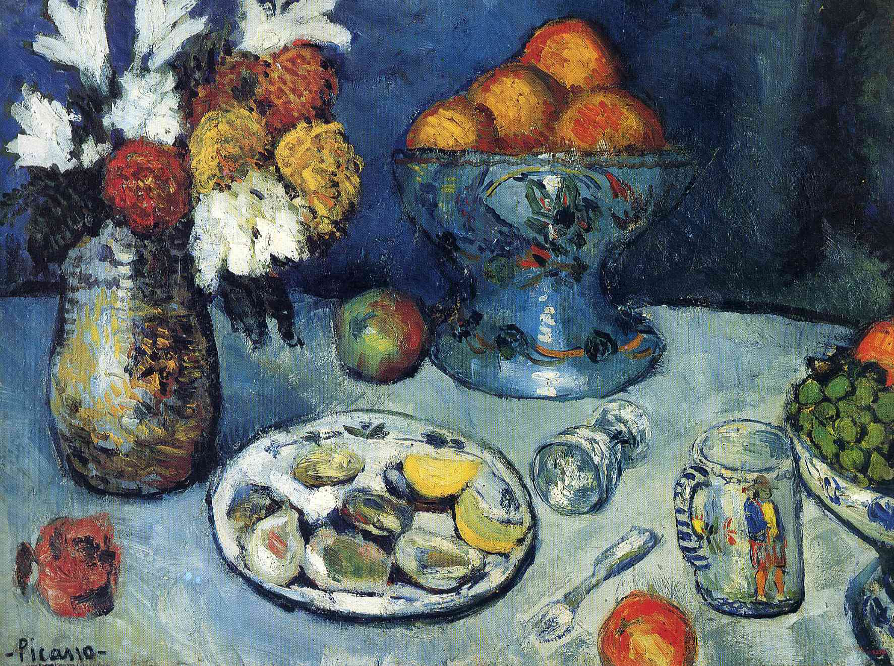
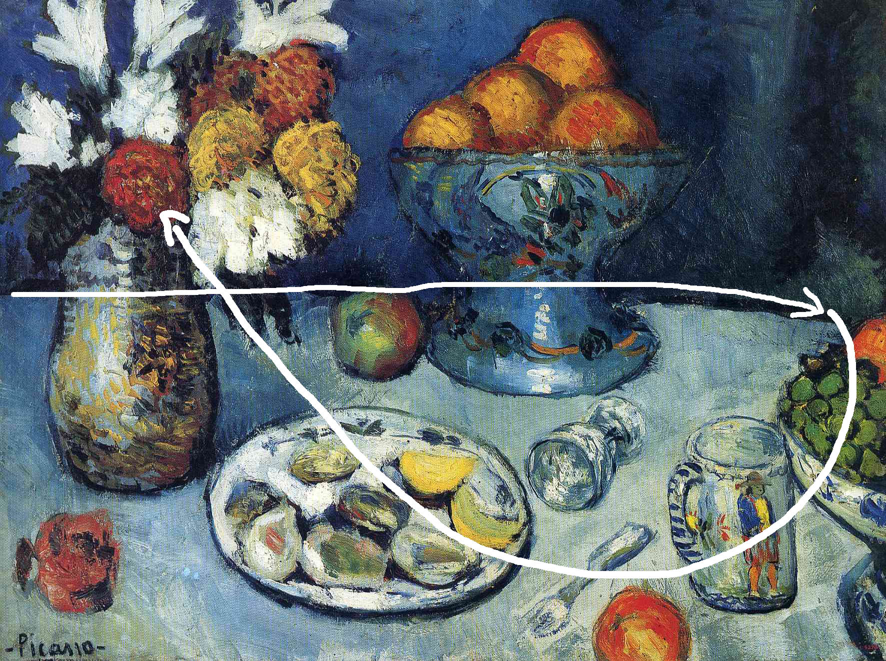 The eye is drawn across the image from left to right, the repeating Orange tones help balance the composition, then the bright white flowers in the top left wrestle the eye back to the other side of the composition and helps keep the eye moving around the frame.
 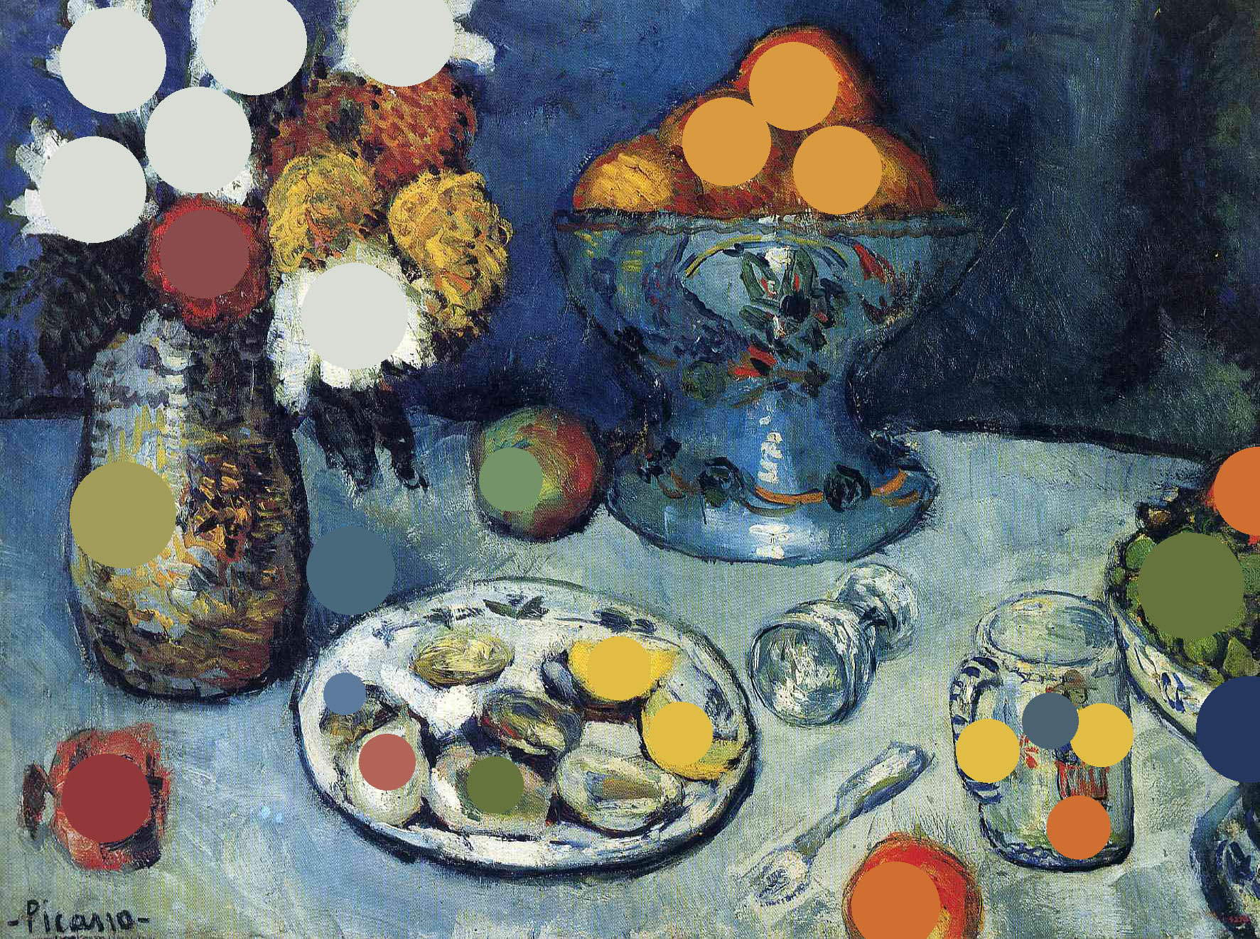 If we highlight the strong repeating tones across the entire image, we can see how Picasso has used reoccurring tones across the whole image to balance it. In black and white photography, we don’t have that privilege.
 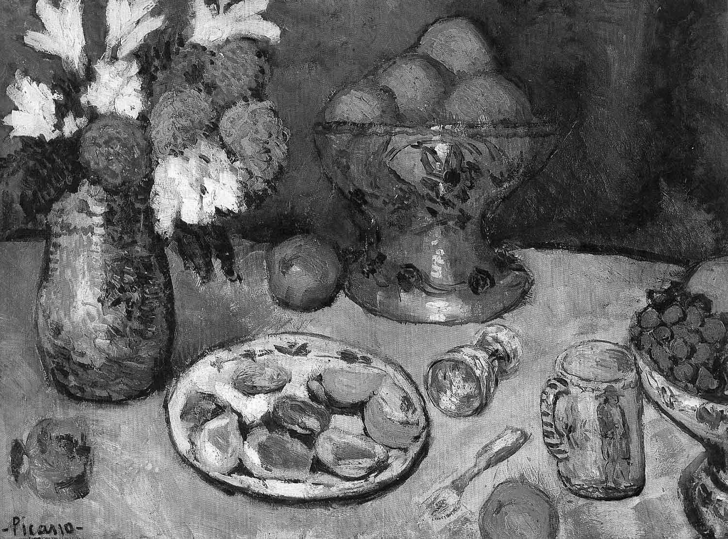 Here, when we take away the colour, we can see how the image is no unbalanced. The left hand side of the image is brighter and the eye struggles to move away from those bright white flowers in the top corner.
Is it Black and White, or Monochrome?
Technically, monochrome is not by definition Black and White. Monochrome simply means that the image is of a single colour, so again, technically, you can have an image that is Sepia or tinted in any one colour. Black and white by definition has no colour. This is a distinction that is worth knowing, but don’t be surprised to hear or read the two terms being used interchangeably. If you are in conversation, no one will pull you up on using monochrome, but if you’re writing a technical paper, use black and white unless referring to a single colour.
Do I need specific equipment for black and white photography?
If you are shooting film, the answer is yes. You’ll need black and white film. If you’re using a digital camera, then no. You can either shoot in colour and make the images black and white later in Photoshop, or you can change the cameras settings to shoot in black and white straight out of the camera. If you are using a mirrorless camera, like the Canon EOS R6, the Fuji X100 or the Sony A7 III, you have the option of setting the camera to black and white, and it will show you a live preview in the viewfinder Literally a ‘what you see is what you get’ preview – which is awesome. The big win of shooting in this way with a mirrorless camera is that it preserves the colour information as well. At least, double check yours does before you go on a paid shoot! But my EOS R 100% does. So if you prefer shooting in black and white (like I do), you always have the option of using the colour version, should the client prefer it. JPEG vs. RAW It’s worth pointing out at this point that if you do switch your camera to black and white mode, and are shooting in JPEG, then the camera will apply it’s own black and white conversion to the image permanently. If you want full control over your black and white images, make sure your camera is set to RAW. You’ll find this in the settings. Why do I need RAW? The simplest way I can explain it – RAW gives you more latitude to edit your image in Photoshop without ruining it’s quality. Are JPEGS bad then? No, it just means if you do shoot in JPEG, and your image is underexposed for example, when you try to make it brighter using Photoshop, the final image will be of a lower quality than if you attempted to perform the same task with a RAW file. Is it better to shoot in RAW and convert to black and white later? It makes most sense to, yes. JPEGs are smaller files, but RAW gives you more options. When you choose ‘black and white’ mode or ‘monochrome’ mode on your camera, the preview image will be in black and white, so this gives you the advantage of being able to visualise the final result.
Do I need filters for black and white photography?
Firstly, what do the filters do? They affect the contrast. With the invention of digital photography came the ability to edit the image after taking it. In Lightroom and Photoshop, it is possible to edit individual colour channels, i.e specifically manipulate the red/green/blue part of the image. In the days of film, this wasn’t possible, and filters had to be used in order to create the degree of contrast the photographer was looking for. Even so, filters could be added to the enlarger during the printing process to alter the image, so even if you’d left all your filters at home, you still had scope to edit the picture. Digital technology has made physical filters largely redundant as the effects can be created in editing software. For the purists amongst you, filters are available for you to buy and experiment with. I’d recommend starting with something cheap whilst you’re still learning, but also something that will fit all lenses. These filter kits that have multiple adaptors are the best place to start.
Key elements of black and white photographs
As we explored above, black and white photography needs to employ a different set of rules to colour photography to be optimally successful. Whilst the absolute basics remain the same, we must approach black and white photography with deliberate intention, otherwise you run the risk of the purpose of the image being lost. When starting out in photography and can be easy to become overwhelmed trying to learn everything at once, so make sure you have a clear intent in your mind before setting out to take pictures. It makes focussing on the task at hand much easier, and perfect practice is better than taking random pictures and hoping for the best.
Shadows
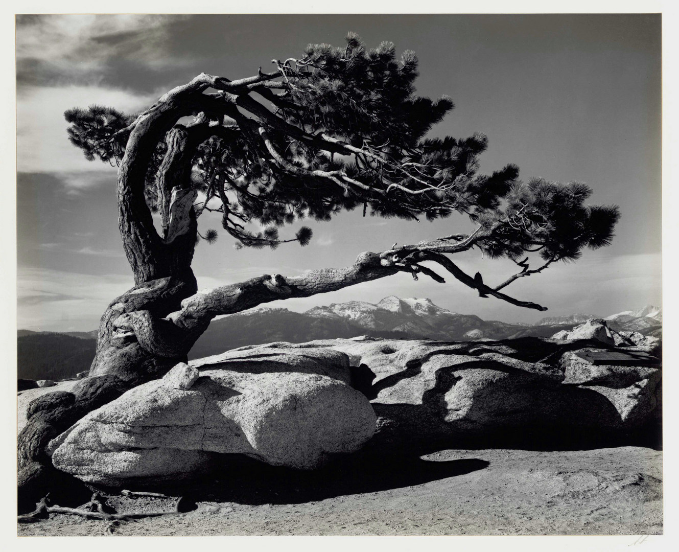
The effect of shadow is enhanced in black and white photographs. Without colour to lead the eye, the interplay between light and dark becomes much more obvious. It’s important to address how we interpret shadows in an image in order to get the most out of them. A black and white image does not need to have every tone in it from black to white in order to be a successful photograph, but you do need to pay attention as to why you are using black and white in the first place and what you are hoping to emphasise. Take the following Ansel Adams picture for example. 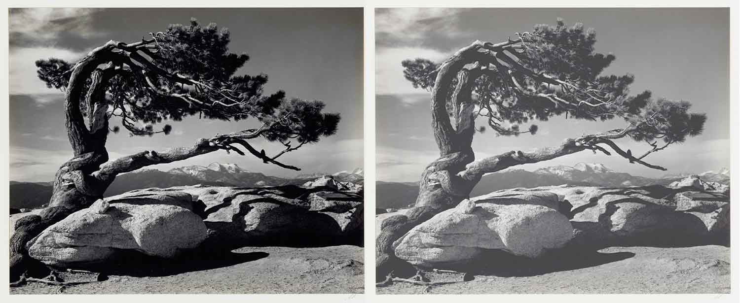 In some contexts, extreme shadows can be scary. In this example, the shadow has been used to place emphasis on the shape and form of the tree. The image is a celebration of shape and texture, where the shadows have been used to highlight the trees texture also. You’ll notice when we remove a lot of the shadow in the image on the right, a lot of the brooding nature of the tree is lost and the image feels flat. The genius use of shadow in this photograph however goes largely unnoticed because the shape of the tree is so alluring. However it is the shadows of the boulders at the bottom of the image that add weight to the bottom of the frame, and keep the eye grounded.
  If we crop the image to remove the boulders and their shadows at the base of the picture, then the eye is drawn to the top left of the image and has a tendency to ‘fly off’ into the sky. It’s difficult to remain focussed on the tree, which is of course the main subject matter. There is a great lesson in this, whilst you are photographing something you think is interesting, you must remember to look more intently at what you are shooting to see if the objects around the main subject are what is making it more interesting. It’s easy to get distracted by the ‘main event’ of a scene, but sometimes you need to give the subject room to breath, as the elements around it are what is actually making it interesting, but only in a very subtle way. Now that they have been removed, we can see the shadows from the boulders are what are balancing the image and stopping the eye from flying off around the frame. They add a visual weight to the scene and are incredibly important, even though they are not the main subject of the image. Shadows is one thing, but their depth and weight would have no bearing without…
Contrast
“The state of being strikingly different from something else”. Contrast is not simply having a bright and a dark part of an image. To achieve the maximum effect of contrast, putting the contrast slider up to the max isn’t going to cut it, we need to know how it works and what it’s doing to the image. Proximity matters. Placing something dramatically dark next to something strikingly bright is known as the greatest area of contrast, and our eyes are naturally drawn to it.
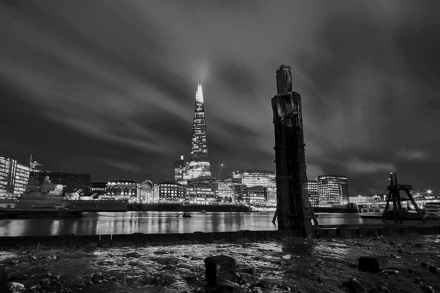
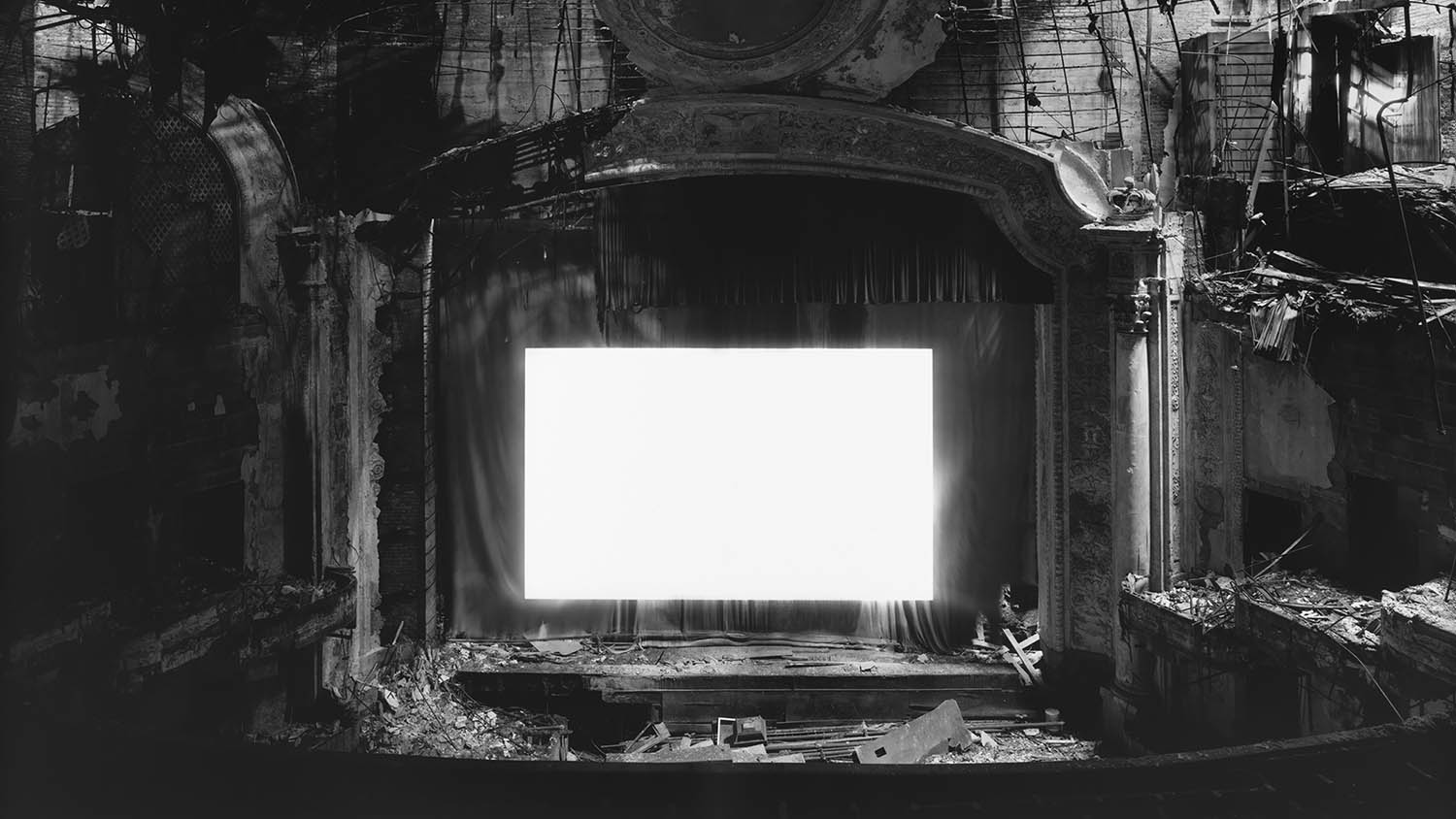
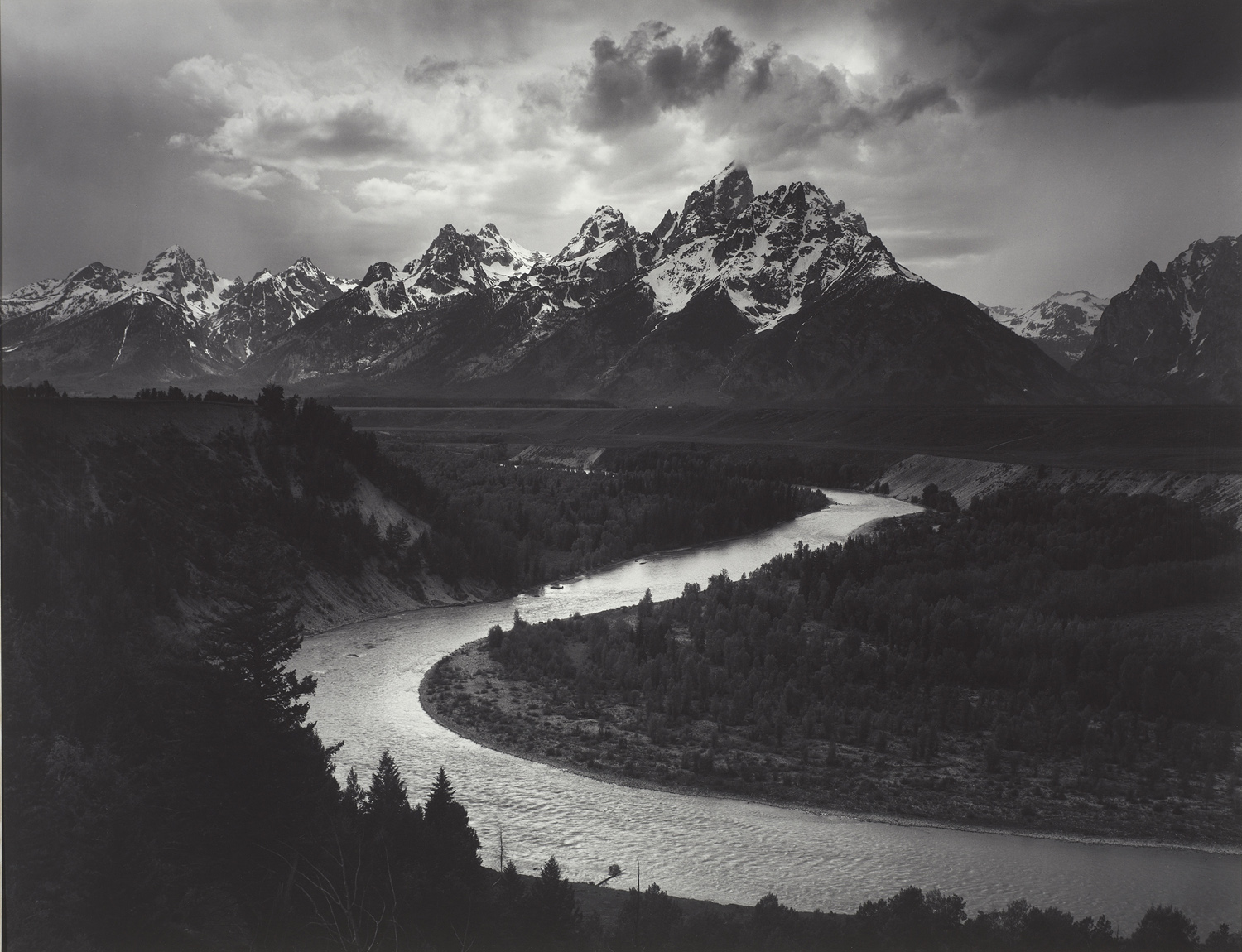
An image doesn’t have to have high contrast to be an effective black and white image, it is contextual, and depends on the subject matter as well as the emotion the photographer may be attempting to convey. Take this photograph by Hiroshi Sugimoto: 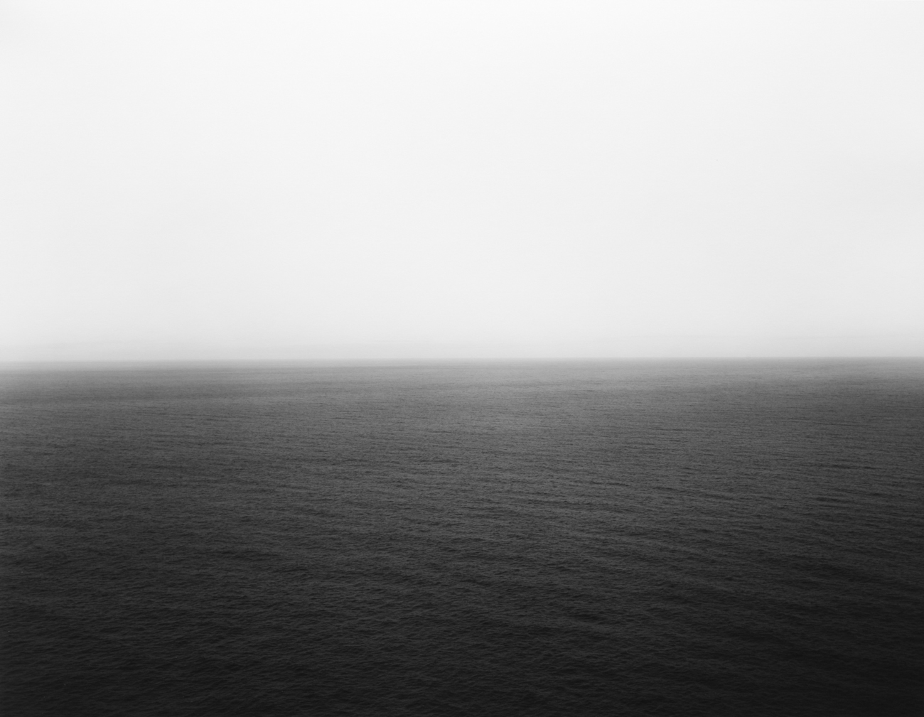 The muted tones, the slow gradation from dark to light as well as there not being a single area of stark contrast, means the viewer is able to view this scene without being lured in any particular direction. Imagine yourself stood in front of it in a gallery and it filling your peripheral vision, it would be immensely soothing. The effect would be lost if the image had high contrast. So, contrast is something bright next to something dark so one stands out against the other, next up…
Tone
Tone is how bright or dark a part of a picture is. Remember, contrast is when those extreme tones are placed directly next to each other. Like the Sugimoto image above, your choice of which tones to use depends on the subject matter and which mood you wish to convey. Changing your exposure will change the tones and therefore change the mood.
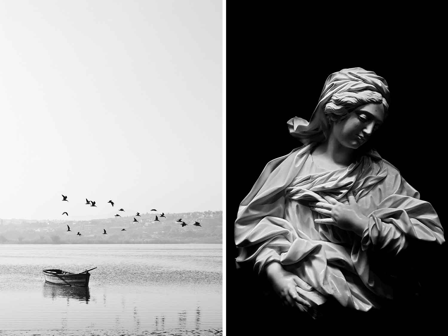
The image on the left for example, has many bright tones and is relatively low in contrast. One could say the tones are ‘muted’ or ‘soft’, they are not confrontational or jarring and fit the tranquil mood of the boat sat on a still lake. There is high contrast between the birds and the sky, which allows them to stand out and play a key role in the composition. The image on the right has many dark tones, combining this with the extreme difference between the light and dark, creates heavy contrast across the entire image and ultimately, creates a sense of drama. The contrasting tones add emphasis to the texture in the image.
Balance and Shape![]()
Take away colour and the importance of shape is elevated. As previously mentioned, contrast between light and dark directs the eye across the image and shape plays a huge role in the visual flow of the picture. Whilst the eye is naturally drawn to the lighter part of the picture, it’s important to the overall balance of the image that the shapes in the picture help the eye travel across the frame harmoniously (or not, if that is the intention).
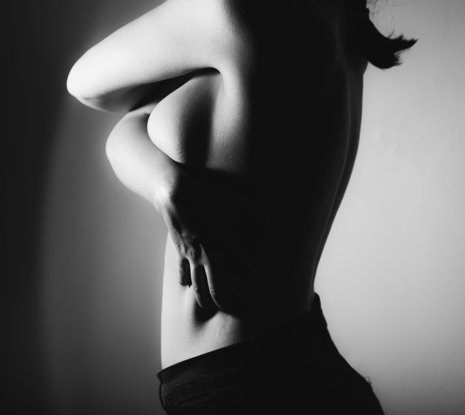
The emphasis black and white places on shape is abundantly present in nude photography. Selective lighting emphasises softness and femininity, the image takes on a tactile nature and awakens the senses.
Shape also allows the photographer to play with what we think we know. Everyone assumes they know what a tree looks like. Big trunk, branches, leaves, done. We see so much in a day, if we didn’t reduce certain objects into their generic group of ‘tree’ the world would be quite an overwhelming place. Imagine if you walked through the woods and your brain was constantly saying to you ‘hornbeam, oak, ash, cedar, etc.’ you’d go mad!
These visual assumptions give you as the creator something to play with, you can reintroduce your audience to a subject they feel they’ve seen a million times before.
Texture
With shape, lighting and contrast, comes texture.
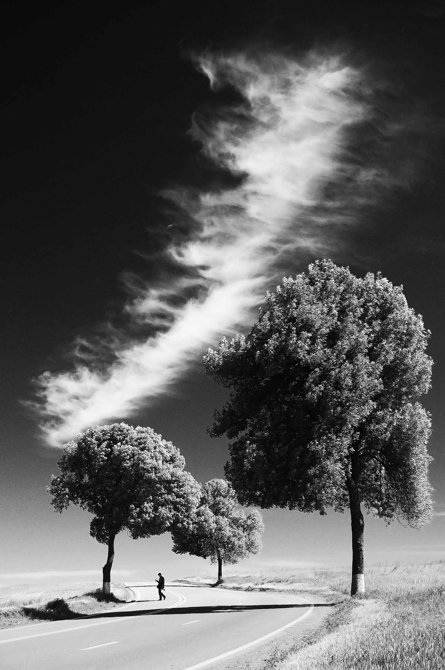
Direct, hard lighting creates bold shadows and allows the viewer to draw a tactile connection with the image. Visual language is amazing in that way, a stirring photograph allows the brain to instantly access the memory of touching something similar, look at this image, and you immediately know what it feels like.

Rough, dry, hard, rugged, all spring to mind. No caption needed, the tree fills in all the details.
Smooth pebbles, soft skin, wispy grass. The effect is the same. Employing texture correctly in an image creates a feeling in the mind immediately upon viewing. If we were to carry on the story of the dead tree above, we wouldn’t seek to use this setting for a teen pop star, the visual language of the tree wouldn’t match. Each element within the picture carries it’s own story and it’s own set of adjectives. We can use this ‘collective knowledge’ to our advantage – if we want to photograph a male model and make them look tough, we would choose this tree as part of the scene to compliment that narrative. Likewise if we wanted to create a soft and sensual image for a nude photograph of a woman, we would use other objects that are equally curvy or carry an association with sensuality, such as ripe fruit.
Texture in black and white photography is quite difficult to betray. Regardless of the lighting, texture remains intact.
Composition
Composition is ultimately the driver of your image. An entirely poorly composed image cannot be saved unless you are willing to photoshop the hell out of it to the point that its no longer a photograph. Either way, you aren’t going to do that to every single image you take, therefore, it makes sense to become a master of composition. This is way down the list, but it really should be higher, composition is everything. It’s the glue that holds the image together. Without it…well, it falls apart.
Take this landscape/streetscape photograph. It’s a nice picture, but the balance is off. If you saw this in a magazine or in a gallery, it would be too easy to walk on by.
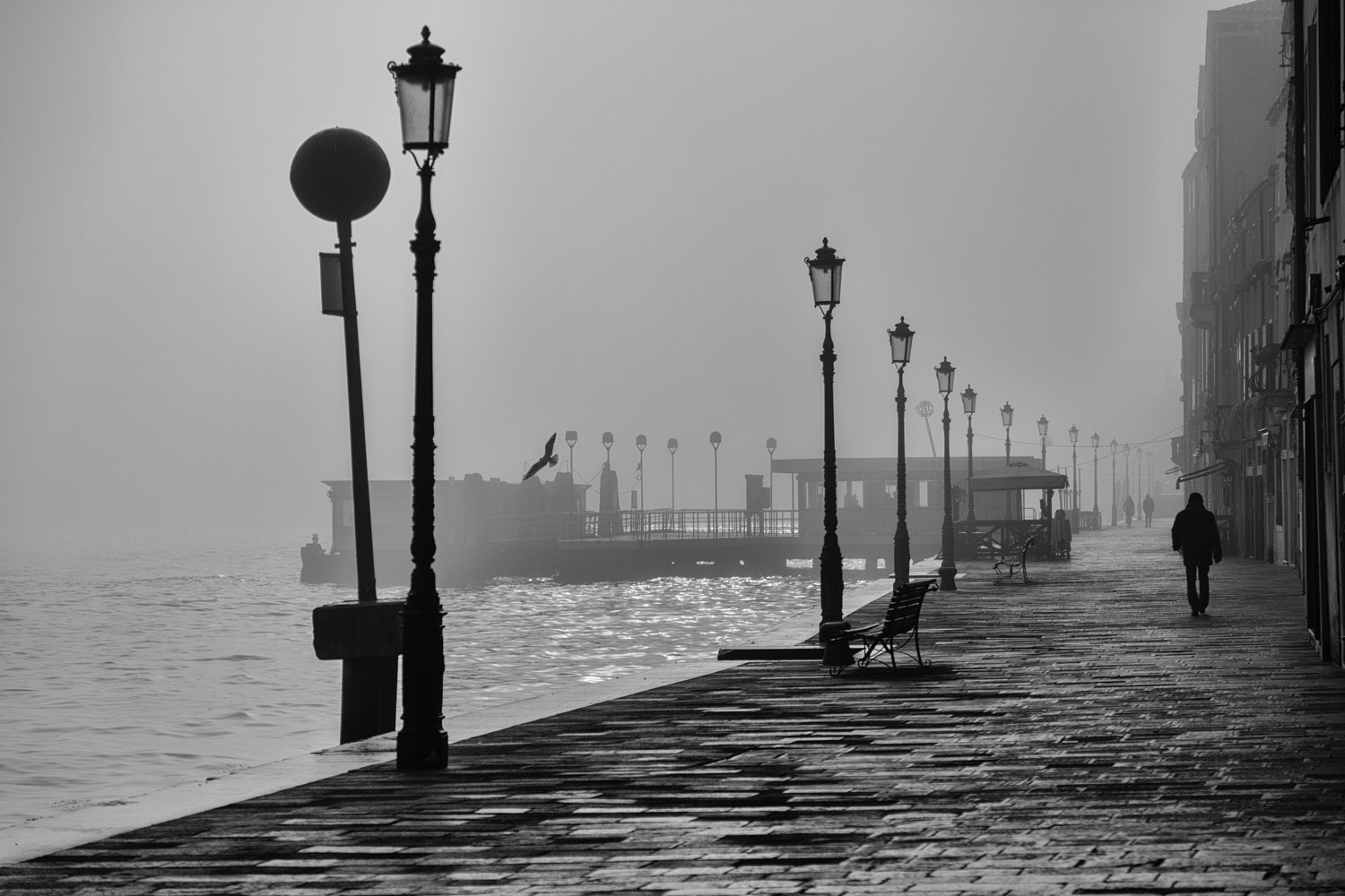
A simple fix in this case, there is too much negative space to the left of the image, so it feels disjointed. My eyes want to follow the lampposts into the scene to look at the people along the walkway, but the negative space to the left and the bird flying from right to left draws the eye away from that.
Look wat happens with a simple crop.
Rather than feeling like a mistake, the bird now provides a counterpoint to the people on the walkway and keeps the eye moving across the image, back and forth between the two.

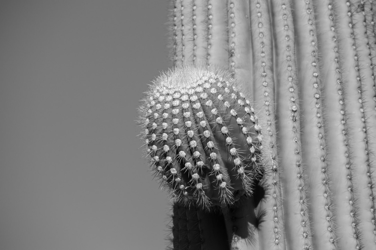
Sometimes however, the crop tool won’t save you. With poor composition comes poor photographs. Take this image of a cactus. Again, not a horrible photograph, In fact, I quite like it’s simplicity, but it highlights the importance of what you are trying to achieve in your images. It shows a cactus and nothing else – without context or a supporting story this image struggles to stand on it’s own, there are no lines leading the eye over the picture, it is entirely static. Is it a scientific record of that object at that time, or possibly an amusing take on erotic photography and shape? I don’t know. But you can see that there is nowhere for the eye to go except to the object in the middle. if that’s your intention, great. If this image is supposed to represent the phallic, then the bold in your face composition works very well as it forces the viewer to confront one thing and one thing only. If that is not what you want from the image, then you need other elements in the frame in order to lead the eye.
Takeaway – your compositions must be made with intent, otherwise the concept is lost.
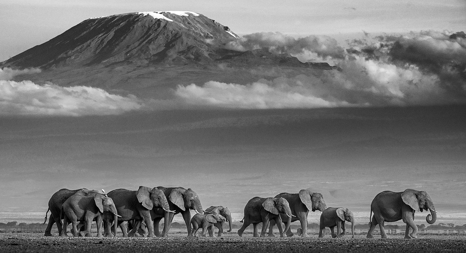
Compare it to the next image. The photographer could have zoomed in and taken a picture of an elephant. However they chose to include the herd and the landscape to add to the story of the picture. It can be easy to become fixated on the main object or person in the photograph, use the surroundings to lead the eye into it and add context. Remember that the viewfinder is tiny, but you can print your photographs to an enormous size which lets the surroundings bring in additional context to the picture.
Post-Processing
If you are shooting on a digital camera, it makes sense to record all of your images in colour and process them at home to make them black and white. Why? Because in camera processing is usually rubbish and often means you lose detail that could have been preserved. Modern cameras can even show you the image in black and white in the viewfinder whilst still recording the image in colour, so you get the best of both worlds.
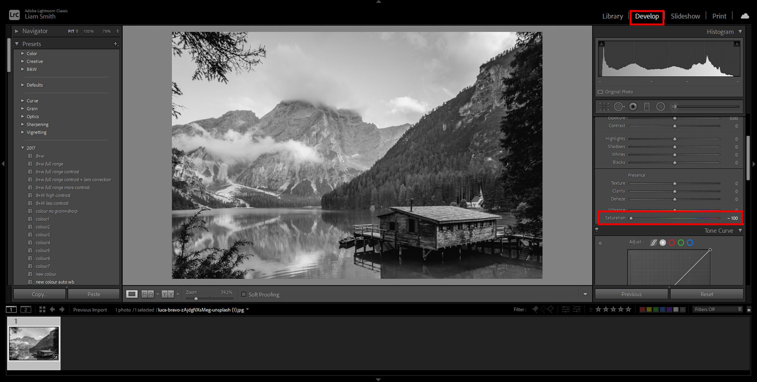
How to Make an Image Black and White in Lightroom
Import your image
Select Develop in the top right
Move the saturation slider all the way to the left to -100
Done.
Conclusion
Black and White Photography is difficult, but I firmly believe that working with it as a starting point will teach you to see light, shade, contrast and texture etc. before you bring the camera to your eye. Black and white photography will teach you to see the image before you take it, which in turn will help you choose better locations, position your models more efficiently, tell better stories and then give you a sound fundamental understanding f photography before then introducing colour theory. Of course, your entire could be made up of black and white photography, but colour brings with it an entirely new set of rules to layer on top of the basics. If you’ve mastered the basics already, then it makes incorporating colour into your work that little bit easier. Some stories however, are meant to be told in black and white. If you can develop an appreciation for all of the elements mentioned in this article and know how and when to wield them to tell your story, then you’ll be a better and more complete photographer for it.
